i love the Orion constellation!The Flag of the People's Commonwealth of Orion.
You are using an out of date browser. It may not display this or other websites correctly.
You should upgrade or use an alternative browser.
You should upgrade or use an alternative browser.
Flag Thread IV
- Thread starter Pragmatic Progressive
- Start date
- Status
- Not open for further replies.
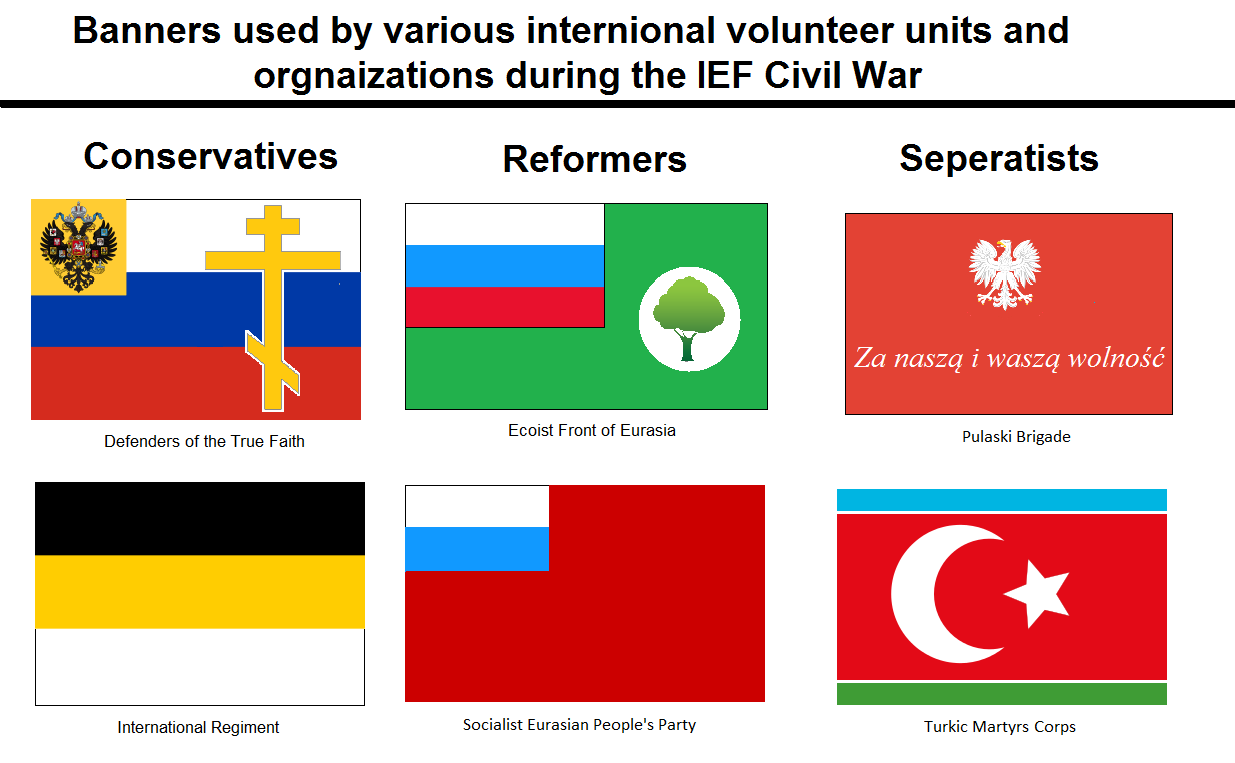
Select flags used by certain foreign volunteer units during the ongoing civil war in the Imperial Eurasian Federation. From The Union Forever: A TL .

Select flags used by certain foreign volunteer units during the ongoing civil war in the Imperial Eurasian Federation. From The Union Forever: A TL .
View attachment 288658
Very interesting, I like it! Just a question, but what territory does the Imperial Eurasian Federation control?
Very interesting, I like it! Just a question, but what territory does the Imperial Eurasian Federation control?
Thanks! For the IEF think OTL Russian Empire circa 1913 plus Manchuria and small portions of northeastern Anatolia.
well well well, were back to this, here are the next 3: Bhutan, Bolivia and Bosnia and Herzegovina...oh boy.
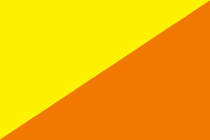
Bhutan:

Colors: yellow: 255-242-0 orange: 242-121-0
Symbolism: the yellow represents civil tradition and temporal authority of the king. the orange represents Buddhism.
Changes: all tho cool and powerful, i took out the dragon because as ive said before, its just to complicated and hard to recreate so i just well took it out.
Bolivia:

Colors: red: 213-0-0 yellow: 255-242-0 green: 0-128-0
Symbolism: the red stands for, say it with me!, "the blood of those who fought for their freedom!" the yellow stands for the wealth of resources, and the green represents the richness of the natural areas and also hope.
Changes: i took out the coat of arms because, well, look above at the changes of Bhutan.
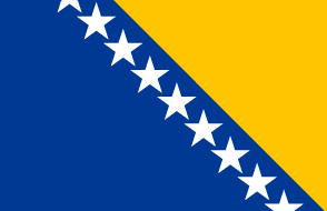
Bosnia and Herzegovina:

Colors: yellow: 255-198-0 blue: 0-57-148
Symbolism: the 3 points of the triangles represent the 3 people groups (the Bosniaks,Croats, and Serbs), the the triangle its self represent the map of the nation which looks like a triangle, the stars represent Europe, the white, blue and yellow represent peace.
Changes: i took the blue rectangle on the right (fly) side because it didn't look correct to me and (as far as i've seen) it didn't have any symbolism so i thought: why have it?
there ya go, the newest installment of "New World Flags" the next 3 will be Brunei, Chad and China. and as always, hope ya like!
Bhutan:
Colors: yellow: 255-242-0 orange: 242-121-0
Symbolism: the yellow represents civil tradition and temporal authority of the king. the orange represents Buddhism.
Changes: all tho cool and powerful, i took out the dragon because as ive said before, its just to complicated and hard to recreate so i just well took it out.
Bolivia:
Colors: red: 213-0-0 yellow: 255-242-0 green: 0-128-0
Symbolism: the red stands for, say it with me!, "the blood of those who fought for their freedom!" the yellow stands for the wealth of resources, and the green represents the richness of the natural areas and also hope.
Changes: i took out the coat of arms because, well, look above at the changes of Bhutan.
Bosnia and Herzegovina:
Colors: yellow: 255-198-0 blue: 0-57-148
Symbolism: the 3 points of the triangles represent the 3 people groups (the Bosniaks,Croats, and Serbs), the the triangle its self represent the map of the nation which looks like a triangle, the stars represent Europe, the white, blue and yellow represent peace.
Changes: i took the blue rectangle on the right (fly) side because it didn't look correct to me and (as far as i've seen) it didn't have any symbolism so i thought: why have it?
there ya go, the newest installment of "New World Flags" the next 3 will be Brunei, Chad and China. and as always, hope ya like!
Last edited:
France:

Colors: White 0-0-0
Symbolism: The color white represents the hilariously banal foreign stereotypes that plague the French military to this very day.
Changes: I removed the blue and red stripes because white is a cool and powerful color, and because blue and red is too complicated to be put on a flag.
I call bullshit! That was a historical flag of France!France:

Colors: White 0-0-0
Symbolism: The color white represents the hilariously banal foreign stereotypes that plague the French military to this very day.
Changes: I removed the blue and red stripes because white is a cool and powerful color, and because blue and red is too complicated to be put on a flag.
I call bullshit! That was a historical flag of France!
Wow, you actually weren't kidding. I knew the white flag had been used by the Bourbons before, but usually it included the fleur-de-lis plastered across the entire field.
The more you know!
Ephraim Ben Raphael
Banned
These three are my favorites- although may I say they're all pretty decent.
Alan Hardy
Banned
Well, news to me, but back in August the PM of Fiji said that they were no longer looking to instigate a change to the current flag. I call that a missed opportunity and that he is square in outlook. Thus I've done him a square of Fiji Blue with a narrow vertical strip of Fiji Beach colour and a vertical strip in the edge of fly in repairing white. Have guts guys and embrace change...


Alan Hardy
Banned
been thinking about my Aussie flag and keep thinking that a ratio 2:3 is just not quite them. 1:2 looks too long so just did one as 4:7. Does any nation have that ratio?
Still I think its even better now. Also reverted the smaller stars to a more direct lift from the wiki' flag and held the same distance to the fly as well.

to answer my own question, looks like only Mexico definitively has a flag with ratio 4:7.
Still I think its even better now. Also reverted the smaller stars to a more direct lift from the wiki' flag and held the same distance to the fly as well.

to answer my own question, looks like only Mexico definitively has a flag with ratio 4:7.
Last edited:
ok?.....first of all that is the flag of surrender and is too slimier, second: there is too much open space that should be filled in, third: stereotypes are not a good thing to put on flags, forth: why put the color white in the colors? everyone knows its always 0-0-0, fifth: the blue and red aren't that complicated and have significant meaning and the white doesn't really, sixth: what the actual f*ck?! seventh: what did i do? i'm guessing that was in response to either Bosnia and Herzegovina or Bhutan and as i said in the changes of the Bhutan changes: "i took out the dragon because as ive said before, its just to complicated and hard to recreate" and in the Bosnia and Herzegovina changes for the rectangle i said "it didn't look correct to me and (as far as I've seen) it didn't have any symbolism so i thought: why have it?" and i though that was a solid reason to take it out and all together the flags look better, no? if you want a re-design, all you need to do is ask, and that goes for everyone, if you don't like the flags i post, tell me what you want me to change and i will to the best of my ability. thank you and see you all tonight when i post later, and as always, hope ya like!France:
Last edited:
Well, news to me, but back in August the PM of Fiji said that they were no longer looking to instigate a change to the current flag. I call that a missed opportunity and that he is square in outlook. Thus I've done him a square of Fiji Blue with a narrow vertical strip of Fiji Beach colour and a vertical strip in the edge of fly in repairing white. Have guts guys and embrace change...
thank you and i will look at those when i get home, for some reason they are not letting me look at them at my school? huh, weird?been thinking about my Aussie flag and keep thinking that a ratio 2:3 is just not quite them. 1:2 looks too long so just did one as 4:7. Does any nation have that ratio?
Still I think its even better now. Also reverted the smaller stars to a more direct lift from the wiki' flag and held the same distance to the fly as well.
to answer my own question, looks like only Mexico definitively has a flag with ratio 4:7.
stuff
Okay, no. The reason the B&H flag looks the way it does is to represent the three constituent ethnic groups present in B&H (Bosniaks, Croats, and Serbs), as well as the shape of the nation itself (a triangle). By removing aspects of a flag, you completely change what that flag represents, something you don't seem to understand.
You cannot just remove the dragon from the Bhutanese flag and have it still remain the flag of Bhutan; the thunder dragon (druk) represents key elements in the national ethos of the country that are sacred to the Bhutanese state. Without the dragon, the flag is literally meaningless aside from the colors of Buddhism (orange) and royalty (yellow).
The reason I responded to you in such a way is that you obviously know absolutely nothing regarding vexillology save for "it looks nice!" and "shapes are hard." Actually study the flags of states and why they exist the way they do before mindlessly modifying them. Notice how most of the board simply makes up an entirely new flag for a country instead of taking the existing flag and simply removing or adding an element (for the most part).
Sorry to be so snarky, but you've already been warned once before for such behavior. It'd be in your best interest to actually stop and think about why people have such reactions to your flags other than "hope ya like!"
France:

Colors: White 0-0-0
Symbolism: The color white represents the hilariously banal foreign stereotypes that plague the French military to this very day.
Changes: I removed the blue and red stripes because white is a cool and powerful color, and because blue and red is too complicated to be put on a flag.

I think people should be a little less harsh to Me!. But, snark aside, the criticism is valid. Vexillology is not only about making simple, clean flags. Many nations and states around the world and history have adopted flags that for some are complicated, and yes, even ugly, but they have a reason to be that way. Some flags even have no symbology at all. Between those extremes there is a world of flags that can be made.
Keep in mind the symbology and you can't go wrong. It's a subjective thing, after all. Of course my flag is, for me, the most beautiful. It represents my country and everything I believe is good about it. But it also has symbology that speaks to the people of that nation. I think that's the key for good flag design.
(That, and knowing how to use inkscape, and that's why I just lurk this thread instead of contributing )
)
Keep in mind the symbology and you can't go wrong. It's a subjective thing, after all. Of course my flag is, for me, the most beautiful. It represents my country and everything I believe is good about it. But it also has symbology that speaks to the people of that nation. I think that's the key for good flag design.
(That, and knowing how to use inkscape, and that's why I just lurk this thread instead of contributing
(That, and knowing how to use inkscape, and that's why I just lurk this thread instead of contributing)
To hell with Inkscape, just don't save the thing as a JPEG and you're grand.
honestly i should just be spectating more than posting(That, and knowing how to use inkscape, and that's why I just lurk this thread instead of contributing)
you do have a very very good point and yes i am guilty and i will look over my flags that i have made for the countries and remove the ones that should stay the same (despite my own opinion) based upon the people who live there, and again if you dont like the flags, please make a suggestion to what i can to to fix them and i will the best that i can (i am limited to ms paint sadly but whatever). btw i will try and make an alternative to the Bhutan flag by maybe simplifying the dragon maybe? but i wont change the B&H flag because the rectangle again, doesn't make sense and (again as far as I've seen) there is no symbolism, also i think you thought i meant take the triangle out? or that is the symbolism of the rectangle? idk but still, thanks for pointing all this to my attention and i hope to do better when i post the next 3 and the rest of the series.Okay, no.
- Status
- Not open for further replies.
Share:


