Thande
Donor
It is one area where one can't argue with this attitude.I love the Scottish Boundary Commission.
It is one area where one can't argue with this attitude.I love the Scottish Boundary Commission.
As the person who made it,indeed.
Nice! It'd be interesting to see elections going farther back, but you'd be hard-pressed to find all the data.
---

2014 is done! For nominees of the same party, I tried horizontal striping (so as not to be confused with eventual ties). Differences I noticed:
- Less unopposed districts
- Democrats actually exist in Arkansas and North Dakota
- Democrats in the Texas panhandle are less anemic
- Can't see any overall swing just from the map, though the overall swing was 4.65% toward the Democrats from 2014 to 2016.

Results of the Virginia gubernatorial election, by county.
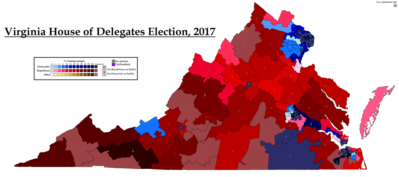
Map of the House of Delegates result in Virginia (at time of writing - I suspect there will be recounts). Small preview below.
Possibly - I was trying to count them up based on what the NYT has called and comparing their uncalled races to those on the AP, but I may have miscounted.Just a note about your writeup, if all races break as they stand currently, dems will tie the chamber at 50-50, not lose 49-51. However, chances are recounts will change the end picture....
Possibly - I was trying to count them up based on what the NYT has called and comparing their uncalled races to those on the AP, but I may have miscounted.
Anyway, here is New Jersey, General Assembly and Senate. @Zaffre can you let me know if I have made any errors in my write-up, in particular I triple-checked district 2's senate result because that doesn't seem to fit the pattern at all.
edit: edited Senate link which went to the wrong year
Sure, it just really sticks out when almost everything else is reasonably consistent between the two estates.It looks right to me - I don't know too much about the 2nd district, but I think Brown positioned himself as pretty Anti-Christie, and Bell is both a) the appointed successor to a long-term incumbent that passed away, and b) a not especially strong candidate that ran into some issues in the primaries.
Spectacular work, Ares. Fluid party identities do make it hard to depict a meaningful election map, as you say, but it's still very interesting. (In those maps I did of the 1630s/40s English elections, it helps that you can retroactively classify almost everyone as a Royalist of Parliamentarian just as a colouring-in exercise, even if that's not strictly the lines they were elected on).
More excellent work. I hadn't realised until recently there was so much information available about the southern legislatures' secession votes.
Yeah, as you say, it was a mix of popular referendums, legislature votes and conventions. IIRC there is an excellent but confusing map from the 19th century which tries to represent all of them at once.This is a convention, not the legislature, but yes. ISTR I've previously mapped the Texas secession vote, which was an actual referendum.

Nice work. What does the striping on those Louisianab parishes mean?
2012 is done! Differences from 2014:
- More Democratic areas; especially in Maine and Iowa
- Less anemic Minnesota Democrats
- Alabama is less noticeably uncontested
- An uncontested Kansas district sticks out like NE-03 in 2016
- Dark red converges into northeastern Texas
- Also, the first county boundary change; an independent city in VA that was disestablished between 2012 and 2014
Thanks! The grey stripes are for districts where multiple members of the same party won parishes. It's there in Washington in 2014 and Louisiana (though fully grey) in 2016.Nice work. What does the striping on those Louisianab parishes mean?