I have no idea how he finds them, but he doesThe Philippines is the vexillological "gift" that just keeps on giving
Thanks for bringing these to our attention @Gillan1220 , I am glad that you are doing so
I have no idea how he finds them, but he doesThe Philippines is the vexillological "gift" that just keeps on giving
I just search on Wikipedia, Google, and the Philippine Vexollogical Association group on Facebook. That group shares posts from local government units (LGU) especially for flags that are rarely seen in public. Keep in mind most municipality flags in the Philippines can be found on LGU social media accounts, usually carried by military reserve or police personnel during fiestas or flag-raising ceremonies.I have no idea how he finds them, but he does
Thanks for bringing these to our attention @Gillan1220 , I am glad that you are doing so
It doesn't look that terrible to me for an organization's flag. Though I might just be more impressed by the effort they put into it rather than the actual design.What do you guys think of this?
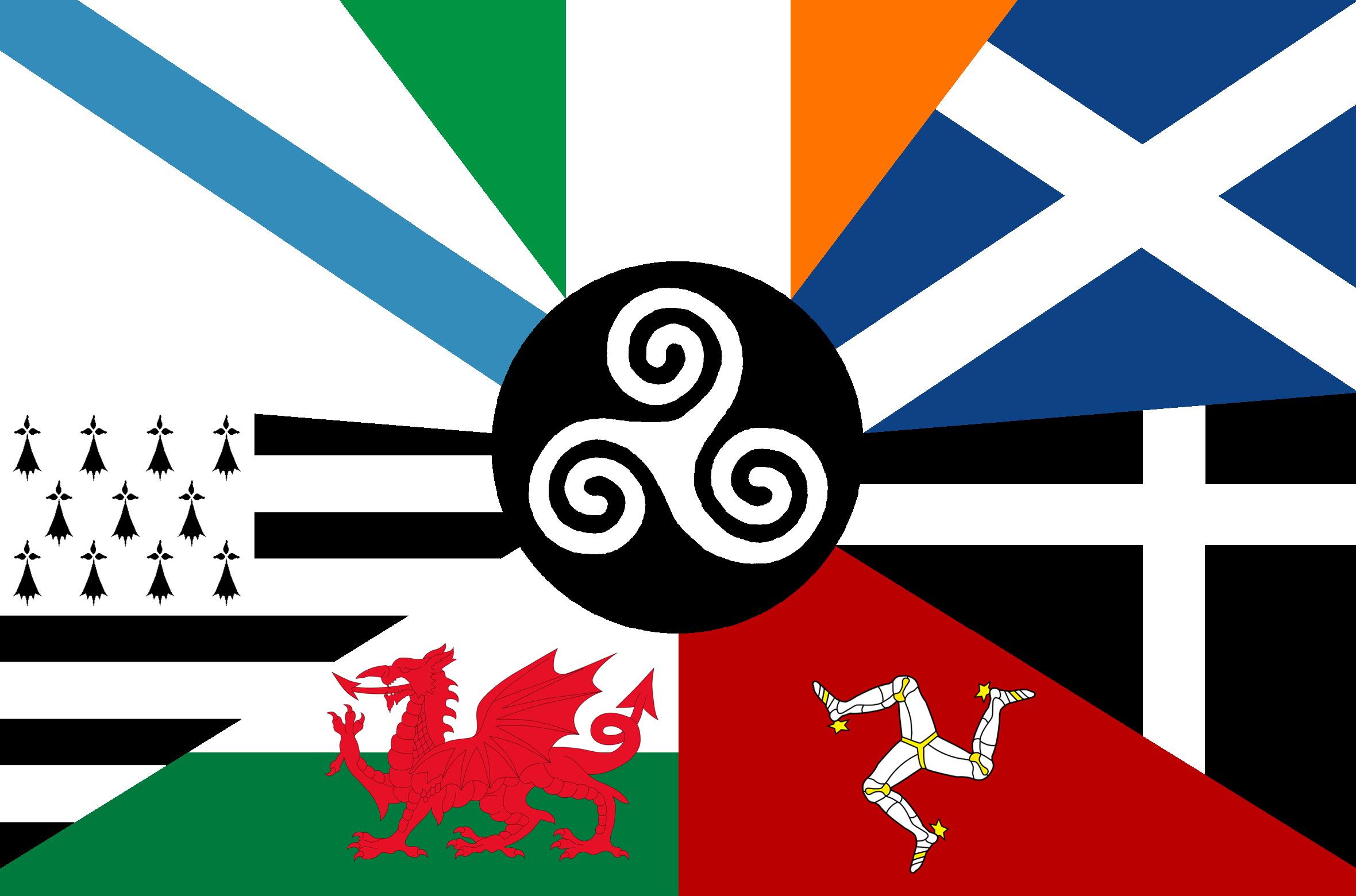
Combined flags of Celtic nations.
You can get your copy from Amazon:
Others would say it's terrible, I would personally say its aesthetically busy.This flag isn't terrible at all. I see it all over Dublin and it looks fantastic in the breeze.
I also don't find it very creative.Others would say it's terrible, I would personally say its aesthetically busy.
It's comparable to the flag of the municipality of Buenavista in Bohol, Philippines.
It makes the flag cluttered and busy.I also don't find it very creative.
It's just all seven member's flags quartered together. At least the English language flag combined the two in an interesting way.
Is the least worst1965-1986 is like Kiribati's long-lost brother.
Sad how London's flag became worse overtime.Is the least worst
Welcoming everyone to mediocre graphic design.1965-1986 is like Kiribati's long-lost brother.
2001-2020 looks like the USAID logo.
2020-present looks like a T-shirt design.
It reminds me of this T-shirt our school had for a pro-enviromental humanitarian stage act back in 2010.Welcoming everyone to mediocre graphic design.
1965-1986 is like Kiribati's long-lost brother.
2001-2020 looks like the USAID logo.
2020-present looks like a T-shirt design.
I think I like the 1986-2001 flag design the best1965-1986 is like Kiribati's long-lost brother.
2001-2020 looks like the USAID logo.
2020-present looks like a T-shirt design.
Are you sure this is the real flag, and not a drawing of it?1965-1986 is like Kiribati's long-lost brother.
2001-2020 looks like the USAID logo.
2020-present looks like a T-shirt design.