You are using an out of date browser. It may not display this or other websites correctly.
You should upgrade or use an alternative browser.
You should upgrade or use an alternative browser.
Return of the terrible flag thread.
- Thread starter Alternativity
- Start date
This looks like Some entrance to a very deep Online rabbit hole
Flag of Marogong, Lanao Del Sur, Philippines.
More info on this post, quoting Italian vexillologist Mr. Paolo Paddeu. Mr. Paddeu has been living in the Philippines for a long time and has been running the Philippine Vexillogical Group on Facebook.
Another one that looks like a welcome sign. It has been a very common thing here that our city and municipal flags look bad because local government units advertise it as a poster or banner-making contest.FLAG AND SEAL OF MAROGONG, LANAO DEL SUR
This flag ( actually adopted ? ) that we can define as a "banner of arms" is a classic example of how a flag should not be made, letters , colors and images that way make it look more like an advertising banner..
( a "Banner of Arms" is a flag of any kind, in vexillology and in heraldry consists of a square or rectangular flag whose design is identical to the shield of a Coat -of- Arms).
Source of the images : Wikipedia
EDIT: In the wild -
Last edited:
I don't think that flag's terrible.
Apart from using words and having two animals superimposed on two colors, it would have been a great flag.I don't think that flag's terrible.
Not a bad one actually, even though it is busy.
Please tell me this is a joke...
The world’s only flag that doubles as a postcard!
Nueva Montana, Buenavista, Bohol; Chapmanville, West Virginia; and Milwaukee, Wisconsin would want a word with you.Please tell me this is a joke...
Last edited:
This is now the new worst... 😢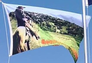
Nope, here it is in action.
If this flag could cause me physically pain it would.
Some fraternity flags in the Philippines:

 filipinojournal.com
City of Winnipeg Flag Raising Ceremony Kicks Off Philippine Heritage Week - Filipino Journal
Filipinos in Winnipeg celebrated their history, culture and liberty during two flag raising ceremonies – one at City Hall and the other at the Philippine-Canadian Centre of Manitoba. The City of Winnipeg commemorated the start of Philippine Heritage Week during a flag raising ceremony at...
filipinojournal.com
Told you it was alive and doing rather wellJeez guys I thought this thread was dead thank you for keeping it alive
")
So long as people around the world keep designing bad flags, we'll keep finding 'em... and posting 'em... and offering our, um, constructive criticism
The mountains would still look odd to me but ya.
Remove the words and it actually looks good.
Pocatello, Idaho's old flag was ranked one of the worst in America

The best part is the copyright on the bottom
The best part is the copyright on the bottom
Share: