You are using an out of date browser. It may not display this or other websites correctly.
You should upgrade or use an alternative browser.
You should upgrade or use an alternative browser.
Map Thread XVIII
- Thread starter FesteringSpore
- Start date
-
- Tags
- map thread maps
- Status
- Not open for further replies.


Shoulda had a throwback and added a Caesar.I prefer Czar myself. Still, it has led to some lovely things on here. There was one galactic map a few years back that had a Tsar, Czar, Tzar, and Csar.
...well that's super. Also, nice Poles. But really, Car?!
In Turkey/Turkish we use Çar.
Louyan
Banned
I promise I'm working on proper maps, I'm finishing a write up for a Sixteen Greeces, that'll be here soon.
 Followed!
Copied from my thread:
To understand the Haxamanid Empire, one must start at the beginning. In 2422 AF, forces of the Neo-Sutarban Empire invading western Katal and the lands beyond had claimed authority over the former lands of the Neathuq and all the new tribes current living there. One such tribe was the Ecbadai, who in that same year became vassals to the Sutarbans. This remained so until 2509 AF when the Ecbadai revolted against Sutarba while they were crushing another rebellion in Kadimar. In less that a decade, however, they were defeated and controlled by the Sutarbans once more. Ecbadaia remained under foreign rule throughout the 2500s and most of the 2600s, switching rulers from Sutarbans to Esirtans when the Neo-Sutarban Empire collapsed during the years 2567-2607 AF.
Independence would finally come in 2670 AF when the King of the Ecbadai (a vassal to the Esirtan Emperor), a man named Haxamanes, rebels against the Esirtan when they are suffering instability and succeeds, driving them from the nation. Haxamanes ambitions don't stop there, however, and he proceeds to conquer the collapsing Esirtans by the beginning of 2671 AF. They inherited a large empire from the Esirtans, stretching from the Sea of Katal in the southeast to the Araini Kingdom in the far northwest. They also adopted the issues facing the former Esirtan Empire, as Lotanian rebels plagued the northern regions of the empire untin 2676 AF, when Haxamanes crushed the rebels with his new army. When Ahluq, in the west of the Sea of Aqta, was conquered in 2680 AF, Haxamanes turned his attention to the great empire in the east, the Kadimarans.
In 2685 AF,after 5 years of planning and preparation, Haxamanes and his newly built army and fleet cross the Sea of Katal and land in Urubar, declaring war on the Neo-Kadimaran Empire. Haxamanes' foresight pays off as the Kadimarans are completely unprepared and are crushed within a year just like the Esirtans before them. In 15 years time, Haxamanes has conquered two empires and created a much larger, more powerful in doing so. He makes the language of the Ecbadai, Ahuran, the official language of the Empire but allows religious freedom, even allowing the Uhaakin people to return to their homeland after their defeat by the Sutarbans in previous centuries. He would not get to rule his new empire long though; for Haxamanes would perish in battle in 2691 AF fighting Umalan tribes in southern Miscaya. Rule of the empire eventually fell to his own wife, Empress Cassia.
Empress Cassia would go on to oversee the conquest of Tymria and the suppression of more rebels in Kadimar before her own death in 2701 AF. After a bout of instability with several claimants to the throne, Emperor Jahan comes to power, and under his rule the Haxamanid Empire would reach it's largest extent yet, conquering southern Haemos in 2705 AF and invading Avarda and Pelasia in 2708 AF. Also in 2705 AF, Jahan would see the new capital city of Ahurasa (Ahuropolis) built in Ecbadaia, a symbol of their dynasty's great power. In 2718 AF, Pelasian in Lotania revolt against their Haxamanid rulers, pleading for assistance from neighboring independent Pelasian city-states. With tensions escalating between the Pelasians and Ahurans, Emperor Jahan and the Haxamanids may face their toughest challenge yet.

The Haxamanid Empire in 2720 AF
To understand the Haxamanid Empire, one must start at the beginning. In 2422 AF, forces of the Neo-Sutarban Empire invading western Katal and the lands beyond had claimed authority over the former lands of the Neathuq and all the new tribes current living there. One such tribe was the Ecbadai, who in that same year became vassals to the Sutarbans. This remained so until 2509 AF when the Ecbadai revolted against Sutarba while they were crushing another rebellion in Kadimar. In less that a decade, however, they were defeated and controlled by the Sutarbans once more. Ecbadaia remained under foreign rule throughout the 2500s and most of the 2600s, switching rulers from Sutarbans to Esirtans when the Neo-Sutarban Empire collapsed during the years 2567-2607 AF.
Independence would finally come in 2670 AF when the King of the Ecbadai (a vassal to the Esirtan Emperor), a man named Haxamanes, rebels against the Esirtan when they are suffering instability and succeeds, driving them from the nation. Haxamanes ambitions don't stop there, however, and he proceeds to conquer the collapsing Esirtans by the beginning of 2671 AF. They inherited a large empire from the Esirtans, stretching from the Sea of Katal in the southeast to the Araini Kingdom in the far northwest. They also adopted the issues facing the former Esirtan Empire, as Lotanian rebels plagued the northern regions of the empire untin 2676 AF, when Haxamanes crushed the rebels with his new army. When Ahluq, in the west of the Sea of Aqta, was conquered in 2680 AF, Haxamanes turned his attention to the great empire in the east, the Kadimarans.
In 2685 AF,after 5 years of planning and preparation, Haxamanes and his newly built army and fleet cross the Sea of Katal and land in Urubar, declaring war on the Neo-Kadimaran Empire. Haxamanes' foresight pays off as the Kadimarans are completely unprepared and are crushed within a year just like the Esirtans before them. In 15 years time, Haxamanes has conquered two empires and created a much larger, more powerful in doing so. He makes the language of the Ecbadai, Ahuran, the official language of the Empire but allows religious freedom, even allowing the Uhaakin people to return to their homeland after their defeat by the Sutarbans in previous centuries. He would not get to rule his new empire long though; for Haxamanes would perish in battle in 2691 AF fighting Umalan tribes in southern Miscaya. Rule of the empire eventually fell to his own wife, Empress Cassia.
Empress Cassia would go on to oversee the conquest of Tymria and the suppression of more rebels in Kadimar before her own death in 2701 AF. After a bout of instability with several claimants to the throne, Emperor Jahan comes to power, and under his rule the Haxamanid Empire would reach it's largest extent yet, conquering southern Haemos in 2705 AF and invading Avarda and Pelasia in 2708 AF. Also in 2705 AF, Jahan would see the new capital city of Ahurasa (Ahuropolis) built in Ecbadaia, a symbol of their dynasty's great power. In 2718 AF, Pelasian in Lotania revolt against their Haxamanid rulers, pleading for assistance from neighboring independent Pelasian city-states. With tensions escalating between the Pelasians and Ahurans, Emperor Jahan and the Haxamanids may face their toughest challenge yet.
The Haxamanid Empire in 2720 AF
Last edited:

They were all Russian States off one sort or another, so they wen with their own spelling. Just imagine if we had that fun on our world. Think of the spellchecks.Shoulda had a throwback and added a Caesar.
Last edited:
Isaac Beach
Banned
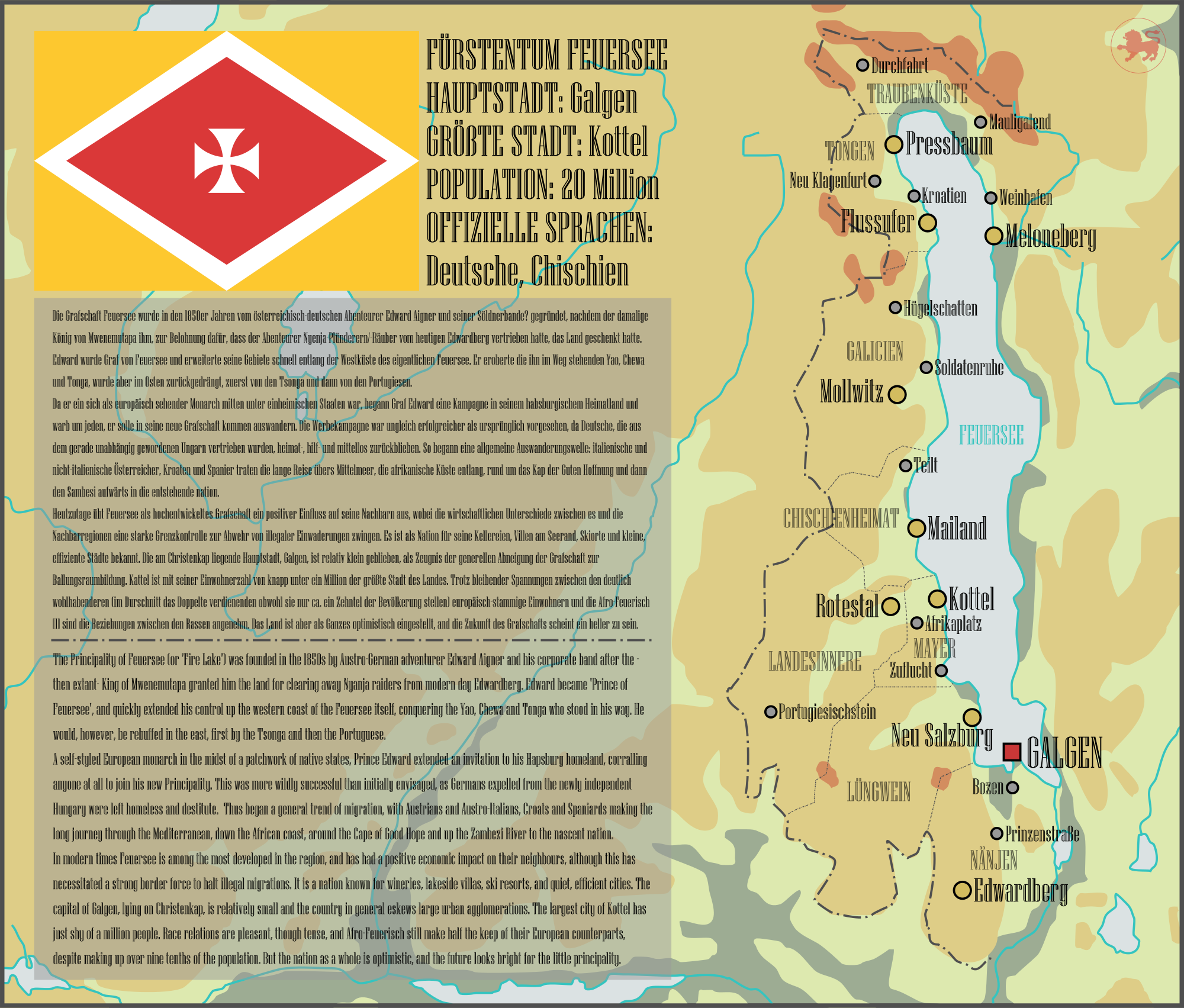
A map detailing the Principality of Feuersee, a Euro-African kingdom founded by an Austrian adventurer, or 'pulling a Sarawak' as I like to call it. 'Tis a part of my Shanti Shanti Shanti project (which is actually more comprehensive then you'd first think, I just haven't posted it).
This map was initially made as a challenge by my partner to see how quickly I could make a map; it took about thirty minutes. The text and lore took significantly longer, of course. To that effect, special thanks to @KanonenKartoffel and @SaveAtlacamani, who did most of the translating and advised me to the German that was mine. Couldn't have done it without you.
This map was initially made as a challenge by my partner to see how quickly I could make a map; it took about thirty minutes. The text and lore took significantly longer, of course. To that effect, special thanks to @KanonenKartoffel and @SaveAtlacamani, who did most of the translating and advised me to the German that was mine. Couldn't have done it without you.
This post has been liked over 45 times, and none of my other posts which have more effort put into them get as much. SMHнет, comrade.

Last edited:
A map detailing the Principality of Feuersee, a Euro-African kingdom founded by an Austrian adventurer, or 'pulling a Sarawak' as I like to call it. 'Tis a part of my Shanti Shanti Shanti project (which is actually more comprehensive then you'd first think, I just haven't posted it).
This map was initially made as a challenge by my partner to see how quickly I could make a map; it took about thirty minutes. The text and lore took significantly longer, of course. To that effect, special thanks to @KanonenKartoffel and @SaveAtlacamani, who did most of the translating and advised me to the German that was mine. Couldn't have done it without you.
Very cool. Is this real life Malawi or somewhere else?

People do love a good shitpost map.This post has been liked over 45 times, and none of my other posts which have more effort put into them don't get as much. SMH
Maybe a different shade - have it be paler or something?
Yeah, take a page out of the way population density maps approach it.
If you had a nice relief map, you could consider using stripes to denote areas, or an outline to show a sphere of influence of genuinely populated areas, but with a standard terra nullius green terrain color (or stuff like that), that'd look too boring.
I've tried something inspired by these, but a little different: a sort of broken glass effect, with the main nation body being surrounded by lots of little pieces of color on a grey background, getting smaller the further away you get. Here's a piece at normal resolution from my paint.net - is it a good look, or should I try something else?Typical practice in most worlda schemes is to have disaster areas in very dark gray, almost black, with a neon green outline. You could put a lighter shade of gray inside the outline, which would allow you to avoid using stripes (which I find annoying to do)

I'm hoping it gives a "broken" feeling that looks better than just having parts of the map being swathes of one color.
TheScottishMongol
Banned
I've tried something inspired by these, but a little different: a sort of broken glass effect, with the main nation body being surrounded by lots of little pieces of color on a grey background, getting smaller the further away you get. Here's a piece at normal resolution from my paint.net - is it a good look, or should I try something else?
I'm hoping it gives a "broken" feeling that looks better than just having parts of the map being swathes of one color.
Really I think the idea of a nation "settling" land is overrated (I've discussed this philosophy before) and that if territory falls within a nation's claimed borders and they can reasonably extert their authority over it, it should just be colored with their color. After all, vast swathes of the American West are "unsettled", but we never depict the US with empty spaces in it.
It's not meant to be a contiguous thing, but that those regions are somewhat organized and have some level of local organization. Think your average town in Fallout and the general environment, but swap nuclear war for a terrible pandemic. General order has collapsed and practically the entirety of civilization with it, and whilst there are some regions that are fairly well organized, the vast majority are broken places that might profess their loyalty on paper, but are more or less independent, and a vast amount of territory has been so totally depopulated that you can go miles without seeing anyone.Really I think the idea of a nation "settling" land is overrated (I've discussed this philosophy before) and that if territory falls within a nation's claimed borders and they can reasonably extert their authority over it, it should just be colored with their color. After all, vast swathes of the American West are "unsettled", but we never depict the US with empty spaces in it.
That's the kind of thing I'm trying to convey, which is easier said than done
I think the best way would be to denote the territory organized under administrative units (counties etc) territory using a border. The territory actually controlled, is denoted by the internal color, and claimed lands using claim lines.I've tried something inspired by these, but a little different: a sort of broken glass effect, with the main nation body being surrounded by lots of little pieces of color on a grey background, getting smaller the further away you get. Here's a piece at normal resolution from my paint.net - is it a good look, or should I try something else?
I'm hoping it gives a "broken" feeling that looks better than just having parts of the map being swathes of one color.
Eg:
It allows you to visualize administrative units (states), while also giving you an idea of the theoretical extent (territory under day to day administration) and that which is effectively controlled by the government.
Here is my take on the matter for an upcoming map. In red here is the Sultanate of Morroco, and in blue is Senegal. These two nations are competing for control of the Sahara, which I think would function much the same as the underpopulated regions you're hoping to depict.I've tried something inspired by these, but a little different: a sort of broken glass effect, with the main nation body being surrounded by lots of little pieces of color on a grey background, getting smaller the further away you get. Here's a piece at normal resolution from my paint.net - is it a good look, or should I try something else?
I'm hoping it gives a "broken" feeling that looks better than just having parts of the map being swathes of one color.
Both Morroco and Senegal are hoping to exert influence over unpopulated regions, and have laid claim over vast tracts of the Sahara. However, only a small part of the border by the Atlantic can be clearly demarcated, and as such is the only part of the border coloured in black. Both nations have established colonies in the Sahara, but these are isolated settlements that have the "broken" feeling you mention. Many of the lands Senegal and Morroco claim to hold are also in fact under the jurisidiction of local tribal leaders. As such, the defacto situation is shown here, with many neutral tribes coloured in neither blue nor red.
I'm planning on a very large Isaac's Empire style thread. I might just focus on TTL's belle epoque era and then following decades.I love this concept of "Romans=Ottomans", wish there were a follow-up to this. Either way, great job!
- Status
- Not open for further replies.
Share: