Here's a future flag for a group of space dwelling Ukrainian decedents officially called Natsiya but more commonly known as the Cosmossacks. Made for the Orion's Arm Universe Project.

You are using an out of date browser. It may not display this or other websites correctly.
You should upgrade or use an alternative browser.
You should upgrade or use an alternative browser.
Flag Thread V
And one more, this time for a group called the Perseus Pirates. Also for Orion's Arm.

Here is the Union of Socialist Heavenly Kingdoms flag (also known as the Communist Jesus flag). Everyone, say hello to the USHK!
(More seriously, I'm thinking where I should use this. It started as a meme conversation about people defending that Jesus was a communist and now I'm thinking of using it as a variant of Christianity from the TERverse
Been knocking about with designs for a flag for a space opera solarpunkish movement-turned-interstellar-nation and I find myself somewhat overwhelmed with choices. So here's all of them in one big design document! 

I swear, there oughta be a law about getting turned around in graphic design...

I swear, there oughta be a law about getting turned around in graphic design...
I think most of these combos would turn out like Space Brazil, unless that's what you're going for.Been knocking about with designs for a flag for a space opera solarpunkish movement-turned-interstellar-nation and I find myself somewhat overwhelmed with choices. So here's all of them in one big design document!

I swear, there oughta be a law about getting turned around in graphic design...
Not deliberately, anyway. Green and gold seem to be dominant solarpunk colors (or at least that's what The Internet tells me) so that's what I went for with a base. Any resemblance to any existing country is largely coincidental because there's only so many colors in the world and most of the good ones are already taken.I think most of these combos would turn out like Space Brazil, unless that's what you're going for.
I'd do green/gold/black/white as the color palette to really sell the solarpunk-space connection.Not deliberately, anyway. Green and gold seem to be dominant solarpunk colors (or at least that's what The Internet tells me) so that's what I went for with a base. Any resemblance to any existing country is largely coincidental because there's only so many colors in the world and most of the good ones are already taken.
Basic template: I recommend basic green and gold stripes, or just a green field. If you want to focus on green and gold and avoid the Brazilian look, your best bet would be to eliminate all the templates with blue.Not deliberately, anyway. Green and gold seem to be dominant solarpunk colors (or at least that's what The Internet tells me) so that's what I went for with a base. Any resemblance to any existing country is largely coincidental because there's only so many colors in the world and most of the good ones are already taken.
Sigil: I recommend the D4 sigil. It contains the sun (for the solarpunk theme), Earth (for the space theme), it contains few small details (which become indistinct at small sizes) and it doesn't remind me of any particular local thing on Earth. The other sigils tend to have those issues: They don't communicate the solarpunk/space theme intuitively (e.g. E1 doesn't remind me of the sun), the details are too small and fiddly (e.g. the outline of the rocketship in C2 is barely visible), or they remind me too much of specific local Earth things (e.g. B1 is Wales, F1 is Pitchfork magazine, A3 is Yorkshire, etc.).
Musical notes: I recommend going with a sole sigil instead. I'm not sure what the musical notes represent, but anyway, a single sigil is better because it would be simpler and more iconic.
Overall suggestion: If it were up to me, I would just use a green field with a golden D4 sigil in the centre.
Edit: This suggestion also makes for a simple roundel - a green disc with a golden D4 sigil in the centre.
Last edited:
The notes stem from a suggestion elsewhere: I was bemoaning how space nations tend to be Federation This or Republic of That and how it was all kinda samey, and somebody suggested going with a musical theme with "Orchestra." I kinda like it, and so a musical motif was born.If you want green and gold but without the Brazilian look, your base templates would be 1, 2, 3, 7, 8, 10, 13, 16, 18.
I think D4 is the best sigil. It contains the sun (for the solarpunk theme), Earth (for the space theme), it contains few small details (which become indistinct at small sizes) and it doesn't remind me of any particular place on Earth. The other sigils tend to have those issues: They don't communicate the solarpunk/space theme intuitively (e.g. E1 doesn't remind me of the sun), the details are too small and fiddly (e.g. the outline of the rocketship in C2 is barely visible), or they look like specific Earth things (e.g. B1 is Wales, F1 is Pitchfork magazine, A3 is Yorkshire, etc.).
I'm not sure what the musical notes are for. I think a single sigil is better because it would be simpler and more iconic.
If it were up to me, I would just go with a green field and put sigil D4 in gold in the centre.
A6 is probably my favorite of the sigils (though it clearly needs some workshopping - it's supposed to be a sun and cogwheel design) though D4 did come out looking nice.
As for the flag... a sigil on a blank field is really common in science-fiction flags, which is kind of why I'm shying away from it. It feels lazy in a way that even simple bicolors and tricolors like 1-6 don't when contrasted against other scifi flag designs, y'know? But anyway, thanks for the feedback! It's helpful to get an outside opinion!
Oh, I love the orchestra idea!The notes stem from a suggestion elsewhere: I was bemoaning how space nations tend to be Federation This or Republic of That and how it was all kinda samey, and somebody suggested going with a musical theme with "Orchestra." I kinda like it, and so a musical motif was born.It's also a bit of a goofy callback to this bit in LoZ: Breath of the Wild because it's my story and I can do what I want tyvm.
A6 is probably my favorite of the sigils (though it clearly needs some workshopping - it's supposed to be a sun and cogwheel design) though D4 did come out looking nice.
As for the flag... a sigil on a blank field is really common in science-fiction flags, which is kind of why I'm shying away from it. It feels lazy in a way that even simple bicolors and tricolors like 1-6 don't when contrasted against other scifi flag designs, y'know? But anyway, thanks for the feedback! It's helpful to get an outside opinion!
A6 is graphically quite great too, though I still prefer D4 for the clear space theme. A6's cogwheel makes me think of 19th century industrialism rather than solarpunk.
I think template 13 is a good choice if you want to include the musical notes, put the focus on a single sigil in the centre, and still be more unique than a plain sigil on a blank field.
You can merge the two symbols by adding the cogwheel part to the D4 sigilA6 is probably my favorite of the sigils (though it clearly needs some workshopping - it's supposed to be a sun and cogwheel design) though D4 did come out looking nice.
One more day on the poll gang!The new flag challenge poll is up!
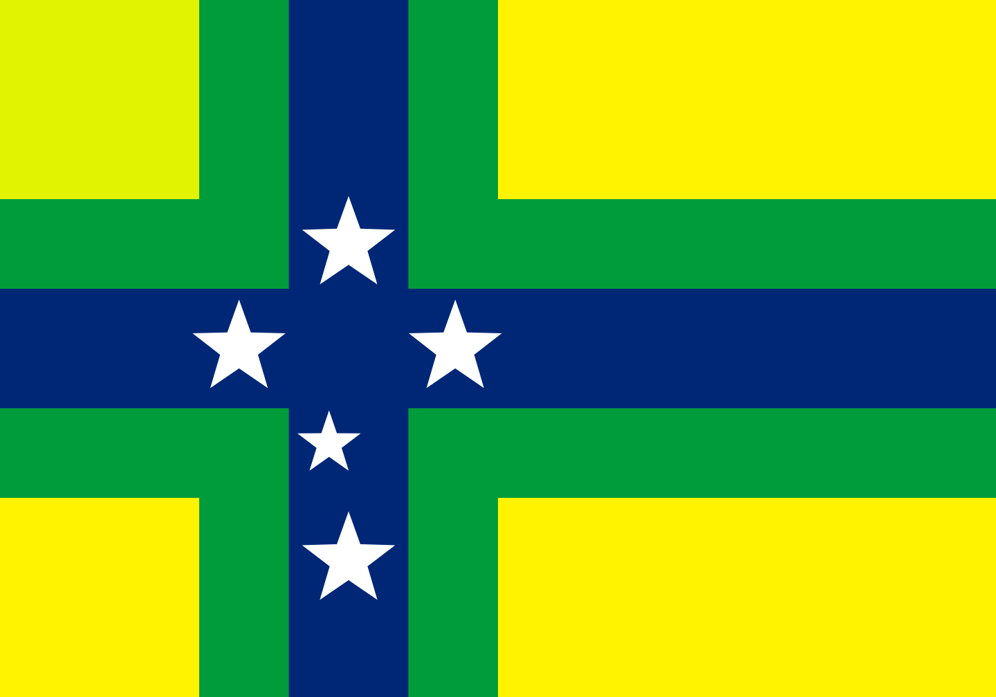
In the theme of Nordic-Cross Flags, though I will admit this is somewhat random, I made a Nordic-Cross Flag for Brazil, if there was some sort of failed colony there like the Swedish Gold Coast or any of the random Danish colonies. It features the Southern Cross.
I think it would be quite funny if a bit random if an Alternate history would be written where Denmark-Norway attempts to get a Brazillian colony in much the same way as the Dutch, attempting to achieve the colonial glory of Portugal. Of course, in all likelihood, they would fail, lose a sizeable amount of money, and probably be in the same situation as Scotland after the Darien Scheme. Anyways, here's a flag of-- Sølvkysten, the Silver Coast Colony, situated along the southern coast of Brazil (think Rio Grande do Sul.)

I think it would be quite funny if a bit random if an Alternate history would be written where Denmark-Norway attempts to get a Brazillian colony in much the same way as the Dutch, attempting to achieve the colonial glory of Portugal. Of course, in all likelihood, they would fail, lose a sizeable amount of money, and probably be in the same situation as Scotland after the Darien Scheme. Anyways, here's a flag of-- Sølvkysten, the Silver Coast Colony, situated along the southern coast of Brazil (think Rio Grande do Sul.)
Last edited:
From a timeline I'm working on

Flag of the Christian Fatherland Party (CVP)
Basically a right-wing militia analogous to OTL brownshirts which helps to maintain order in Germany after the First Great War.
The black/white lozenge flag is meant to symbolise soldiers marching in formation, while the wheel is a dual symbol - a wheel represents industrious Germany, and the spokes spell I-X, the monogram for IESVS XRYSTOS (JESUS CHRIST).

Flag of the Fourth French Republic
A Paris Commune (1870) -esque situation occurs in France near the end of the First Great War, this time successfully defeating the government and beginning the Fourth Republic. The state ideology can be described as Electoral Vanguard Socialism, which holds that socialism must achieved by a vanguard party which stays democratic amongst itself. Therefore, the state is a one-party dictatorship, but anyone in the party can vote. As membership grew to the wider population, the Fourth Republic essentially became an ordinary Social Democracy.
The torch is representative of the flame of socialism and liberty, while the two tongues represent competition within the party. The idea is that better strategies burn brighter.

Flag of the Christian Fatherland Party (CVP)
Basically a right-wing militia analogous to OTL brownshirts which helps to maintain order in Germany after the First Great War.
The black/white lozenge flag is meant to symbolise soldiers marching in formation, while the wheel is a dual symbol - a wheel represents industrious Germany, and the spokes spell I-X, the monogram for IESVS XRYSTOS (JESUS CHRIST).

Flag of the Fourth French Republic
A Paris Commune (1870) -esque situation occurs in France near the end of the First Great War, this time successfully defeating the government and beginning the Fourth Republic. The state ideology can be described as Electoral Vanguard Socialism, which holds that socialism must achieved by a vanguard party which stays democratic amongst itself. Therefore, the state is a one-party dictatorship, but anyone in the party can vote. As membership grew to the wider population, the Fourth Republic essentially became an ordinary Social Democracy.
The torch is representative of the flame of socialism and liberty, while the two tongues represent competition within the party. The idea is that better strategies burn brighter.
Last edited:
From a timeline I'm working on

Flag of the Christian Fatherland Party (CVP)
Basically a right-wing militia analogous to OTL brownshirts which helps to maintain order in Germany after the First Great War.
The black/white lozenge flag is meant to symbolise soldiers marching in formation, while the wheel is a dual symbol - a wheel represents industrious Germany, and the spokes spell I-X, the monogram for IESVS XRYSTOS (JESUS CHRIST).
I like the concept, but the white six-spoked wheel on a red field already means the Electorate of Mainz. So using a design like that looks like it's Mainz trying to stake a claim to a colonial territory, or like it's a flag for some other kind of corporation or territory controlled by Mainz.
If this were a left-wing group, far enough left to want to deliberately disavow hundreds of years of meaning invested in traditional symbols, then it might be less jarring. But the Germans have spent centuries romanicising the Middle Ages, I don't feel that any right-wing German group of that era, especially one that espouses Christianity in their name, would not be aware of this connection. Being aware of it, I personally don't feel that such a group would try to force a novel meaning onto the Mainz coat of arms.
Mainz did cross my mind, but I thought they'd be sufficiently different to avoid conflating the two. But it makes sense the way you explained it, so I'll change it to a simple IX monagram.I like the concept, but the white six-spoked wheel on a red field already means the Electorate of Mainz. So using a design like that looks like it's Mainz trying to stake a claim to a colonial territory, or like it's a flag for some other kind of corporation or territory controlled by Mainz.
If this were a left-wing group, far enough left to want to deliberately disavow hundreds of years of meaning invested in traditional symbols, then it might be less jarring. But the Germans have spent centuries romanicising the Middle Ages, I don't feel that any right-wing German group of that era, especially one that espouses Christianity in their name, would not be aware of this connection. Being aware of it, I personally don't feel that such a group would try to force a novel meaning onto the Mainz coat of arms.
I like the concept, but the white six-spoked wheel on a red field already means the Electorate of Mainz. So using a design like that looks like it's Mainz trying to stake a claim to a colonial territory, or like it's a flag for some other kind of corporation or territory controlled by Mainz.
If this were a left-wing group, far enough left to want to deliberately disavow hundreds of years of meaning invested in traditional symbols, then it might be less jarring. But the Germans have spent centuries romanicising the Middle Ages, I don't feel that any right-wing German group of that era, especially one that espouses Christianity in their name, would not be aware of this connection. Being aware of it, I personally don't feel that such a group would try to force a novel meaning onto the Mainz coat of arms.
I think that is a good point, Cydonius. It does look like Mainz. However, I don't think it would hurt to serve the right-wing cause by referring to old symbols of Germany, especially since this happened in real history. The Nazi emblem itself is a cross, the ancient Christian symbol, with it's four limbs broken and twisted. Giving old symbols new meaning certainly isn't new to the Germans.
Edit: the swastika is not a cross...got that wrong. See page 73.
Also, I went down a rabbit-hole reading about this symbol. The wheel of Mainz itself, while it does stand for Mainz, stands for the progress and movement of God's chariot. It is also disseminated over a good part of Central Germany, not just the former Electorate of Mainz--there are maps and information of this on this link: https://en.wikipedia.org/wiki/Wheel_of_Mainz.
This symbol is also used in the coats of arms of almost 100 towns and cities across central Germany. In conclusion, you could definitely use it! It refers to more than just Mainz and definitely fits with your Christian theme. (To be specific, the symbol is used in Lower Saxony, Thuringia, Baden-Wurttemburg, Bavaria, Hesse, and the Rhineland Palatinate.)
Nevertheless, If that's something you want to avoid, PolishMagnet, then I have a few suggestions. The flags are awesome, and I especially like the first one, it reminds me a lot of Bavaria, but with a different pattern. Great colors by the way! I have a suggestion: perhaps you could try removing the wheel while still keeping the I-X monogram. Or, if that doesn't work, to avoid confusion with Mainz, you could space out the wheel a little farther from the "spokes" (the I-X). However, absolutely feel free to keep it! It seems like you have a good amount of symbolism behind it.
Last edited:
FireCrispyHistory
Banned
The Nazi Emblem was just the swastika, a Buddhist Symbol, rotated 45 degrees to turn into the nazi emblem. The Symbol of Peace turned into the Symbol of War. It has nothing to do with Christianity/Judaism.View attachment 738273
However, I don't think it would hurt to serve the right-wing cause by referring to old symbols of Germany, especially since this happened in real history. The Nazi emblem itself is a cross, the ancient Christian symbol, with it's four limbs broken and twisted.
FireCrispyHistory
Banned
Flag for the Allied States of America. Don't know the place? Check out the thread "The Great War of 2050 and Beyond" in Future History, or in my signature.
Share: