You are using an out of date browser. It may not display this or other websites correctly.
You should upgrade or use an alternative browser.
You should upgrade or use an alternative browser.
Weekly Flag Challenge: Discussion & Entries
- Thread starter Transparent Blue
- Start date

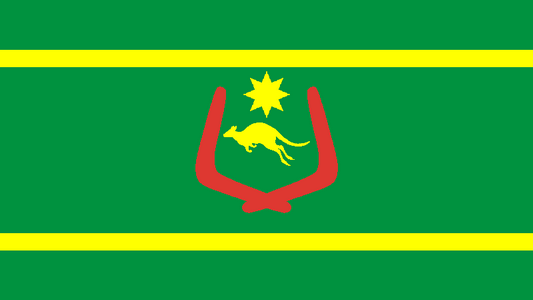
what is that white box on kangaroos tail
I would guess a watermark from the site where the clipart was taken.
Just the impression made by the Roo's Tucker Bag in which he'd been carrying some bits of Jumbuck, mate. Fades out after a while, as you can now see.what is that white box on kangaroos tail
")


Not too bad???? It's bloody brilliant!I usually hate maps on flags but that's not too bad
Not too bad???? It's bloody brilliant!
I'm (British) English. We're masters of understatement
Not too bad???? It's bloody brilliant!
meh, it seem only step removed from having the actual name of the country written on it.
I can't see anything 'wrong' with having the country 'name' written on a flag (cf. California Republic). In fact with independent nations I don't feel there is a right or wrong with a flag. Aesthetically displeasing, politically unpleasant, religiously offensive and so forth (all of course in the eye of the beholder), but all down to the relevant nation - and IMHO that applies to OTL and ATL nations and their flags.meh, it seem only step removed from having the actual name of the country written on it.
I can't see anything 'wrong' with having the country 'name' written on a flag (cf. California Republic). In fact with independent nations I don't feel there is a right or wrong with a flag. Aesthetically displeasing, politically unpleasant, religiously offensive and so forth (all of course in the eye of the beholder), but all down to the relevant nation - and IMHO that applies to OTL and ATL nations and their flags.
The problem with having the country's name (or map) on a flag is that it seem to imply "we're so obscure, that's the only way you'll know what this flag represent" which is exactly why sub-national agencies often do it.
For a *National* flag however, something which is meant to inspire in a symbolic way, a name or map means "we don't have much to represent". The only time that a map made sense was on the flags of cyprus, the olympic united korean team or the 1992 cambodian flag where the intent was to be completely neutral by representing *none* of the group present on the territory.
An additional problem with names (although less so with maps) is that text is hard to make out when the flag is draping.
An additional problem with names (although less so with maps) is that text is hard to make out when the flag is draping.
can lead to unfortunate confusion
can lead to unfortunate confusion
That's pretty awful
About 8 hours left for people to enter.
When blowing in the wind or, even worse, hanging limply from a flagpole on a windless day, various aspects of flags can be obscured or appear to be re-formed. It's a fact of life.
However, how could "Australia" be confused with "Österreich"?
However, how could "Australia" be confused with "Österreich"?
THE FEDERAL REPUBLIC OF AUSTRALIA
- Green & Yellow, the 'Official' colours of Australia since the 1980s
- Red, White and Blue, acknowledging history
-The Southern Cross, rather inevitably
- but at least no sign of a ****** kangaroo!

- Green & Yellow, the 'Official' colours of Australia since the 1980s
- Red, White and Blue, acknowledging history
-The Southern Cross, rather inevitably
- but at least no sign of a ****** kangaroo!
THE FEDERAL REPUBLIC OF AUSTRALIA
- Green & Yellow, the 'Official' colours of Australia since the 1980s
- Red, White and Blue, acknowledging history
-The Southern Cross, rather inevitably
- but at least no sign of a ****** kangaroo!
Oh I like this one.
Needs a bit cleaning up though.
Weirdly I had thought about something similar but with a stylised Australia shape (a kind of arrow) instead of the circle
When blowing in the wind or, even worse, hanging limply from a flagpole on a windless day, various aspects of flags can be obscured or appear to be re-formed. It's a fact of life.
However, how could "Australia" be confused with "Österreich"?
actualy happened during the last olympic games reporting in the US.
Share: