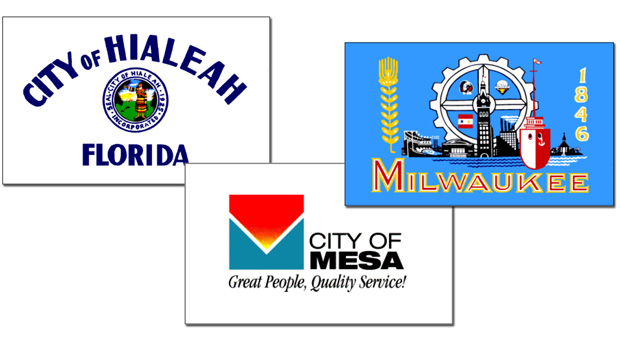

From this CBS article dated September 4, 2016:
Some not-so-grand old flags
A standard-bearer for good flag design points out city and state banners that are emblems of disaster
Surely you’re joking
Flag of Amulang, Cagayan, Philippines.
That flag really sucks.Surely you’re joking
This is someone’s hand drawn proposal for the flag…
Please tell you’re joking
Surely you’re joking
This is someone’s hand drawn proposal for the flag…
Please tell you’re joking
It is literally hand-drawn based on a local contest.That flag really sucks.
 www.facebook.com
Even though it's really amateurish, I actually like this one. The graphic is well-balanced, and conveys the sun and hills and rivers and happy people. And the text is pretty well laid out (not good by any professional standards, but could be worse), and their printing isn't bad - it could almost be one of those fake-handwriting fonts.It is literally hand-drawn based on a local contest.
Others users on Facebook mentioned that it is more of a poster-making contest. Entries #4 and #7 look decent enough.
I have yet to see photos of it in the wild.
Gotta love my home state...View attachment 767364
Apologies for the poor quality, but this was the best I could find online. Feast your eyes on the flag of Logansport, Indiana! It’s got everything: an uncomfortable racial depiction, a photorealistic train, weird editing choices, and even a literal map!
The Conferete South Africa?View attachment 716679Flag of southern unity, on one hand I actually like it on the other leaving the Saint Andrews cross is too much of a nod ye old Confederate flag.
But that's also the point obviously a southern take on the South African flag.
If you don't know the context, actually this is a good simple design in itself.... Perhaps the sword could be less cliparty but otherwise it's clearly recognizableProposed flag of the General Government, (A German Puppet)
The sword looks like clipart, and the Black and white has nothing to polish culture.
View attachment 709879


More bad flags.Full list below. Philippine city and municipality flags are terrible. Props for the municipality flags of Bohol and Bukidnon provinces though.
Flags of cities and municipalities in the Philippines - Wikimedia Commons
commons.wikimedia.org
"MAY THE RATS EAT YOUR EYES!"
- Maximilian Roivas
"Holy shit! What is that?! What the fuck is that?!?"
- Sgt. Hartman
Flag of San Quintin, Abra, Philippines
In the wild
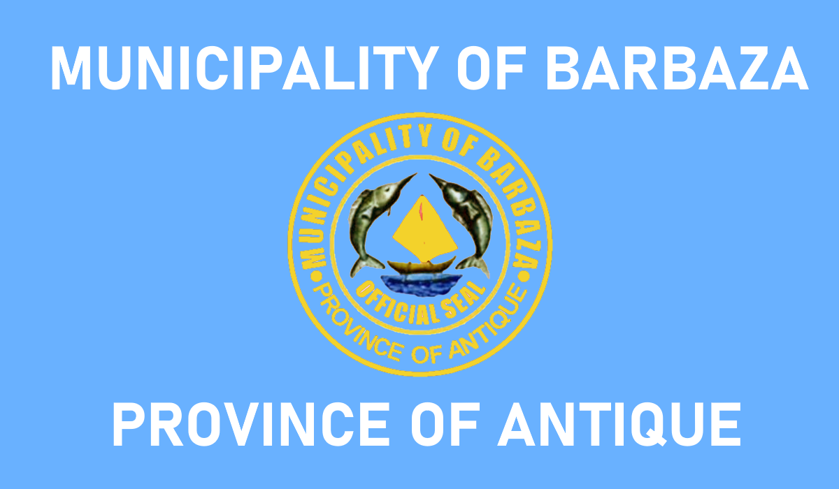
Barbaza, Antique, Philippines
In the wild
Culasi, Antique, Philippines
In the wild
It seems that making interesting flag designs is a felonyI mean what happened to the most creative Filipino flag makers?
The joke about it being a felony to make good flags made me laugh.It seems that making interesting flag designs is a felony
More accurately, no one really cares about municipality flags
More bad flags.
I mean what happened to the most creative Filipino flag makers?
Just like the contest which as a "banner making" one, Filipinos tend to confuse banners for flags. Hence most of our flags look like welcome signs instead.It seems that making interesting flag designs is a felony
More accurately, no one really cares about municipality flags
Really, who decided that every Philippine municipality needs its own flag?It seems that making interesting flag designs is a felony
More accurately, no one really cares about municipality flags
Local government units often hold contests for a banner design. Since it is a banner-making contest, those who submit entries often make banners, posters, and what is like a welcome sign instead.Really, who decided that every Philippine municipality needs its own flag?
Which is why the flags tend to be so terrible.Local government units often hold contests for a banner design. Since it is a banner-making contest, those who submit entries often make banners, posters, and what is like a welcome sign instead.
Would despite the name of province, we should note that the first flag is of a county, and one which may not include the entire island. A bit confusing on the status of one of the cities, and the various Wikipedia maps show it differently. The flag of the region it is in looks nice, as do the coats f arms themselves. I wouldn’t be surprised if this was an intern I’m thing or something for social services.Since @ramones1986 already mentioned about the Philippine provinces flags being bad and you can look it up on Wikipedia, but here's some special mentions:

Two seals occupying the upper half of the field and a text on the lower field. Just no.

Province of Sultan Kudarat. I don't know what to say if this is a banner or a billboard.
The next one is a municipality flag
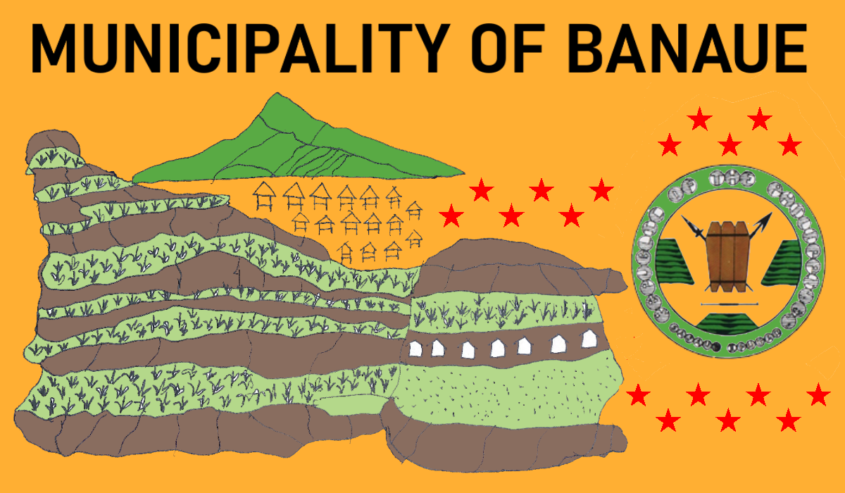
Banaue, Ifugao. Looks like a kid drew this and the local government unit just adapted it.
For more horrible city and municipal flags, click the link below:
Flags of cities and municipalities in the Philippines - Wikimedia Commons
Again another non-creative flagSince @ramones1986 already mentioned about the Philippine provinces flags being bad and you can look it up on Wikipedia, but here's some special mentions:
Two seals occupying the upper half of the field and a text on the lower field. Just no.
Province of Sultan Kudarat. I don't know what to say if this is a banner or a billboard.
The next one is a municipality flag
Banaue, Ifugao. Looks like a kid drew this and the local government unit just adapted it.
For more horrible city and municipal flags, click the link below:
Flags of cities and municipalities in the Philippines - Wikimedia Commons
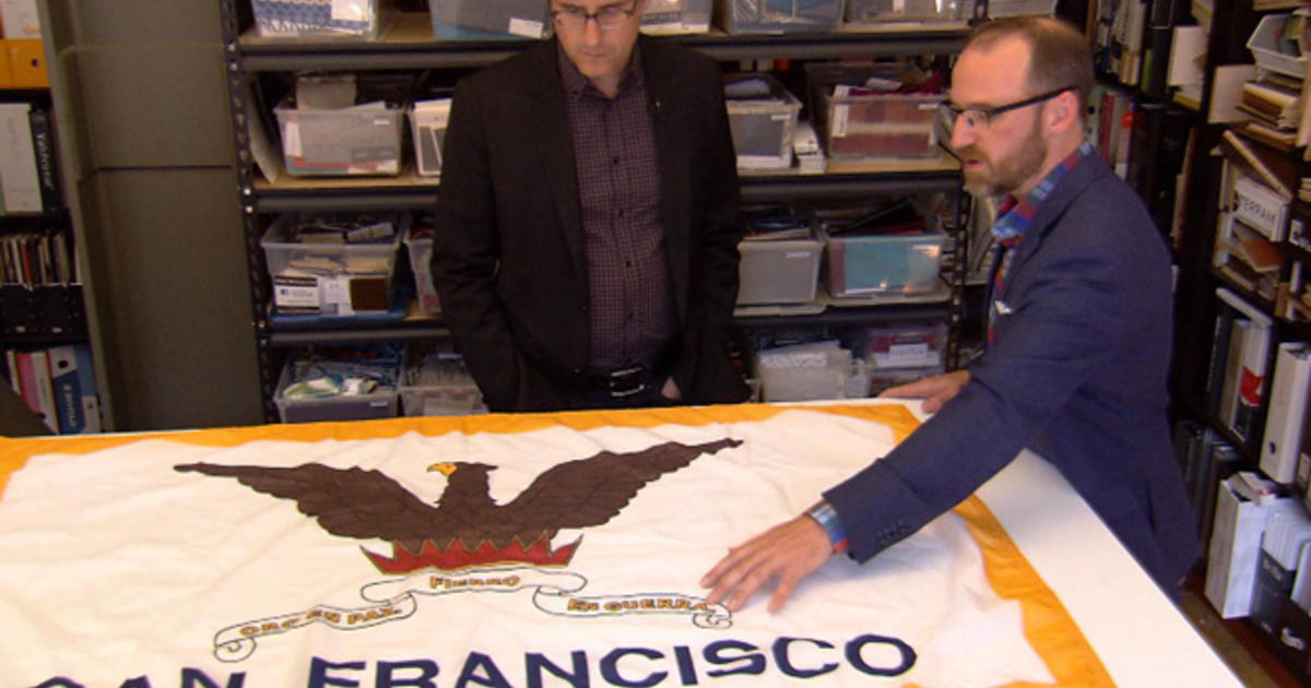
The Pocatello flag sucks.
From this CBS article dated September 4, 2016:
Some not-so-grand old flags
A standard-bearer for good flag design points out city and state banners that are emblems of disasterwww.cbsnews.com