You are using an out of date browser. It may not display this or other websites correctly.
You should upgrade or use an alternative browser.
You should upgrade or use an alternative browser.
K-7 Map Thread
- Thread starter Switz
- Start date
-
- Tags
- g-projector map q-bam
If you compare this map tot he Q-BAM, what are the biggest differences?
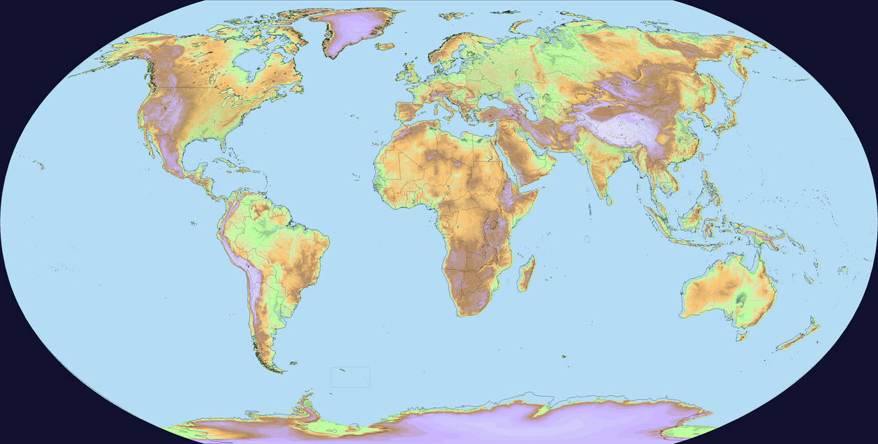
The QBAM is wrong! by Ashtagon on DeviantArt
The above map is of QBAM proportions (ie width, height, and position of the curved edges is QBAM standard). The black lines for coastlines and borders are from standard QBAM maps. The altitude shading is sourced from high-resolution data sources, re-projected to K7 standards using g.projector, then width:height aspect ratio adjusted to match that of the QBAM standard. Note that the source data for altitude did not distinguish between "water", "land than is less than 32m in altitude", and "land below sea level".
It can be seen that the Americas are generally in the correct position, although South America should be a little bit wider than drawn in QBAM. The west coast of Europe and Africa in QBAM should be a little bit farther east. This error increases as you travel eastwards through to Asia. QBAM's Pacific Ocean is too small.
If the QBAM were entirely correct, then all the drawn (ie altitude-shaded) land on this map would have been entirely within the lines of the black QBAM coastline.
Last edited:
each image has been updated.The map seems to not reflect some recent administrative changes:
SNNPR of Ethiopia was dissolved and replaced with 3 regions
Sierra Leone has a new province "Northwest"
Kazakhstan has 3 new regions created last year
Panama created a new Indigenous province, "Naso Tjër Di" 3 years ago
Algeria has 10 new regions in the south
Angola reorganised their Luanda and Bengo province in 2011
Pakistan's FATA region was merged into another a few years ago
Norway merged together some regions from 19 to 11
Indonesia created some new regions in Borneo and New Guinea since
Greenland created a new subdivision in 2018
This might not be all of them though, only the ones I could find
this methodology seems to really struggle with islands. pretty much all of them are blobby/ merged with each other or the coast. is there any other data sets that could be used to augment this? i am a simple 3head brain who does not understand qgis or vectors.
congrats on getting a mathematically fixed qbam out and finished tho. that seems omega difficult. have been following the development of rbam which is a similar project.
congrats on getting a mathematically fixed qbam out and finished tho. that seems omega difficult. have been following the development of rbam which is a similar project.
Share: