Here are the first two contestants, splitting the contestants into two posts due to the fact i can only upload 10 attachments
Entry 1 said:Flag to redesign - Zambia:
From the World Factbook: "Flag Design: green field with a panel of three vertical bands of red (hoist side), black, and orange below a soaring orange eagle, on the outer edge of the flag; green stands for the country's natural resources and vegetation, red symbolizes the struggle for freedom, black the people of Zambia, and orange the country's mineral wealth; the eagle represents the people's ability to rise above the nation's problems."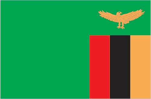
As I see it, one of those problems is the design of the flag. Flags with no symmetry have to have some other familiar guideposts, something to help the viewer put things into context. While the flag is definitely recognizable, and the eagle is iconic, this flag isn't going to win any beauty contests. In redesigning it, I didn't want to lose any of the components or symbolism. I went with a flag design that would handle 4 colors in a strong way, keeping the red away from both the orange and the green (which to my eyes are problematic pairings).
Template flag - Vanuatu:
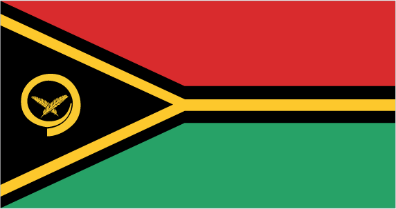
The New Flag of Zambia:
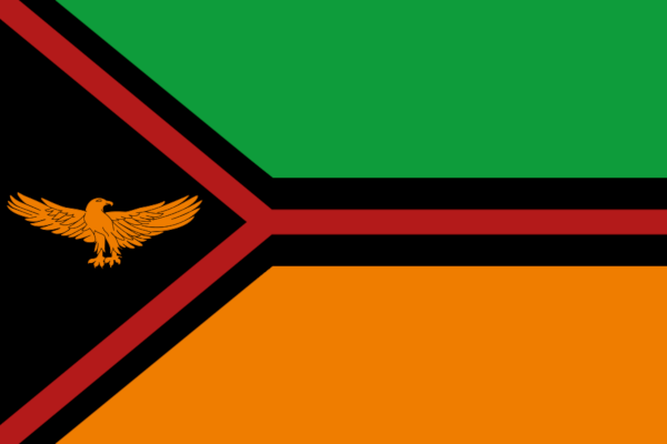
One major design choice I made in the new flag of Zambia was to make black the central color. If black represents the people, then I want the people to be central to the flag. I also didn't want to minimize the red (symbolizing the struggle) but in this design, the struggle is a part of the people, and not the largest part. Now, this flag is a beauty.
The New Flag of Vanuatu:
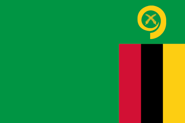
Everything that has been improved for Zambia has been lost for Vanuatu. A once-proud flag is wondering, Why did this happen to me? All I can say is that it was part of the rules.
Entry 2 said:Mozamb Islands and Marshallique

Flag of the Mozamb Islands, a.k.a. Mozambisles (Marshall Islands post-Mozambique flag swap)

Flag of Marshallique (Mozambique post-Marshall Islands flag swap)
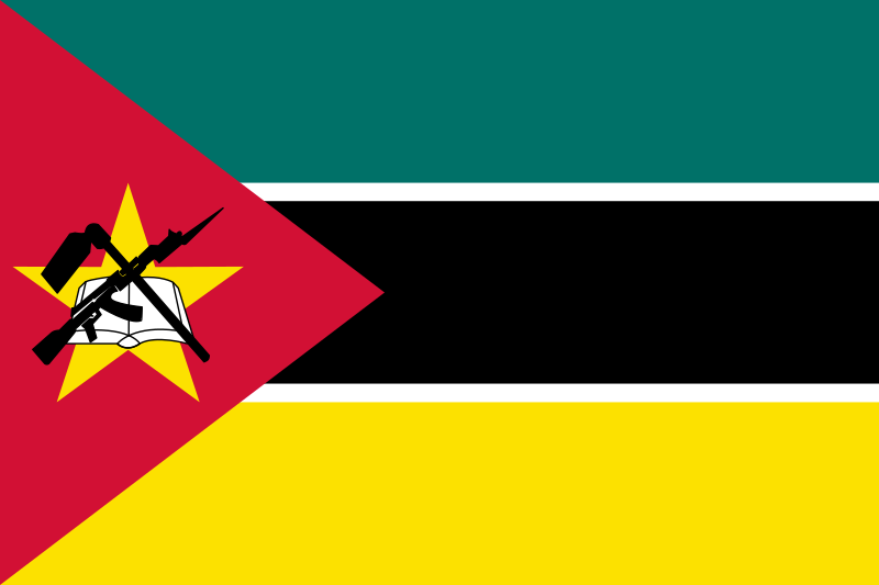
To be perfectly honest, I don't think the OTL flag of Mozambique is that bad-looking. When it comes to modern African national flags, the Mozambique flag is, in my very humble opinion, somewhere around the middle of the scale, slightly towards the higher quality end of the middle. Not a horrible flag by any means, but also not among the best-looking and the most interesting of African flag designs. By and large, I think the flag itself, in terms of colour combinations, is actually decent.
What's my main objection to it ? The national emblem in the red wedge of the flag is simply... too busy. The colours also clash into one giant mess: Red, black, gold, white. Enough for a separate flag. Let's examine the charges of the emblem, shall we ? There's a golden star in the background, then a book symbolising education, okay, but then there's also a hoe symbolising agriculture, and as if that wasn't enough, it's also the only country that put a Kalashnikov assault rifle into its emblem ! Yeah, yeah, I understand the struggle of the locals for independence from the Portuguese, or that they had some infighting of their own, but as far as emblems including firearms and weapons go, this particular national flag has always irked me with that overly modern symbol. Either way, it's Mozambique's flags, and it's their choice what they put on it. However, if this round was about improving existing OTL national flags, I'd probably throw out the hoe, rifle and book entirely and keep only the star. Or keep the star and book, or keep only the book (to show Mozambique might value education more than other African countries, or some similar bragging). But those are just my ideas. Decent flag, but could have been a little better.

I sincerely don't know if the OTL flag of the Marshall Islands is considered gorgeous or amazing by the global public, but in any case, it sure is much better in terms of colour combination and colour contrast, in being easy enough and not too busy to remember, and so on.
Skip and Chip, that dynamic duo of inseparable Alien Space Bat friends, were bored out of their minds one day (as they do), and decided to come up with a new game to pass the time. To make it even more exciting, they placed a bet on the game they were about to play. Skippy bet with Chip that he can magically swap the national flags of two random OTL nations with each other, improving an all right but unexceptional flag in the process, and completely vandalising a visually attractive and well-regarded flag in the process.
The next day, the citizens of Mozambique woke up, bewildered to see someone had tweaked their national flag, and thought that it's not exactly that bad-looking now. In turn, the citizens of the Marshall Islands woke up and shook their heads in disbelief. Who redesigned their national flag to look like the flag of some leftist revolutionary state in Micronesia ?!
Skip won the bet, and Chip had to concede they both had a good laugh.
Last edited: