Three flags I made for a communist United States (the third is a pan-American socialist union, hence the mesh of the Stars and Stripes and the Bolivarian tricolor).
Which one works the best?
I like the 2nd one for a Communist USA.
Three flags I made for a communist United States (the third is a pan-American socialist union, hence the mesh of the Stars and Stripes and the Bolivarian tricolor).
Which one works the best?
I centered the gyronny's zero coordinate on the hoist, though I'm not sure if that's what you wanted. It's a tad jagged and the fibriations are slightly off-center, but it only took about 15 minutes in GIMP. Aside from that, it's pretty damn ugly if I do say so myself.
No, you've done a solid job of interpreting what was requested. The request itself is not particularly pretty, though

Three flags I made for a communist United States (the third is a pan-American socialist union, hence the mesh of the Stars and Stripes and the Bolivarian tricolor).
Which one works the best?
Agreed, the second one is the best. I don't really think that they look communist enough, but they're definitely cool looking.I like the 2nd one for a Communist USA.
This flag was real, actually, and called the Goliad Bloody Arm Flag.


I like that! It's a different style of cross flag from most I've seen.
Flag of the Republic of England. I thought it was simple and effective:
Very nice. I've always liked to use the phrygian cap as a Republican alternative to other, more established republican symbology nowadays.
Zachary Comstock would approve of TTL's Custer.


I also made an alternate version-naval ensign maybe?
Stars stand for the seven states-Washington, Oregon, Lincoln, Biritsh Columbia, Vancouver, Northern Idaho, Jefferson, and Cascadia itself.
It's just... perfect. Well done, I say, old chap.Not gonna lie. That's one of my favorite flags EVER.
Seal of the Republic of Russia from my Madness TL:
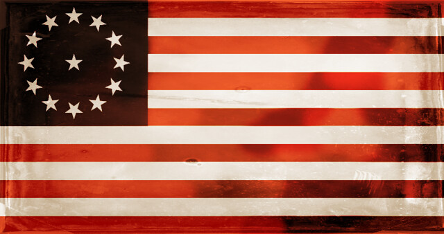
Yet another Communist American flag:

though the stars are a bit messy. The Canton makes me think of the Republic of China. The emblem is really cool though, it echoes that of the Canadian CP and it's a welcome deviation from the usual "stamp a hammer-and-sickle on it" approach that is so overused.Thanks. I was trying to go for a more American look rather than traditionally communist. The stars are a bit sloppy, but I couldn't really figure out a way to fix that in GIMP, since I copy-and-pasted them from Wikipedia's Betsy Ross flag and colored them yellow.Not bad at all