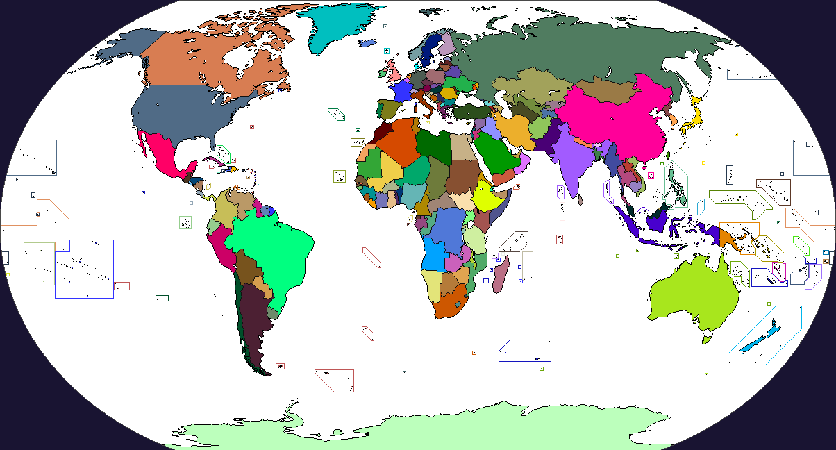
This is an example of Ashtagon's color scheme. As you can see, it is not very difficult to discern national colors.
]
Re-read my post: my problem isn't that much the accumulation of various colours (even if it's an issue IMO), is that the system proposes five different shades for each colours for each different situation.
Such used would be unreadable and/or unidentifiable on a worlda+ scale.
Having too much colours and more importantly too much shades for these colours makes a map unreadable. What you show me is a map with each country having its colour,
which is as useful as a blank map for readability (too much colour takes away the interest giving colours to point specific situations) : showing the political blocs, influences, etc. requires more subtelty including in the colouring part.
I dare anyone to make a complex use of Uzbek and Kirgiz colours as intended by this colour scheme, meaning using two really close colours with their all five shades without getting confused.
Not that the regular cs doesn't have formatting issues : but I think it avoids much by being abstract enough when it comes to treatment.
As an anthropology student, I find it despicable that people will leave out a sovereign nation because they believe it has no value in the modern world and yet add a never ending list of ancient and imaginary entities that actually have no value in the modern world.
Which shouldn't be sur-compensated by giving anything that moves, or doesn't even moves (5 colours for France, depending on the regime? Seriously?).
Giving that aRCS/RCS roughly have the same number of colour for Africa than TACOS (mostly because they're issued from a same source), I feel personally insulted by this remark as a contributor, as pulling a "dspicable" work. It's probably not your intent, but that's its effect.
I think we had this discussion, or it might be with someone else. In any case, apologies for the redundance : Colour schemes aren't, IMO, about giving countries or cultures what they deserve, but modelling as best as it's possible when it comes to readability, an historical situation.
When in the 2015 map, I painted Gabon with the "influence shade of french colour" it's not about making a point about Gabon having no value, but about political situation.
When in the 814 map, I gave a colour to Kanem because, in the XIth century, we kinda need a Kanem shade to point their influence on Kotoko city-states : it's not a point about Kanem having more value than Sao, but just I can't think of an use for a Sao colour except for the sake giving it a colour.
It's as I said above : rather than having a sole colour for each thing under the sky, we recycle these. Modern Morroco have as little to do with Mauri than Italy have to do with Roman Empire, or Egypt with the pharaonic realms, I agree. But there's only so much colouring mixes you can do, and it allows a relatively easy identification ("oh, this kind of brown is about a North African native entity", "oh, this kind of brown indicate a Roman/Romance Italian entity", "oh, this kind of beige indicate a Nile-based entity")
I mean, Alex and I debated a lot about what to add on Africa and Americas, in the same time we removed some European colors that basically were as much relevant than giving Soa civilization its own color.
The result is, IMO, relatively balanced if perfectible (keeping in mind that half of basemaps are focusing on Europe). I stress perfectible : we welcome any discussion on the topic, because frankly, we don't know that much about neither he (I can testify for this) or me (I can testify for this as well, but it's obviously less credible) are open to changes and proposals.
Of course, if what we do is just pointed as despicable without any kind of discussion or point on why we should add a specific colour for, for a non-european exemple that appears on maps, Igbo people...
But really, I don't think the solution to keep and readability and historical relevance is to simply just add colours and shades like there was no tommorrow because it ends as being unusable : I mean, it's unused. I never saw an OTL map really using it.
It's not at all an attack on Ashtagon's work : I don't really care this much. But it's just so blatantly unfair and uncalled when we see peoples that doesn't intervene, even less participate, to OTL map-making telling us out of blue that our work is s**t because a mess of colours and shade is technically better (if unused) that stuff that we pass time to work on.
(-rant off-)