4. Crimea is smaller than Crete, apparently.
but this is not crimea. it's the kinburn peninsula, and crimea just doesn't fit in the map
4. Crimea is smaller than Crete, apparently.
1. Ireland is flat-out gone, as are the Aegean islands and Malta.
We're not going to address that the North isn't even pointing to the North of the map?
Crimea should still be in the map though. If you look closely, there's a bit of sea that shouldn't be there.but this is not crimea. it's the kinburn peninsula, and crimea just doesn't fit in the map
View attachment 412606
Still has the central Asian states, but lost the caucuses, somehow annexed Finland, and flat out annexed Poland, Slovakia, Hungary, and Romania (save for Wallacia).View attachment 412847
I remember this gem appeared in the Things that look like Alternate History Thread several years ago. I've just rediscovered it.
Reminds me of something you would see in a strategy board game.I remember this gem appeared in the Things that look like Alternate History Thread several years ago. I've just rediscovered it.
Still has the central Asian states, but lost the caucuses, somehow annexed Finland, and flat out annexed Poland, Slovakia, Hungary, and Romania (save for Wallacia).
If Rome doesnt exist how can the pope have power over my faith?
Checkmate Catholic
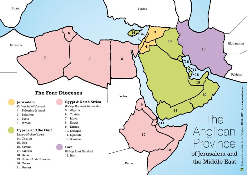
What is wrong with that map? Those are actual Anglian dioceses, and I have in fact met Bishop Suheil Dawani, who is an Anglican bishop and not a Catholic one.
Which countries are missing. It explicitly says it is for Jerusalem and the Middle East.Apart from the terribleness of the outline, and the lack of several countries, you mean?
Doesn't excuse the fact that Italy has sunk, or that Turkey has been stretched like a wool sweater you washed too many times.Which countries are missing. It explicitly says it is for Jerusalem and the Middle East.
That's a fair point but the geography is horrific, and given that its a map that's a pretty big deal.I'd argue that it's not actually bad because it successfully conveys the information it is supposed to, and that information is correct (as far as I'm aware).
That's a fair point but the geography is horrific, and given that its a map that's a pretty big deal.
They are showing everything that counts as Europe. And why would the second map be considered educational? It is simply an unofficial editing of the picture, as shown by the identical numbers on them, as well as the broken cross that doesn't reach over the U.K. In the second map. Where did you come across it?What makes this map especially unpleasant tot he eyes is that Arabia, Persia and East Africa are depicted more or less correct (given the detail limitations of the map) but already North Africa is significantly distorted (and I won't say anything about Spain, Turkey or Italy)
Oh also forgot, Maine looks weird.View attachment 412906
Wow, I guess Texas annexed some new land, it was probably overshadowed by the Kavanaugh case. Silly media!
Not that bad. Still, it might come down to Islands blobbing into the mainland. Been some real weird things with some states when their coastal waters are added to them on maps.Oh also forgot, Maine looks weird.
And why would the second map be considered educational?
What makes this map especially unpleasant tot he eyes is that Arabia, Persia and East Africa are depicted more or less correct (given the detail limitations of the map) but already North Africa is significantly distorted (and I won't say anything about Spain, Turkey or Italy)
I mean if you wanna simplify your map that's fine by me but don't throw different levels of detail into it.
Like for example this map, while being kinda ugly probably still does what the creator has intended to use it for:
View attachment 413514