I'd really like to see that. The Caspian Sean has always got me.I've wanted to do a tounge-in-cheek cover of that map, portraying it as an actual alternate history. It is actually the worst map I've ever seen, but it's so bad it's hilarious.
You are using an out of date browser. It may not display this or other websites correctly.
You should upgrade or use an alternative browser.
You should upgrade or use an alternative browser.
Return of Horrible Educational Maps
- Thread starter Westphalian
- Start date
i've been ninja'd, but that was clearly meant to evoke maps of the timeSpeaking of pirates and the Caribbean, take a look at this beauty from CNN (and yes, the URL is spelled "Carribean")
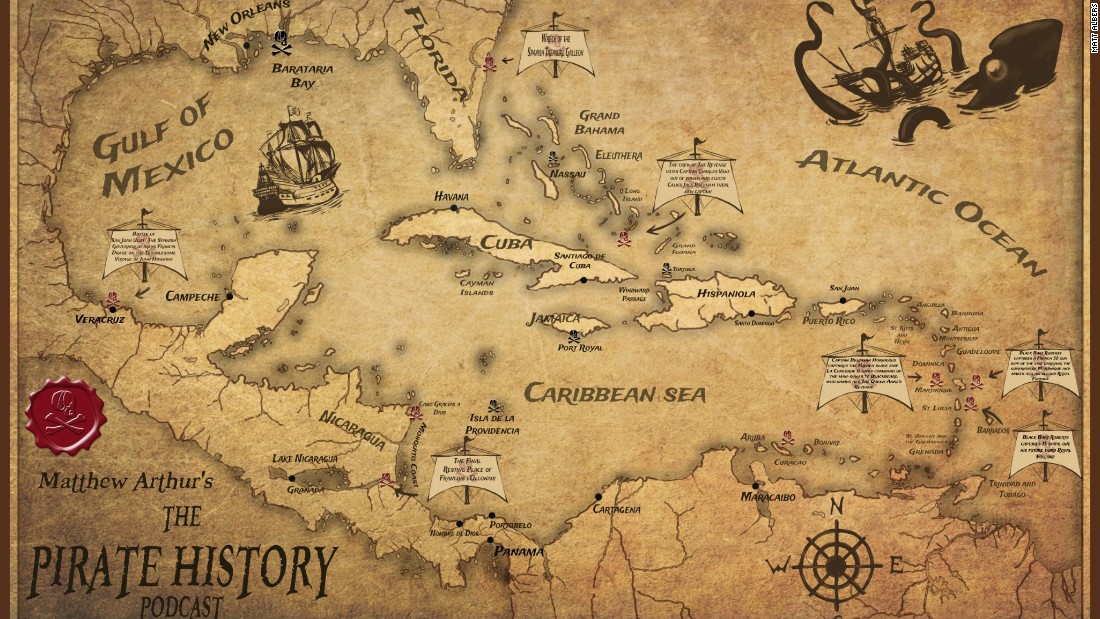
Especially look at Fat Hispaniola and whatever in the ever-loving f*ck is going on in Central America and Florida.
It's supposed to look inaccurate.Speaking of pirates and the Caribbean, take a look at this beauty from CNN (and yes, the URL is spelled "Carribean")
Especially look at Fat Hispaniola and whatever in the ever-loving f*ck is going on in Central America and Florida.
West Virginia, you can't southern Virginia

Meanwhile Vermont has annexed Coös County and the rest of New England has united with New York in an amorphous blob.
West Virginia, you can't southern Virginia
I'm more worried about what happened with Vermont and Mississippi-Alabama.

Huh. Rhode Island is literally an island.West Virginia, you can't southern Virginia
and then there's the merger of Pennsylvania, New Jersey, Maryland, and Delaware
i do rather like these awful maps--they're great inspiration for what some alternate countries could look like in place of the rather monolithic US/Mexico/Canada we have IOTL
I once tried to make a map scenario based on all of the mistakes here and the content of the things that look like ah but aren't thread, but it got really out of hand.
sure sounds like it wouldI once tried to make a map scenario based on all of the mistakes here and the content of the things that look like ah but aren't thread, but it got really out of hand.
Which very well might be merged with the weird West Virginia.and then there's the merger of Pennsylvania, New Jersey, Maryland, and Delaware
oh, and also it apparently has New York CityWhich very well might be merged with the weird West Virginia.
West Virginia, you can't southern Virginia
Sucks to be Virginia: not one, not two, not three, but four Virginias: West, Central, East and South Virginia.
And NYC part of the NJ-Maryland-Delaware amalgam while Long Island shrinks by 50%? OK then...
Fresh from a Smithsonian channel documentary, we get this WW1 map, one that gets more perplexing the more you look at it:


WTF?
Also Russia annexed Serbia and Romania because something something pan-Slavism (yes I know Romania isn’t Slavic but that’s the best explanation I can come up with).Huh, who knew that the Central Powers were only the Ottoman Empire and the Germany Austro-Hungarian Empire?
to be fair, Bulgaria is on there, too, it's just not labeledHuh, who knew that the Central Powers were only the Ottoman Empire and the Germany Austro-Hungarian Empire?
Fresh from a Smithsonian channel documentary, we get this WW1 map, one that gets more perplexing the more you look at it:
My fist thought when looking at that map was: So someone at the Smithsonian also watches Youjo Senki, eh?
Share: