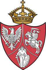
In response to a suggestion by @Spiritual Sausage , I decided to start a thread specifically for flags, coats-of-arms, and emblems of various sorts for movements, proposed national entities, etc which for whatever reason, never came to pass... I'll kick it off with this one, a revival of the concept of the Polish-Lithuanian-Ruthenian idea 1st proposed by the Treaty of Hadiach, which was revived by Polish revolutionaries in the 1800's:

You are using an out of date browser. It may not display this or other websites correctly.
You should upgrade or use an alternative browser.
You should upgrade or use an alternative browser.
Flags, Coats-of-Arms, and Emblems for Proposals that didn't happen Thread
- Thread starter Aghasverov
- Start date
Hilarious Portuguese Republican flag proposal; a challenge to see how many symbols could fit on a single flag.
View attachment 577520
Hilarious Portuguese Republican flag proposal; a challenge to see how many symbols could fit on a single flag.
This is indeed hilarious. I like the playing cards and three different hats on top (army, civilian and navy?). But if it was republican wh did they put a crown on it?
Well, the Crown is shifted off to the side, whereas the Homburg-looking hat has the "position of honour"... I'd imagine it's a (clumsy) attempt to depict the "classic" four classes of western society (emulating also the four suites of a deck of cards)... it's an all-inclusive flag!This is indeed hilarious. I like the playing cards and three different hats on top (army, civilian and navy?). But if it was republican wh did they put a crown on it?
Oh dear God... where to beginView attachment 577520
Hilarious Portuguese Republican flag proposal; a challenge to see how many symbols could fit on a single flag.
Yeah, I know, I posted it on another thread sometime before, but I just happen to like itIn response to a suggestion by @Spiritual Sausage , I decided to start a thread specifically for flags, coats-of-arms, and emblems of various sorts for movements, proposed national entities, etc which for whatever reason, never came to pass... I'll kick it off with this one, a revival of the concept of the Polish-Lithuanian-Ruthenian idea 1st proposed by the Treaty of Hadiach, which was revived by Polish revolutionaries in the 1800's:
View attachment 577516
Even though it's an Ace of Hearts in the middle, for some reason now I have Motorhead "Ace of Spades" on continuous loop in meh hedThis is indeed hilarious. I like the playing cards and three different hats on top (army, civilian and navy?). But if it was republican wh did they put a crown on it?
View attachment 577520
Hilarious Portuguese Republican flag proposal; a challenge to see how many symbols could fit on a single flag.
Is this a real proposal?
Not really a proposal but I saw this and liked it
Crazy Boris
Banned
Not really a proposal but I saw this and liked it
I saw Evwnt Horizon a while ago (good movie btw) and also noticed that the British characters wore patches that looked like some kind of altered EU flag. The American patches however, are the same as the modern Stars and Stripes
Bringing this back into real life, this is one of the many, many proposed PRC flags from back when the regime was first established. This was Mao’s preferred flag, with a yellow bar to symbolize the yellow river. This was opposed by some because they saw the yellow bar running across the flag as symbolizing China being divided, which, given the CCP’s attitude towards places like Tibet and Taiwan, was unacceptable. Zhou Enlai eventually took notice of the eventual winner, designed by Zeng Liansong, and managed to convince everyone to go for it. Before it’s official adoption, Mao decided to drop the hammer and sickle emblem from Zeng’s official design, to distinguish the new Chinese flag more from the USSR’s.


This is apparently a proposed design for the Belarusian flag back in 1995, proposed by Lukashenko himself.


Casino Republic of Portugal?View attachment 577520
Hilarious Portuguese Republican flag proposal; a challenge to see how many symbols could fit on a single flag.
Any idea what Lukashenko's rationale behind this design was? Seems rather... uninspired... and uninspiringThis is apparently a proposed design for the Belarusian flag back in 1995, proposed by Lukashenko himself.
Me personally I'd like to see the traditional white-red-white horizontally-striped banner, with a coat-of-arms bearing a Pahonia proudly displayed, but that's just me
My eyes! My eyes!.svg/890px-Flag_of_Panama_(Bunau-Varilla_proposal).svg.png)
Philippe-Jean Bunau-Varilla's proposal for Panamanian flag
I think I may understand the symbolism of the strange symbol in the canton (I'm thinking it has to do with the geography of Panama maybe?), but the colours... yikes.
The design was American-inspired, but the colors (blue, yellow and red) were Colombian-inspired; no wonder, it was rejected.I think I may understand the symbolism of the strange symbol in the canton (I'm thinking it has to do with the geography of Panama maybe?), but the colours... yikes.
Crazy Boris
Banned

One of the proposed flag for Jamaica
Jamaica: “Can I copy your homework”
Tanganyika: “Sure, just don’t make it look too obvious”
Share: