You are using an out of date browser. It may not display this or other websites correctly.
You should upgrade or use an alternative browser.
You should upgrade or use an alternative browser.
A Flag Thread
- Thread starter Magnificate
- Start date
- Status
- Not open for further replies.
Krall
Banned
A flag featuring the Runic letter pertho:
That hurts my eyes for some reason. Could you try putting a white line between the red and the blue?
It's a good design, though.
That hurts my eyes for some reason. Could you try putting a white line between the red and the blue?
It's a good design, though.
What's the problem with red-on-blue, a lot of OTL flags have that, like Cambodia and Lichtenstein.
Reminds me of the North Korean flag, nice design.A flag featuring the Runic letter pertho:
")
Deleted member 4898
I agree with Krall. There's something about the flag - possibly the shades of the colours used - that doesn't quite work for me. I think I white line may make it look better.
Nice design though.
Nice design though.
bite your tongueCanadians are apparently incapable of thinking up good flag designs.
https://www.alternatehistory.com/discussion/showpost.php?p=1058612&postcount=2378
Krall
Banned
What's the problem with red-on-blue, a lot of OTL flags have that, like Cambodia and Lichtenstein.
After having checked the aforementioned OTL flags I have determined that it is the shade and hue of the red and blue used that makes them hurt my eyes.
Evidence to support FallenMorgan's theory?
That hurts my eyes for some reason. Could you try putting a white line between the red and the blue? It's a good design, though.
Reminds me of the North Korean flag, nice design.
I agree with Krall. There's something about the flag - possibly the shades of the colours used - that doesn't quite work for me. I think I white line may make it look better. Nice design though.
After having checked the aforementioned OTL flags I have determined that it is the shade and hue of the red and blue used that makes them hurt my eyes. Evidence to support FallenMorgan's theory?
Thanks for the complements and feedback everyone. Here's a "toned down" version (I tried putting white lines in between the blue & red, but didn't like how it looked):
Deleted member 4898
That's a lot better.Thanks for the complements and feedback everyone. Here's a "toned down" version (I tried putting white lines in between the blue & red, but didn't like how it looked):
I have a Challenge.
Can anyone make Alternative versions of the British Empire flags of
Good Luck & Happy St Patricks Day
- Oceania
- ie
- Australia
- New Zealand
- Christmas Island
- Cocos (keeling) Islands
- Norfolk Island
- Fiji
- Indonesia
- New Caledonia
- Pupa New Guinea
- Solonom Islands
- Vanuatu
Got one for Oceania

Hm, either crazy-expansionism, or crazy-internal-balkanization...179 states!? wtf?
Flag for a greek dominated Cyprus (from Ill Bethisad alternate world)

Malafra or Bialawi, a mix between the flags from Malawi and Biafra.


Malafra or Bialawi, a mix between the flags from Malawi and Biafra.
I have a Challenge.
Can anyone make Alternative versions of the British Empire flags of
Good Luck & Happy St Patricks Day
- Oceania
- ie
- Australia
- New Zealand
- Christmas Island
- Cocos (keeling) Islands
- Norfolk Island
- Fiji
- Indonesia
- New Caledonia
- Pupa New Guinea
- Solonom Islands
- Vanuatu
My try on Norfolk Island. I can't say is much imaginative, just obvious.
Got one for Oceania
Wow, it's so simple, yet so appropriate and incredible. I really love this flag, especially the badge.
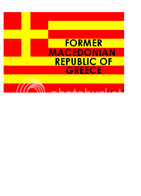
Just Found this one on garena.com-A Flag of anti-FYROM Macedonian Greeks...
I just put this one into my photobucket account-I really don't think I could have made this one up. Honestly-a Flag with words?? A little too iffy a flag design for me....seems it would be better without the words....Maybe the canton can be blue and white but the field red and yellow... or vise-versa! Does would anyone like to redo this one so it looks a little more visually appealing, please?
Thanxs
If you don't mind, I'd like to see a Confederate battle flag with 55 stars, to show the "implausibly conquered the Union and some other land" Confederacy from the movie CSA: Confederate States of America.
I'd also like to see an American flag that looks-fascist. Not one that has explict fascist symbols on it, but one that just looks more facist and totalitarian than the OTL one.
I'd also like to see an American flag that looks-fascist. Not one that has explict fascist symbols on it, but one that just looks more facist and totalitarian than the OTL one.
- Status
- Not open for further replies.
Share: