You are using an out of date browser. It may not display this or other websites correctly.
You should upgrade or use an alternative browser.
You should upgrade or use an alternative browser.
Flag Thread III
- Thread starter Dom
- Start date
- Status
- Not open for further replies.
A few months ago we had a spate of Australian flag redesigns, and I've been playing with that off and on since then.
Here are four designs for a future flag for Queensland. I'm pretty happy with the arrangement, just the colours are giving me some trouble. Comments and suggestions welcome.
I think with C and D, you don't need the blue bar to separate the field. Also, D might look better if the stars where the same maroon as the fly-wise field instead of bright red.


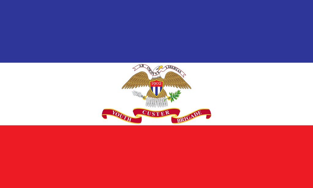
Could anyone clean up/finish this flag for me? It should have some sort of ribbon in its talons that say "CUSTER YOUTH BRIGADE," and somewhere it should say "Established 1902." Maybe a motto, too, "Ad Ordine Libertas" (From Order comes Freedom).  And if you'd be a dear p), maybe make a second version where the shield is solid blue and has a thick, very visible upper-case C. If you want to go all out and make a better eagle and what-not, be my guest! It just needs to be an eagle with my description on the tri-color.

And if you'd be a dear p), maybe make a second version where the shield is solid blue and has a thick, very visible upper-case C. If you want to go all out and make a better eagle and what-not, be my guest! It just needs to be an eagle with my description on the tri-color.A flag of Tasmania without the devil. Shame.
Hell yeah. I want to get it embroidered and hang it up in my bedroom next to my Texas and Ecuador flags.Excellent!
I have a flag for a sort of NewNited States of America/2nd American Revolution flag. Im not sure on color placement as well as whether I should put stars.
Here are the 3 color variants I have. I have each without stars as well.
I like C the best.
I like C the best.
It is the classic red white and blue but....I dunno. I get the same feeling as the Stars and Bars vs. Stars and Stripes. Too similar.
It is the classic red white and blue but....I dunno. I get the same feeling as the Stars and Bars vs. Stars and Stripes. Too similar.
If you're trying to shy away from the old flag, why use the 13 stripes/stars at all?
Also, all I can think when I look at the eagle is "put your hands in the air, wave 'em like you just don't care."
Could anyone clean up/finish this flag for me? It should have some sort of ribbon in its talons that say "CUSTER YOUTH BRIGADE," and somewhere it should say "Established 1902." Maybe a motto, too, "Ad Ordine Libertas" (From Order comes Freedom).
Here's a little something I put together: http://i.imgur.com/fx59ZQM.png
Not posting it here because people will hate me again. (It's 2000px wide)
I can't do words on wavy things, but maybe someone can do something with it; there are two banners with lots of text room.
Here's a little something I put together: http://i.imgur.com/fx59ZQM.png
Not posting it here because people will hate me again. (It's 2000px wide)
I can't do words on wavy things, but maybe someone can do something with it; there are two banners with lots of text room.
Thanks!
That looks great! I'll try to put words on with Ribbet.com, and post the results.Thanks, but I just realized that there is a weird gold thing pointing down--just beneath the red banner.Thanks!
I missed it the first time, but it shouldn't be hard to cut out.
Also the eagle kind of looks like it is struggling (which is understandable given its present condition and the fact that it's an eagle.)
If you're trying to shy away from the old flag, why use the 13 stripes/stars at all?
Also, all I can think when I look at the eagle is "put your hands in the air, wave 'em like you just don't care."
Because its meant to be reminiscent of the original using the same sort of symbolism but it isn't supposed to be too close to it
And lol
Now that you mention it, there's an overwhelmed look in its eye, even considering that it has its talons full.Also the eagle kind of looks like it is struggling (which is understandable given its present condition and the fact that it's an eagle.)
Being a heraldic eagle is a thankless job though--shit in your talons, shield on your chest, or--god forbid--a second head.
Last edited:

A flag for a strange little timeline. This a flag for a country/movement founded by the group Anonymous. I like to call it the Anonymous Nation. Based on an Anarcho flag with a generic blue color for the internet along with the "Man with no head" logo. Anyone think they could make the division of colors smoother? It seems a little pixely to me.

This is the flag of the world state that the Anonymous Nation fights against.
A flag for a strange little timeline. This a flag for a country/movement founded by the group Anonymous. I like to call it the Anonymous Nation. Based on an Anarcho flag with a generic blue color for the internet along with the "Man with no head" logo. Anyone think they could make the division of colors smoother? It seems a little pixely to me.
This is the flag of the world state that the Anonymous Nation fights against.
A sitcom, maybe. A timeline, that's pushing it.
A sitcom, maybe. A timeline, that's pushing it.
Now now. Anything and everything is possible. There are plenty of timelines where a corrupt world state rises. It isnt that hard to make one. All you need is a change to create some extremists or a war to make the world ripe for the taking of some organization. And the idea that people would remain passive when that occurs is laughable. A group like anonymous is just a fun little template I wanted to use. A loose association of nations trying to gain sovereignty from the World State in a war. A broad concept that a timeline can be made from without much difficulty. Though you could make a story out of it even easier, I'll admit. And thank you for the clean up.
- Status
- Not open for further replies.
Share: