I really like this one. What are your thoughts on it being slightly simpler though? Like having only one emblem (for now)
Like just a hammer since it's more industrial
I really like this one. What are your thoughts on it being slightly simpler though? Like having only one emblem (for now)
Like just a hammer since it's more industrial
Hmm...nice flag, but I would like to suggest a way to make it a little less convergent with the old DDR flag while retaining the essence of it:
- Have a cogwheel (or rather half a cogwheel) on the right side replacing the wheat there. Thus the circle represents equally agriculture (wheat) and industry (cogwheel). I'm thinking of the cogwheel found on the People's Democratic Party of Afghanistan symbol.
- the wheat could remain the same, or it could be simplified like the wheat found on this flag from an old flag challenge thread or the wheat on the Romanian communist party logo.
- In the centre replace the hammer (now unnecesssary) and compass (which represented the intelligentsia but that is a group rarely featured in communist symbolism) with a golden torch which can be interpreted as the KPD lighting the way to a better future/Germany being (one of) the leading lights of eventual world communism. A torch like this (in solid yellow/gold) or as found here, might be quite nice.
I avoided having the hammer because the aim of the flag was to show the industrial workers and agricultural peasants more or less equally and with the cogwheel in it the hammer is unnecessary:
https://www.alternatehistory.com/discussion/showthread.php?p=11615302#post11615302
https://www.alternatehistory.com/discussion/showthread.php?p=11617411
And I think that makes sense for overarching national movement but here were just talking workers in Berlin.
Hmm...maybe I'll take a crack
Glad to see this back!
And for the looks of it, it'll be even better than last time!
That's an interesting flag. I'm not sure I've seen socialist iconography of the factory elsewhere, but it makes total sense.
Short post this time. I wanted hear thoughts on the flag before in continued.
Appreciate you saying that. Though i wonder if a bigger, centralized symbol might be better?

• • •

• • •
 Nice flag. Also, I do not know if extending the middle finger to one's enemy is a German thing, as it is in the US, however the industrial rooftop and tall smokestack almost evoke the thought. But. then. I am renown for thinking a little bit off center.
The quality of the updates is nice too.
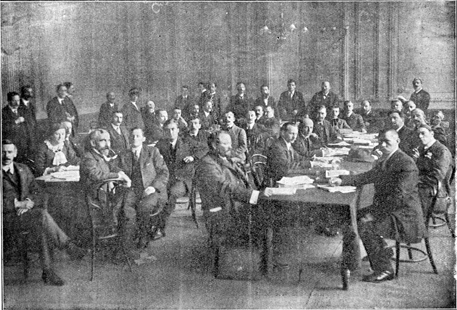
“Befreiung!,” he bellowed as he tossed the first draft newspaper onto the table. “And Die Industrearbeiter,” as he tossed the other in quick succession.
Btw, any thougts on the names of the newpapers? Both names seemed to fit the setting enough but im open to feedback.
It actually should be Der Industriearbeiter or Der Fabrikarbeiter-unless you want it to be Die Industriearbeiterin, to reflect the feminine nature of socialism in Germany ittl