You are using an out of date browser. It may not display this or other websites correctly.
You should upgrade or use an alternative browser.
You should upgrade or use an alternative browser.
[POLL] Japanese Alaska flag
- Thread starter Thomas27
- Start date
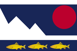
I would take number Two but I would remove fish and rotate red circle lower and make that bit smaller.
This.
I would also give the Sun a thin white border; it looks a little odd on a dark blue background.
Just my view, and it could be totally wrong, but it doesn't look like the kind of flag the Japanese would design.
What period is the Japanese that designed this flag?
What period is the Japanese that designed this flag?

The mountains aren't stylized enough for Japanese tendencies. Ravenflight is correct, though I think there is a compromise here somewhere.
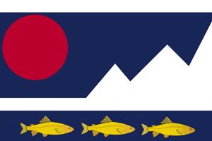
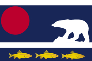
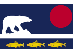
All seem to agree the fish are a bit much, but I also find the Bear a too European/Western idea on a map. I don't pretend to know much, though, in that regard.
However, keeping the blue sea, white land, and red sun, throw in a current use stylized mountain range and I think you've got it. Though it does look a tad like preschooler tepees.
The mountains aren't stylized enough for Japanese tendencies. Ravenflight is correct, though I think there is a compromise here somewhere.
All seem to agree the fish are a bit much, but I also find the Bear a too European/Western idea on a map. I don't pretend to know much, though, in that regard.
However, keeping the blue sea, white land, and red sun, throw in a current use stylized mountain range and I think you've got it. Though it does look a tad like preschooler tepees.
I like this with a white ring around the red sun. A bit thicker than the one from the first Alt-Suggestion.
And best of luck with your TL!
Sabot Cat
Banned
For reference, here's a list of national, prefecture and municipal flags. Almost all of them have simple geometric designs, usually centered and bicolor. None of them have animals.
Thomas27
Banned
Just my view, and it could be totally wrong, but it doesn't look like the kind of flag the Japanese would design.
What period is the Japanese that designed this flag?
End of 19th centuarie.
So, something... roughly like this, then?
Love this one.
Noted.The mountains aren't stylized enough for Japanese tendencies. Ravenflight is correct, though I think there is a compromise here somewhere.
All seem to agree the fish are a bit much, but I also find the Bear a too European/Western idea on a map. I don't pretend to know much, though, in that regard.
However, keeping the blue sea, white land, and red sun, throw in a current use stylized mountain range and I think you've got it. Though it does look a tad like preschooler tepees.
I like this with a white ring around the red sun. A bit thicker than the one from the first Alt-Suggestion.
And best of luck with your TL!
Thanks. I don't when i'll start to really work on it. I've some other project to finish before. Maybe it's gone a be a collaborative TL.
For reference, here's a list of national, prefecture and municipal flags. Almost all of them have simple geometric designs, usually centered and bicolor. None of them have animals.
Noted. I'll take look to it.
Thomas27
Banned
How about just the sun disk in the centre, like the Japanese flag, with the dark-blue background?
Noted to.
I'll organisze a "round 2" poll next week with some new designs from me and from proposal done in this thread so continue to vote and make proposal.
Share: