Status
Not open for further replies.
I'm also cross posting from the weekly flag challenge thread too, but with a counterpart for Imperial Japan that won a US-less WWII that also liberalized yet still is authoritarian.

o4TgLFG.png
 

Alan Hardy

Banned
Mexico...
Never see anyone think they can rework the Mexican Flag. The country with my new favourite ratio. 4:7
Thing is the vertical tricolour is equidistant green, white red. Yet only the white is defaced with the Crest charge. How about giving it room to breath? Make the outer bands at 2/7ths and the white 3/7ths... This image is built from a 1024x585 pixel base. Placed on 700x400 outline.
first image is my rework - the lower one just for reference.


Alan Hardy

Banned
I like most of the crest. I challenge you to change only the Rock (I think it looks like a terracotta pot) and the Lake. Everything else has to stay the same. If you need to know how your lake may look then google earth for lakes in or around Mexico City since that's where the rock was.
 

Hapsburg

Banned
A revised version of a flag I made a long while ago.

The national flag of the Federation of Cygnus. Originally an autonomous region of the Terran Dominion centred around expansion colonies in the Cygnus Arm, it peacefully separated in the 2500s to form a princely federation of local nobles, nominally headed by a First Prince, elected from amongst the nobles for a five-year term. Over time, the Princely Council tended to elect its leader from the same family, the Cliffwaters; this led to the revision of the federal constitution to include an elective monarchy limited to members of House Cliffwater. This led to a number of civil wars at the close of the 2nd millennium, and the further revision of the constitution to enshrine a hereditary monarchy. The state maintained its name, the Federation of Cygnus. Originally more cosmopolitan than the Terran state, repeated conflict with neighbouring alien states and with the Sagittarian state soured this attitude into one of xenophobia. Its continued strong ties with the Terrans inevitably led to the Cygnoids falling under Terran hegemony. An armed coup by human-nationalist elements in the royal government and military in the early 3100s precipitated their transformation into a National Humanist police state by the time of the Great War--sometimes acting as a "testbed" for National Humanist policies that would later be implemented in the Terran Empire and, after the 3260s, across the Galaxy. Like the other allied states of the Interstellar Treaty, the Federation of Cygnus was dissolved in 3275 and its subject worlds became member planets or colonies of the Central Galactic Union.

Their flag consisted of a divided field in black and white, with opposite-coloured swan silhouettes on either side facing each other, and a gilt sword placed between them.

Flag of the Federation of Cygnus.PNG
 

Alan Hardy

Banned
I really don't like that the flag of Haiti has such a small coat of arms in the centre. Really tricky to see whats going on. If "you" want it on the flag, then it needs to be able to be seen.
Built from a 2000 pixel long flag. mounted to ratio 4:7 as a 700x400 size. Added a fimbriation of white between the red and blue, and bit away the green mound and replaced with white bordering the red.


Alan Hardy

Banned
And the flag of Liechtenstein was changed, adding a crown, when they noticed it looked like the Haitian flag. I left it as ratio 3:5, but had to fibrate a 1/24th strip between the blue and red. Same as the gold used on the crown (which is now 255-215-0) and straightened the aspect and removed the black between the crown details.


Alan Hardy

Banned
The Central American Federation left 5 countries with flags taking inspireation from the Argentine flag , El Salvador, Nicaragua, Guatemala, Honduras and Costa Rica. Those 5 are honoured by the 5 stars on the Honduran flag, but are on the weedy side. Here you see my rework. Stars from a 2000 pixel image mounted on a ratio 4:7. Sized at 700x400. 4 stars now white on blue. The fifth for Honduras in the centre still blue on white.

 
Last edited:

Alan Hardy

Banned
Then on to Nicaragua. Not a country you hear a lot about unless they are having a coup, but I fall back on the first thing that comes into my head. Flags - identification - signals - low and behold, the flag signal for "N" is a blue and white chequered pattern...

 
I love how the Nicaraguan, Costa Rican and Salvadoran coats of arms all have "América Central" written on them, as though even their own people need to be reminded where their country is exactly.
 

Alan Hardy

Banned
El Salvador. Going to re-incorporate a load of history back into their flag. Based on the 1865 layout which had nine stripes (5 dark blue, 4 white) and a red canton with white stars. First I replace the red canton with the current crest still on it's white field but lower it by one stripe. That top stripe is coloured in the blue from the 1822 flag. The next one in the blue used from the 1823 flag. The middle blue stripe is a carry over from the 1865 flag but shorterned. Then the bottom two blue and the last white stripe are joined and coloured for the current flag 1912 flag.

The layout thus devised, produces a giant white letter "E" for El Salvador.
Plus, with the crest being in the canton it shows that El Salvador is a West Coast Central American country.


Alan Hardy

Banned
and the fifth CAF state, Costa Rica. of-course no longer just blue and white stripes after the President's wife got involved to make it more French revolutionary. But we need to see the seal if you want it on the flag. Can you see the large white letter C for Costa Rica? The motto note about being in Central America is lost. But 3/7th of that red has to go...


Last edited:
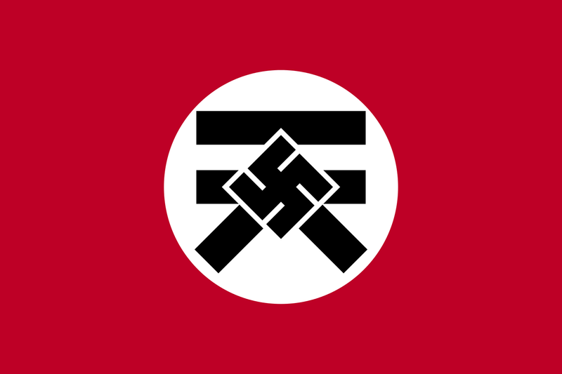
Speaking of an Axistic, authoritarian Japan, here's a flag of an ASB "Nazi" Japan (or rather Japan run by "Nazis by any other name"); why ASB? because it was for a nationstates esque game called Sprite Wars and it's quite ASB as hell but has some interesting mythos and attempts at storytelling so to say.

But anyway, I was going for a "best of both worlds" approach to this flag (or rather the worst of both worlds regarding the nature of this organization) , of which reflects the "Japananazi" theme of my faction. It was quite simple, have a Nazi esque flag with a different symbol with a swastika (and yes I'm using this here and I won't regret it) in it and the red background matching that of the post-1999 Japanese flag; and that symbol in particular is based on the kanji lettering for "Heaven". And speaking of lettering, in case you ask, the organization's name derives from the Japanese lettering for "East Heaven" of which the word "Heaven" is used in a secular sense rather than any kind of religious meaning.

touten_flag__asb__by_kubocaskett-dak0ui2.png
 
ooh you know what time it is, its time for the next 3 flags: Indonesia, Iran and Iraq and without any further adue!
Indonesia:
upload_2016-10-4_21-23-1.png

Colors:
206-17-38
Symbolism: the red stands for courage, the human body and/or physical life. the white stands for purity, the soul or spiritual life and together they stand for a complete human being. the star represents democracy and the 5 points represent the 5 main ideals of democracy: solidarity, peace, tranquility, courage and decisiveness.
Changes: the flag is very similer to Poland and i wanted to fix that, so i tried experimenting with stripes representing the main islands but i couldn't do it so i want with a star and it does now look similer to Japan but not enough to confuse it.
Iran:
upload_2016-10-4_21-38-43.png

Colors:
green: 0-128-0 yellow: 255-242-0
Symbolism: the green represent Islam and the Flora of the nation (mostly in the north). the yellow represent the desert, the yellow circle itself represents the sun ant the dawn of a new era in the 21st century.
Changes: yes, this is the flag of the Safavid dynasty, but it is a good flag, simple yet powerful, everything a flag needs. the current flag is good with a bada** symbol in the center but the edges of the stripes dont look good to me, i would get rid of the border and call it a day, but i know that would make people mad so i looked for alternatives ant this is what i came up with. if it receives bad reviews, ill take it down and do a re-design.
Iraq:
upload_2016-10-4_21-58-27.png

Colors:
green: 0-128-0 red: 206-17-38
Symbolism: the black white and red are the Pan-Arab colors, the green represents Islam, the star represents the (reluctantly) the Democratic party instilled by the USA.
Changes: to be honest, i love the Pan-Arab colors and i didn't want to get rid of them, i decided to go Kuwait style and swapped the black and green and added a star and it looks very to me.

well there you go, it is 10:14 PM where i am so ill bid you good night and here are the next 3: Ivory Coast, Jordan and Kiribati and as always...hope ya like!
 
Last edited:
Then on to Nicaragua. Not a country you hear a lot about unless they are having a coup, but I fall back on the first thing that comes into my head. Flags - identification - signals - low and behold, the flag signal for "N" is a blue and white chequered pattern.

The checkered pattern reminds me of Croatia for some reason.
 
Top
Status
Not open for further replies.
Top