Flag Thread III

Status
Not open for further replies.
Sure many are simple but large numbers of flags are extremely complex.

Yes, but that doesn't mean they should be. Complex flags are a sin, and the people who design them go to Flag Hell, where they are tortured by Vexillucifer.

I recommend reading this. :)
 
while on the topic of the Olympics, here is a flag I made a while back;
fcjndx.png

to be honest, I made it in about 10 minutes and its not my best work.
 
Se5Eq.png


A flag for ancient Egypt, if flags were around back then.

Rvdr5.png

And a communist version; not meant to be realistic at all, just fun.
 
Last edited:
while on the topic of the Olympics, here is a flag I made a while back;
to be honest, I made it in about 10 minutes and its not my best work.

It's pretty awful. The wide range of colours shown in the world globe contrasts terribly with the schematic simplicity of the stars and the death pixels on the rings.


Simplicity of flags is also not true. Sure many are simple but large numbers of flags are extremely complex. Before you even say it I am not talking about flags with arms on them. Finally since when does an organization have to make an incredibly realistic.

Less is more. Depends on taste, otherwise no one would like blazing Gothic architecture or Rococo style. But flags tend to be simple. Look around and you'll see it's true.

Black over blue and other basic colours like that is instant death. Save for red over black, not because it looks better, but because it's already well stablished as a rather dark combination that brings off anarcho-syndicalism.

Also, when you put the world map, aside of being overcomplex (and unneccessary, the world can be represented with other, simpler symbology, like a world globe, or an armillary sphere, or a bezant. Also, you already put "the colors of all nations" to symbolize the world, why to add the world map as well?), you put it in a very sloppy way, just like that, on top of everything, as if you didn't even look where did it fall. Look at the UN flag, it has a world map, but it's much nicer because the complexity of the map and the leafs is compensated by the plain blue on the rest of the flag.

AND, they chose white and sky blue, colours that don't contrast much, but look pleasant. Like gold and white, also little contrast, good for too complex designs because you don't get dizzy looking at it.

My take on the Olympic stuff. It looks weird, because of .jpg screw.

olympicsfuture.jpg
 
Last edited:

Nietzsche

Banned
A flag for ancient Egypt, if flags were around back then.


And a communist version; not meant to be realistic at all, just fun.
The first one is kind of bland, but good. The second one, I don't know why, but I find the communist symbol you cobbled together to be brilliant.

Hey, I once did something similar! It's quite old, and not particularly good... I've been thinking of making a spiffier version.
That's quite pretty. My only complaint is that it looks like Egypt is lorded over by some sort of Robot/Golem God.
 
That's quite pretty. My only complaint is that it looks like Egypt is lorded over by some sort of Robot/Golem God.

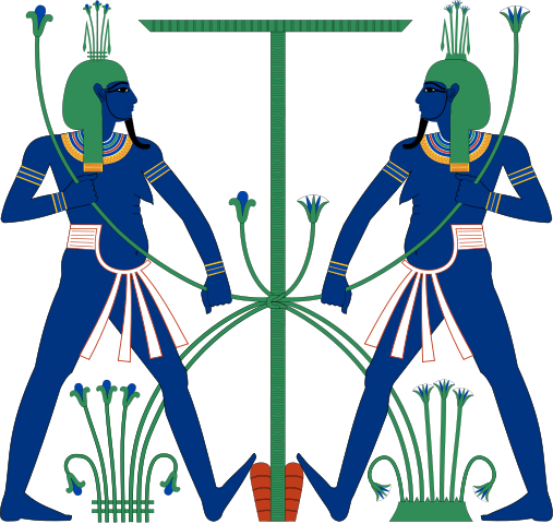
Heh, that's actually the attempt of a much younger me at drawing a sematawy symbol (a representation of the union of Upper and Lower Egypt) in MS paint, kinda like the one in this image, but without the two blue dudes. I always thought it would be fantastic as an Ancient Egyptian coat of arms, if such things were used back then :p

507px-Hapy_tying.svg.png
 
Well that wasn't what you said, you said My immediate thought was a red hammer and sickle in place of the globe, and otherwise the same as OTL. And as I said, that was clichéd and frankly false.
For future reference, I've put this together. Every communist state (I think, I may have missed some). NEVER have they just taken the old flag and put a Hammer and sickle on. In fact the H&S doesn't future on this chart since I used the original Russian communist flag, which was a bit sneaky I admit. As well some of the earlier flags are a bit of a push, East Germany and the Portuguese colonies especially. Hey, I'm making a point not doing proper historical research.
flowroot3796.png


In fact, more specifically the flags DON'T LOOK LIKE THIS:
path3531.png


COMMUNISM DOES NOT WORK THAT WAY :mad:.


Sorry, but this has come up before and I just felt it needed to be done. Nothing personal Martinus Paduei. Plus it was good procrastination :rolleyes:...

Could you do a fascist and/or nazi version of this?
 
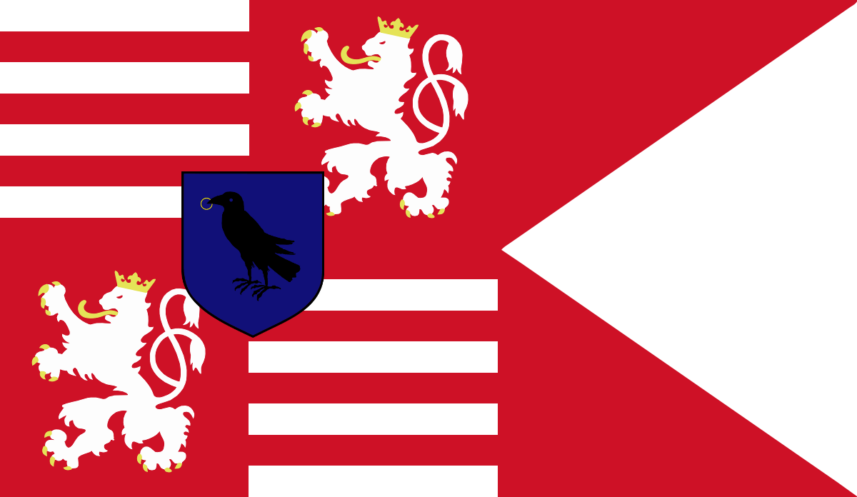
I've seen it referred to as the Black Brigade, Black Regiment, Black Army, Black Legion and more, so I just went with what they were called in the first thing I read about them. n_n'
 
I've seen it referred to as the Black Brigade, Black Regiment, Black Army, Black Legion and more, so I just went with what they were called in the first thing I read about them. n_n'

I guess translations are tricky. I don't know what's the meaning of the origianal Hungarian (or Latin) terms.

Anyway, Matthias' Black Army rocks. It ravaged the whole of Hungary after his death, afraid as the soldiers were that they would not get paid XD
 
Does anyone want to create a British communist flag? Preferably a white background with a red icon in the middle, perhaps an English rose. White representing the more peaceful and ethical premise of 'English socialism' as opposed to Stalinist Russia.

Also, what would a white-blue-green tricolour look like?

You could use the logo of the Communist Party of Britain, the dove would convey that peaceful meaning:

Communist_Party_of_Britain-2.png
 
Top
Status
Not open for further replies.
Top