BobTheBarbarian
Banned
Calling all geography nerds! ")
Which map projection do you like the best? Either for its geometric properties or for aesthetic appeal? Why is it your favorite?
Which would you use as a reference map to teach geography to others?
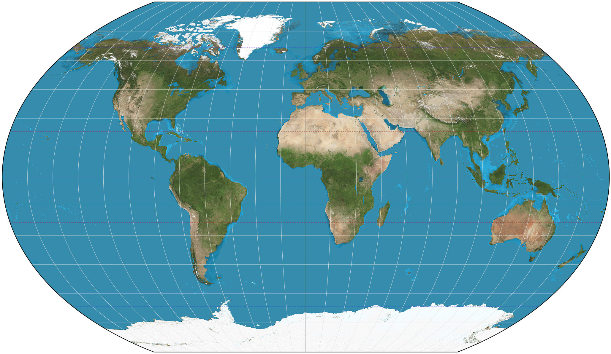
I like Van der Grinten I:

Pros: decent at maintaining shape of countries, less distortion than Mercator, was the official projection used by the National Geographic society from 1922 to 1988.
Cons: slanting Alaska and Siberia, Greenland is still bigger than Australia.
Which map projection do you like the best? Either for its geometric properties or for aesthetic appeal? Why is it your favorite?
Which would you use as a reference map to teach geography to others?
I like Van der Grinten I:
Pros: decent at maintaining shape of countries, less distortion than Mercator, was the official projection used by the National Geographic society from 1922 to 1988.
Cons: slanting Alaska and Siberia, Greenland is still bigger than Australia.