You are using an out of date browser. It may not display this or other websites correctly.
You should upgrade or use an alternative browser.
You should upgrade or use an alternative browser.
Weekly Flag Challenge: Discussion & Entries
- Thread starter Transparent Blue
- Start date
Flag to redesign: Nanjing, China
 The flag isn’t ugly per se, in reality, I’d say by placing its emblem in the center of the red section, it’s displayed the majesty of the medieval capital of the Chinese empire quite well. The problem, however, is the colour.
Not only the red-and-green combination unpopular in Chinese aesthetics, it also had little relevance to the local culture. The combination of “Red = blood of the martyrs who died for the freedom, Green = New life, vegetation, ecology” could be used for every city around the world. Only the white line for Yantze River is relevant.
In addition, its complex emblem of Bìxié, while beautiful, is hard to draw. In the light of the central government’s hostility to cities having their own flags, we need the flags to be easily memorable in order for it to survive as a part of local identity.
So I decided to give it an easy-to-draw floral emblem, topped on an easy-to-remember colour combination. In search for an example, I found the flag of Ehime, Japan.
Example flag: Ehime, Japan
 Wiki:“Yellow stands for happiness, green for peace and white for simplicity and purity. The mon represents orange blossom, the prefectural flower.”
It’s colors are very are well-coordinated and pleasing to the the eye, while it’s floral symbol could easily be drawn by a child. No wonder it’s re-adopted in 1999 after a 1989 abolition.
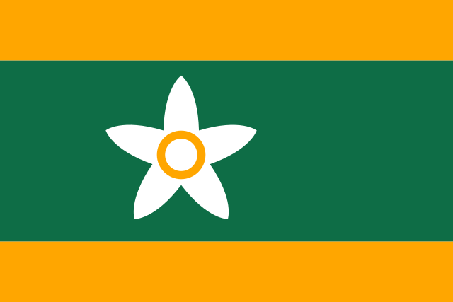
New flag of Nanjing

Purple and Gold alludes to the “Purple-Gold Mountain” north of the city, while six plum blossoms (City flower of Nanjing) symbolizes the status of Nanjing as an imperial capital during the Six Dynasties period.
If you wonder, red is chosen for the plum to commemorate the Ming Dynasty, while gold, associates with water in Fengshui, could also mean the Yangtze River.
New flag of Ehime

Red for the Japanese sun, green (peace) and yellow (happiness) from the original flag, while the central figures are the three famous castles of Ehime, a majestic emblem, but tedious to draw. ( but even this design is better than the 1989-1999 Ehime flag.)
Not only the red-and-green combination unpopular in Chinese aesthetics, it also had little relevance to the local culture. The combination of “Red = blood of the martyrs who died for the freedom, Green = New life, vegetation, ecology” could be used for every city around the world. Only the white line for Yantze River is relevant.
In addition, its complex emblem of Bìxié, while beautiful, is hard to draw. In the light of the central government’s hostility to cities having their own flags, we need the flags to be easily memorable in order for it to survive as a part of local identity.
So I decided to give it an easy-to-draw floral emblem, topped on an easy-to-remember colour combination. In search for an example, I found the flag of Ehime, Japan.
Example flag: Ehime, Japan
It’s colors are very are well-coordinated and pleasing to the the eye, while it’s floral symbol could easily be drawn by a child. No wonder it’s re-adopted in 1999 after a 1989 abolition.
New flag of Nanjing
Purple and Gold alludes to the “Purple-Gold Mountain” north of the city, while six plum blossoms (City flower of Nanjing) symbolizes the status of Nanjing as an imperial capital during the Six Dynasties period.
If you wonder, red is chosen for the plum to commemorate the Ming Dynasty, while gold, associates with water in Fengshui, could also mean the Yangtze River.
New flag of Ehime
Red for the Japanese sun, green (peace) and yellow (happiness) from the original flag, while the central figures are the three famous castles of Ehime, a majestic emblem, but tedious to draw. ( but even this design is better than the 1989-1999 Ehime flag.)
Last edited:
Zambia and Vanuatu entries
Pennsylvania and South Carolina entries
Nanjing and Ehime entries
Well argued !
Last edited:
Apologies for not entering. I couldn't settle on a pairing I was happy with. Ah well.
Good luck to all in the poll.
Sorry I didn't enter. I'm about to move house, internationally, so have very little time available for anything else.
Sorry I didn't enter. I'm about to move house, internationally, so have very little time available for anything else.
Apologies for not entering. I couldn't settle on a pairing I was happy with. Ah well.
No shame in sitting out a round. This time, I'm making up for your absence in this round.
")
While still waiting for @BelfastBrawler to conclude this challenge, I‘d like to consult y‘all that for a French Revolutionary flag challenge, would it be a good idea to allow or forbade the Napoleonic Kingdoms?
Congratulations @Green Painting, for wining this week's challenge!
Also to the rest of the contestants, there were some really cool entries this week.
The new challenge has been posted
Weekly Flag Challenge 227: Liberty Guides Our Steps
In celebration of the upcoming French National Day, with a PoD no later than 8th July 1815, create a flag for an AH country organized under Revolutionary French influences. The country must show certain level of revolutionary ideals on its flag.
It could be a more successful Republican France itself, or
1) the French army marching into a country they didn’t conquer IOTL, and set up an AH Sister Republic, or
2) the OTL French allies organized differently into an AH country, or
3) a French-style revolution breaking out where they didn’t IOTL, under the DIRECT influence of the French Revolution.
Republican government isn’t compulsory, the country can be Napoleon’s creation, but it mustn’t have a monarch from Napoleon‘s family.
Submissions Open: Now
Submissions Close: 14th July 23:59, Paris Standard Time ( or 21:59 GMT)
Can the Revolution go slightly different to OTL?Any thought? Is it too specific?
Yes, of course, any PoD you wantCan the Revolution go slightly different to OTL?
Flag of the French Republic as a member of the European Union of Republics.
ITTL French Republic survived and remained fairly radical republican. However Denmark-Norway and several German monarchies would ally with the revolutionaries and over the course of 14 Wars of Coalition non Republican allied monarchies were almost thrown out of Europe (Ottoman Balkans, Iberia and British Isles are the non republican aligned monarchies in Europe). Over the course of these wars the United States of America was destroyed and brought back into British fold. France and its ally would find more allies in India and China against the Grand Coalition. Free Republic of Annam and Republic of the Kongo are are the other anti coalition allies (these two being EUR allies).
The plain red banner of Revolutionary France was the iconic symbol of the revolution. Its main sister republics and later founded republics all followed the French example by adopting red banners. To help differentiate between flags national mottoes or the name of the nation were often written on the flags. This practice even became the official flag of several allied republics. Eventually France and its 7 close sister republics would join together to form the European Union of Republics. The plain red banner was adopted as the flag of the union while member nations adopted red flags with national mottoes (such as the Italian SPQI and the Rheinish "Einigkeit und Recht und Freiheit"). France, despite being the ones to least often to modify the red banner, would follow suit and adopt the above flag with the revolutionary motto of "Liberty, Equality, Fraternity or Death" on a field of red.
(From the below map)
Here goes then:
Revolutionary Britain
The History
A quirk of birth leads to a Wittelsbach on the thrones of England, Ireland, and Scotland, and a later, milder political union of all three, albeit with heavier oversight from the Lords and the Crown.
Rebellion in the American Colonies is averted and representation in the form of the Colonial Chamber provided. This dampens down reform but not the clamour for it from the commoners who see rich colonials having greater influence on government than they.
Across the channel France hasn't needed to overspend as much it might but the financial cracks and lower class discontent remain. This boils over when a riot over bread prices leads to massive overreaction by local troops and a full blown rebellion occurs. Rebellion leads to revolution and the King flees to a friendlier Britain.
However this inflames the local British poor. One thing leads to another and the Revolutionaries now control northern France and southern Britain...
The Flag
The early flag was the simple horizontal blue-white-green of the republicans but has since been modified as the Revolution senesced and the least aristocratic moneyed classes brought on board.
The British Tricolour now has cottices and is overlain with the new symbol of the Revolution in Britain, a voided white star on red. This is surrounded by a golden laurel and surmounted by 3 golden stars for Liberty, Fraternity, and Equality.
.png")
Revolutionary Britain
The History
A quirk of birth leads to a Wittelsbach on the thrones of England, Ireland, and Scotland, and a later, milder political union of all three, albeit with heavier oversight from the Lords and the Crown.
Rebellion in the American Colonies is averted and representation in the form of the Colonial Chamber provided. This dampens down reform but not the clamour for it from the commoners who see rich colonials having greater influence on government than they.
Across the channel France hasn't needed to overspend as much it might but the financial cracks and lower class discontent remain. This boils over when a riot over bread prices leads to massive overreaction by local troops and a full blown rebellion occurs. Rebellion leads to revolution and the King flees to a friendlier Britain.
However this inflames the local British poor. One thing leads to another and the Revolutionaries now control northern France and southern Britain...
The Flag
The early flag was the simple horizontal blue-white-green of the republicans but has since been modified as the Revolution senesced and the least aristocratic moneyed classes brought on board.
The British Tricolour now has cottices and is overlain with the new symbol of the Revolution in Britain, a voided white star on red. This is surrounded by a golden laurel and surmounted by 3 golden stars for Liberty, Fraternity, and Equality.
Last edited:
Here goes then:
Revolutionary Britain
The History
A quirk of birth leads to a Wittelsbach on the thrones of England, Ireland, and Scotland, and a later, milder political union of all three, albeit with heavier oversight from the Lords and the Crown.
Rebellion in the American Colonies is averted and representation in the form of the Colonial Chamber provided. This dampens down reform but not the clamour for it from the commoners who see rich colonials having greater influence on government than they.
Across the channel France hasn't needed to overspend as much it might but the financial cracks and lower class discontent remain. This boils over when a riot over bread prices leads to massive overreaction by local troops and a full blown rebellion occurs. Rebellion leads to revolution and the King flees to a friendlier Britain.
However this inflames the local British poor. One thing leads to another and the Revolutionaries now control northern France and southern Britain...
The Flag
The early flag was the simple horizontal blue-white-green of the republicans but has since been modified as the Revolution senesced and the least aristocratic moneyed classes brought on board.
The British Tricolour now has cottices and is overlain with the new symbol of the Revolution in Britain, a voided white star on red. This is surrounded by a golden laurel and surmounted by 3 golden stars for Liberty, Fraternity, and Equality.
View attachment 564003
A nice balance between simplicity and detail. Great stuff.
Thank you. The 3 stars sold it on me.A nice balance between simplicity and detail. Great stuff.
Would you believe it was originally going to be an American Republic? But playing around with the colours reminded me of an old Victorian British Republic Flag I'd done with purple and a sun and I thought it could easily adjust to the Napoleonic era. There is potential for it being a Union of British Republics with the members each having a coloured variant.
The Revolution to End All Revolutions
Point of Departure: Napoleon Bonaparte - A Subtle Man
From the moment he was thrust into command via battlefield commission in Italy, Napoleon became the fulcrum on which the Revolution leveraged change throughout the continent. His superiors, upon learning of his strategies, called him “mad,” but by then, it was often too late. Those serving under his command – and his army swelled to fantastic size – loved him. Napoleon was a believer. He believed in the ideals of the French Revolution. He believed in the ideals of the perfect republic. He believed that the people deserved to have the biggest voice in their own fate.
And so, wherever he went, he used spies and informants to organize and prepare the people, to create cells of natives who supported those same ideals and who wanted to avoid bloodshed if they could. Napoleon set up political units and took on volunteers to join his Armée de la République. He established true republican governance and put real power in the hands of trusted, local folk. He eschewed political power, making attempts to control him via bribery doomed to fail. His most famous quote was in response to such an attempt:
“The Council has met, and they want to make you Emperor, Napoleon!”
“Then they do not understand how a Republic functions at all. A Republic does not need an Emperor.”
Monarchs, tyrants, and despots were forced to flee. The Catholic Church, although not forbidden, was severely restricted and taxed. It lost political power. In the end, even the French Republic found itself unable to waver far from its own principles. Napoleon and his Armée de la République were simply too powerful, and always watching. Napoleon was elected President of the National Assembly and oversaw the European Republican Convention which was tasked with creating a permanent governing charter. This landmark document had provisions for organizing the political units his army was creating into larger structures, and formalized sister-republics took shape out of the chaos of European revolution.
Iberia was one of Napoleon’s great successes. Officially, he never campaigned in Spanish territory. It was Napoleon’s refusal to answer communications as President that eventually led Spain’s King Charles IV to a sweeping declaration of the new Republic of Spain. Although the Republic of Spain was not organized according to the ERC Charter, Napoleon agreed that the benefit of avoiding war was well worth the compromise. The Spanish royal family remains to this day, although in a beloved advisory role.
Portugal had established itself as an ERC Republic, but voted to reorganize as part of the Republic of Spain in 1822 when Brazil declared its independence. This led to the institution of the Republic of Iberia.
For those interested:


The Republic of Iberia - The Star of Unity (1822)

This flag was arrived at after weeks of negotiation. Until it was approved, a simple tricolor in red, blue, and gold was in fairly wide use as a celebratory flag of union. The union flag, however, was never approved as an official flag of the republic. This one was chosen to contrast with the many evolving flags of Europe and her republics. Among the rules agreed upon in committee:
Point of Departure: Napoleon Bonaparte - A Subtle Man
From the moment he was thrust into command via battlefield commission in Italy, Napoleon became the fulcrum on which the Revolution leveraged change throughout the continent. His superiors, upon learning of his strategies, called him “mad,” but by then, it was often too late. Those serving under his command – and his army swelled to fantastic size – loved him. Napoleon was a believer. He believed in the ideals of the French Revolution. He believed in the ideals of the perfect republic. He believed that the people deserved to have the biggest voice in their own fate.
And so, wherever he went, he used spies and informants to organize and prepare the people, to create cells of natives who supported those same ideals and who wanted to avoid bloodshed if they could. Napoleon set up political units and took on volunteers to join his Armée de la République. He established true republican governance and put real power in the hands of trusted, local folk. He eschewed political power, making attempts to control him via bribery doomed to fail. His most famous quote was in response to such an attempt:
“The Council has met, and they want to make you Emperor, Napoleon!”
“Then they do not understand how a Republic functions at all. A Republic does not need an Emperor.”
Monarchs, tyrants, and despots were forced to flee. The Catholic Church, although not forbidden, was severely restricted and taxed. It lost political power. In the end, even the French Republic found itself unable to waver far from its own principles. Napoleon and his Armée de la République were simply too powerful, and always watching. Napoleon was elected President of the National Assembly and oversaw the European Republican Convention which was tasked with creating a permanent governing charter. This landmark document had provisions for organizing the political units his army was creating into larger structures, and formalized sister-republics took shape out of the chaos of European revolution.
Iberia was one of Napoleon’s great successes. Officially, he never campaigned in Spanish territory. It was Napoleon’s refusal to answer communications as President that eventually led Spain’s King Charles IV to a sweeping declaration of the new Republic of Spain. Although the Republic of Spain was not organized according to the ERC Charter, Napoleon agreed that the benefit of avoiding war was well worth the compromise. The Spanish royal family remains to this day, although in a beloved advisory role.
Portugal had established itself as an ERC Republic, but voted to reorganize as part of the Republic of Spain in 1822 when Brazil declared its independence. This led to the institution of the Republic of Iberia.
For those interested:
The Republic of Iberia - The Star of Unity (1822)
This flag was arrived at after weeks of negotiation. Until it was approved, a simple tricolor in red, blue, and gold was in fairly wide use as a celebratory flag of union. The union flag, however, was never approved as an official flag of the republic. This one was chosen to contrast with the many evolving flags of Europe and her republics. Among the rules agreed upon in committee:
- No tricolor bands
- No crosses
- No heraldic crests
- Preserve the colors of the new flags in use in Spain and Portugal
- Add a new icon to symbolize the unity of the Iberian peninsula under the new republic
Last edited:
Republic of the Third Estate (R3E)
The Reign of Terror is even more bloody as Jean-Paul Marat survives the assassination attempt on him by Charlotte Corday when she slips on the wet floor while speaking with him during his bath. Her knife sliced his arm as she fell, but she could not complete the murder as her head struck the floor killing her. Marat's wife Simone blamed the Girondins and a greater purge of their numbers occured, even into their hiding places in Normandy where many had fled.
The Flag of the R3E was based off the French cockade. The red and blue remain the same, being identified with Saint Martin and with Saint Denbut. The white was replaced with gray, since gray had been associated with peasants and workers for some time. The field is divided diagonally in-two and represents the guillotine that freed France from the monarchy. Along the divide is a red slash with three droplets representing the Third Estate or any one not of the First and Second (Clergy and Monarchy). A quartered cockade is place in the canton.
Last edited:
I thought I would be getting tricolors with classical-style seals on them, as per the fashion of French Revolution days. You guys are giving me semi-commie red stars.
Share: