Weekly Flag Challenge: Discussion & Entries

Are they missing from the winners thread or this one or both? I usually copy and paste (rather than direct image quoting) since bandwidth is less a problem these days. But perhaps an update to the wiki is best.

Personally, I'd create "summary images" grouping winning entries into 50 per image but that's a lot of work hence why I haven't done it!
 
Are they missing from the winners thread or this one or both?

Those that are not visible are usually missing from both threads.

I usually copy and paste (rather than direct image quoting) since bandwidth is less a problem these days. But perhaps an update to the wiki is best.

You know, first, try and check whether the winners of rounds 2, 82, 86, 150, 156, 158 have their entries visible. (Those are the only six I haven't been able to salvage.) It's entirely possible there might be some issues with my browser and certain images aren't showing up properly for me, despite being properly hosted by the winning contestant. I just want to be sure they're not visible for everyone, rather than just me.

I'll attempt to upload them in the wiki image archive and make a showcase page for them. (The winners are linked to from the list, but that's just text proof that can stay either way - regardless of whether the flags are visible or not. We'll just give the flags an extra space of their own.) People have uploaded all sorts of silliness to the image archive over the years, and it was just recently cleaned of that sort of obsolete or non-AH stuff. AH flags and maps are definitely among the main things that can and should be uploaded to the wiki, so I think the WFC has full leeway in this regard.

Personally, I'd create "summary images" grouping winning entries into 50 per image but that's a lot of work hence why I haven't done it!

I've thought of that solution. As you say, it's a lot of work with arranging them all. :D And not all of them might look that great if changed to a certain size.

----

EDIT: I've started a new page for the gallery. It took me a little experimenting to come up with something that would be easy to look at and browse, but I think this is a pretty good template. What do you and the others think ? Can I continue ?
 
Last edited:
You know, first, try and check whether the winners of rounds 2, 82, 86, 150, 156, 158 have their entries visible. (Those are the only six I haven't been able to salvage.) It's entirely possible there might be some issues with my browser and certain images aren't showing up properly for me, despite being properly hosted by the winning contestant. I just want to be sure they're not visible for everyone, rather than just me.
Not visible for me either.
I doubt we'll be able to find those of the banned but for the latest we can ask their authors.
I also did a mini search on deviantart but suspect under different username.
 
Not visible for me either.

Hm, pity. But at least it's not just a tech issue on my side.

I doubt we'll be able to find those of the banned but for the latest we can ask their authors.

I've already asked Mirror and Flashman for help with their's. Aside from those 6 flags, I have all of the others. Even those that are currently down. So not much is missing.

I also did a mini search on deviantart but suspect under different username.

I've searched Aesir's DA account, but he has no flags there.
 
Mirror has replied to me, we'll be sorting out his missing flags soon.

On an even more positive note, I searched around my hard drive and managed to find the lost flags by autonomousoblast. Especially that Scandinavian set for Round 82 that I was worried we'll have to write off without any images. Excellent ! Currently, I'm snooping around whether I don't have his Duchy of Wallachia flag from Round 86 as well. I need to be sure first.
 
I am going to echo the sentiment that having this sort of a gallery is a great idea.

A small suggestion that I thought of while browsing: maybe there should be a column with a short description of the challenge as well? Often the name is enough (such as #21 Create A Communist Flag), but sometimes the connection between the challenge and the winner isn't obvious at all (#54 Wait, what?!).
 
I am going to echo the sentiment that having this sort of a gallery is a great idea.

Thanks for the kind compliments ! :cool:

I think this sort of "book-keeping" is good for the long term health and reputation of the contest. Especially since I don't seem to be able to retrieve 2 particular flags, even after fiddling around on the Internet and on archiving sites. To avoid retreading such a situation in the future, I'll be doing regular updates of the gallery too.

A small suggestion that I thought of while browsing: maybe there should be a column with a short description of the challenge as well? Often the name is enough (such as #21 Create A Communist Flag), but sometimes the connection between the challenge and the winner isn't obvious at all (#54 Wait, what?!).

Not a bad suggestion. I might add to the more obscure descriptions, but I want to get the rough work finished first. :)

However, note that I've decided to provide links under the round numbers. These lead straight to the post with the description of the specific round's challenge. Given all the painstaking collecting of links in the main list, I thought I could reuse those in some sensible way while designing the overview on the Showcase page.
 
Last edited:
Y'know, looking at the Wiki, you can really see how the WFC has evolved. Titles have all become puns or references, the entries a bit more elaborate and polished. You can even see when the rule was created that you can't enter your own contest came into place. Pretty cool.
 
Not a bad suggestion. I might add to the more obscure descriptions, but I want to get the rough work finished first. :)

However, note that I've decided to provide links under the round numbers. These lead straight to the post with the description of the specific round's challenge. Given all the painstaking collecting of links in the main list, I thought I could reuse those in some sensible way while designing the overview on the Showcase page.

I completely missed that. This might be quite enough, but maybe a reminder in the beginning (click on the round numbers to see the full details) could help more absent-minded readers.
 
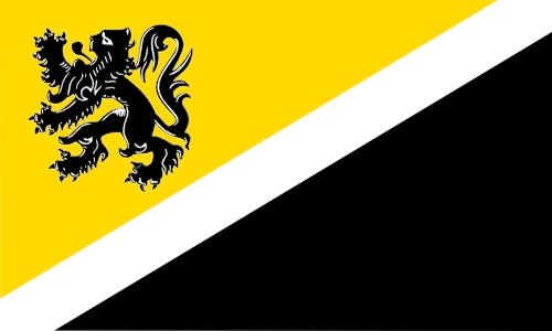
Here is Aesirknight's winning design from round 2:

AesirKnight%20-%20Flanders.png
 
The showcase looks great but the images are too small in the table and, as pointed out, the descriptions (both the round descriptions and the winning flag descriptions) aren't visible and it's not clear that the reader can click on the round number for more details. Between the showcase and the "quick overview" on the main WFC page there is a lot of duplicated information and I would personally just combine the two lists. Lastly, if dividing the list into sections of 50 is meant for comfortable categorisation and navigation, it seems that this size is still too large; I would recommend dividing the rounds by year. Otherwise, really great work here. Thanks for taking the time to compile all of this!
 
Here is Aesirknight's winning design from round 2

I have no idea where you had this stored, but thanks a ton !

The showcase looks great but the images are too small in the table

They're thumbnails. On our wiki, you can click any thumbnail to enlarge it. And keep clicking until you get to the source file. (Same principle as on Wikipedia and so on.)

I've experimented with larger thumbnails, but the more leeway I gave them, the more horrible it started to look. The tables started feeling overwhelming and adding unintentionally to the length of the whole page. My initial plan were much larger thumbnails, which would simply go one after the other, without any neat table. The page would look long and unappealing as a result. Luckily, I realised very quickly there's a better way to do a gallery, even on DokuWiki. But, with the large number of flags present, it did necessitate their initial thumbnails being a bit smaller.

and, as pointed out, the descriptions (both the round descriptions and the winning flag descriptions) aren't visible and it's not clear that the reader can click on the round number for more details.

This will be rectified. I plan to make everything as understandable as possible, while avoiding cluttering the tables.

Between the showcase and the "quick overview" on the main WFC page there is a lot of duplicated information and I would personally just combine the two lists.

I've thought about that, but it would be too much of a hassle to move everything and to rework the table in order to include the voting threads and whatnot. The whole point of the showcase is that it isn't cluttered. It's intended for visitors as well, whereas the list isn't. That one's more for our convenience. (And frankly, if I had not worked on it up until now, I would have severe issues making any sort of gallery.)

Lastly, if dividing the list into sections of 50 is meant for comfortable categorisation and navigation, it seems that this size is still too large; I would recommend dividing the rounds by year. Otherwise, really great work here. Thanks for taking the time to compile all of this!

I'm afraid I'm not going to change that. Thinking about it, dividing things by year would create a slew of tables of uneven length, and only make the page longer. It would also create 8 different sections, rather than just 4. Why add needless complexity ? It would be even more headache-inducing than what I already had to do while making the tables.

I chose 50 rounds for each table because 50 is a nice, round number. People get to see a lot of flags in one go, but still just enough to not feel overwhelmed while they're scrolling or clicking a hyperlink to just one particular section. Would we prefer to have tables starting and ending at unpredictable numbers (e.g. ends at 32, starts at 33, ends at 67, starts at 68), with seemingly no rhyme or reason where it ends or starts other than the year ? It would just confuse newcomers, and that's exactly what the showcase is aimed against.

Therefore, I chose a regular length to every table (50 rounds, not a single more or less). That's the most democratic approach to putting the flags in the gallery, and the most accomodating to any newcomer who's completely new here, but has an interest in whether we have contests and so on. The less you confuse people and the more predictable you are in showcases like this, the better.
 
I am happy to announce I've just finished completing the gallery. :) Beyond regular adding of new entries, some small additions might appear in the future, but for now, I consider the effort more or less finished.
 
Challenge cross post.
Flag Challenge #172: Unity of Division

Design flags for 2 countries who claim the name and mantle of their collapsed predecessor; each country having formed as a union of lesser states formed in the collapse/division of the predecessor state.
Restrictions:
No fictional countries ie no SciFi or Fantasy entries.
Each of the 2 flags should fit within a 200x400 px rectangle (preferably both on the same image file for ease of copy).

Submissions Open: Now
Submissions Close: 2 September 2017
Voting Closes: 9 September 2017 ish.
 
Sorry about them being two seperate images, I didn't have time to combine them.

People's Republic of The Netherlands
People's Republic of The Netherlands.png


Nationalist Union of The Netherlands
Nationalist Union of The Netherlands.png


Following the end of World War II, conflict broke out in the already war-weary Netherlands between nationalist and communist factions. Communists inhabiting the northern provinces proclaimed the founding of a "People's Republic of the Netherlands" with it's capital in Groningen. To the south, a single nationalist faction rose to prominence and secured Amsterdam as it's capital. From there, the "Nationalist Union of The Netherlands" was founded and it's armies marched north to meet it's hated foe. The two sides clashed time and time again, but neither was able to gain the upper hand and eventually a ceasfire was reluctantly signed. The two sides continued to stay at odds and fight occasional border skirmishes up until the fall of the Soviet Union, when a NATO-led incursion forcefully unified the two sides. Today, The Netherlands is an unstable democracy fraught with tension between the two sides, and civil war still hangs in the air just waiting to be sparked once more.


Here's a challenge: Devise a Maryland flag involving neither the Calvert nor the Crossland arms.

Er, there's only one official challenge, created by the previous challenge's winner. The Professor posted his for the week on this page; it's the quoted block of text
 
Top