Weekly Flag Challenge: Discussion & Entries

Had to change mine thanks to Mirror ;)

The Civil or National flag carries traditional Yellow and Black for Flanders, and also Brabant where Antwerp was situated in; checkered for Antwerp design.
The Naval flag or ensign includes a red centre reminiscient of the UK Red Ensign. As the Freestate's naval capacity is carried out by the UK this flag tends only to be borne by Coast Guard and other governmental maritime services, though UK ships specifically on patrol of the FSA coast sometimes fly it in addition to the UK's.
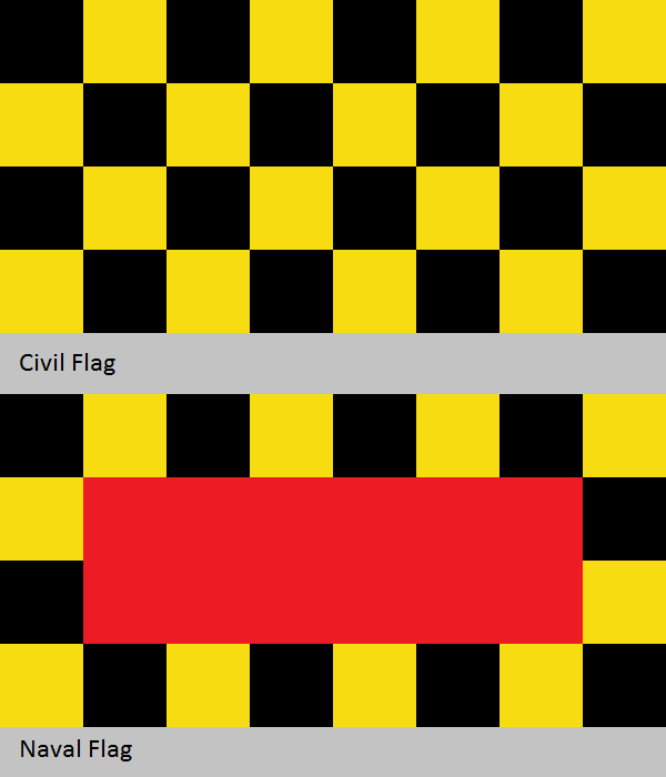
FreestateAntwerpCivil&Naval.png
 
Last edited:
Now that the vote is over, I'll elaborate on my comments about Mirror's entry: I too was originally quite taken with the idea of adding that blue in. On my second draft (the final I submitted being the third draft) the edge stripes were blue, not extra-white. However, during my research, I found that the references to the blue in the modern Antwerp flag and other such things actually is a symbol of inclusion of a specific area that might not actually be included in the protectorate as envisioned by that article that laid forth the backstory. In the end that's why I dropped the blue, but from a purely aesthetic point of view I think the blue really adds to these concepts.
 
Now that the vote is over, I'll elaborate on my comments about Mirror's entry: I too was originally quite taken with the idea of adding that blue in. On my second draft (the final I submitted being the third draft) the edge stripes were blue, not extra-white. However, during my research, I found that the references to the blue in the modern Antwerp flag and other such things actually is a symbol of inclusion of a specific area that might not actually be included in the protectorate as envisioned by that article that laid forth the backstory. In the end that's why I dropped the blue, but from a purely aesthetic point of view I think the blue really adds to these concepts.

That is interesting! My research never went quite that far, I just liked the look that blue added to the flag (I started with white-yellow). I do agree that blue edge stripes would have looked great in your flag.
 
Flag Challenge no 143: Britishest Quebec

FLAG CHALLENGE № 143: Britishest Quebec


If you look at the flag of the province of quebec, it's pretty obvious that francophones are the predominant ethnic group among its population. What if for whether reasons that would have happened post 1840s, modern days quebeckers were predominantly anglophones ?

The Challenge: Create a alternate provincial flag for a canadian province of Quebec that represent the fact that francophones are, at best, a small minority.

Submissions Open: Now
Submissions Close: Midnight (Sydney Time) Sunday 10th April
Voting Opens: Monday 11th April
Voting Closes: Saturday 17th April
 
Hmmm, at first I was skeptical, but now thinking about it this is hardest one to come up with an idea for yet. I like it. I don't even have a rough first draft yet, but I will say this is the most I've learned about Quebec deliberately in awhile while doing research.
 
Here's a quick and dirty submission.

There's no one clear POD, more like a number of small changes. First, the Continental Army does even better in the American Revolutionary War and the gains from the Treaty of Paris include a large chunk of the OTL Southern Ontario as well.

This means that the loyalists fleeing to Canada are set to arrive right at the heart of Quebec and the tensions rising from the conflict over language and legal system shape up to be significantly worse. Unsurprisingly, the British administration sides more with the anglophones and the rights of francophones are curtailed bit by bit over decades-long cycles of resentment, rebellion and repression.

Consequently, the francophone Canadian emigration to the United States which was already a major demographic factor in OTL, becomes a veritable flood in TTL. During the 19th century, more than half of the francophone population leave Canada. Among other weird issues, the US states of Vermont, New Hampshire, Massachusetts and Rhode Island now have significant francophone minorities, or in the case of the first two, actual minority-majorities.

By the second half of the 20th century, the francophone population of Quebec province is only somewhere between 20-30%. Although French is again one of the official languages of the province, this is regarded by most Canadians as a quaint historical oddity. Indeed, the French past has now acquired almost a romanticized aura. Of course, this also ignores most of the injustices of the past, much to the chagrin of remaining French Canadians.

Thus, when the provincial flag for Quebec was chosen, the design incorporating both French and English symbols became an unanimous favorite and was adopted with almost no legislative debate.

The flag is a red field with the royal Arms of France in the canton, charged in the fly with the golden Lion of England.

Quebec.png
 
Last edited:
A bit vague with the POD this one :D

The Province of Saint Laurence
With the adoption of the Maple Ensign as the Canadian Confederation’s national flag, the public’s attention was drawn to those of the provinces.
The Province of Saint-Laurence, formerly Canada East or Quebec, in particular had a highly vocal discussion involving its Francophone minority who were strongly against overt Anglophone symbols and so an ensign with the SL arms was rejected.
Variants based on the arms themselves were debated and with both French fleurdelys and English leopards rejected the most acceptable flag involved the maple leaf emblems.
Eventually a flag with 3 joined maple leaves in green on gold was agreed upon, symbolically reflecting the Francophone, Anglophone, and Native peoples working together

BritishQuebec4.png
 
Last edited:
My entry. Inspired pretty heavily by the coat of arms (though I think so far everyone's taken a look at that ;) ) The top blue is for the area's French heritage, the distant past, the middle white and red England, the closer past, and the bottom gold for Canada, the future. The two stars are for Montreal and Quebec City, the largest and most important cities in the province.

EngQeb.png
 
Oh yeah, most of us inspired by the arms. Though since they date from 1868 someone could theoretically make different arms and base a flag on those.
 
My entry. Inspired pretty heavily by the coat of arms (though I think so far everyone's taken a look at that ;) ) The top blue is for the area's French heritage, the distant past, the middle white and red England, the closer past, and the bottom gold for Canada, the future. The two stars are for Montreal and Quebec City, the largest and most important cities in the province.

Looks a bit like Chicago's flag.
 
Oh yeah, most of us inspired by the arms. Though since they date from 1868 someone could theoretically make different arms and base a flag on those.

could also refers to local fauna, geography, events or even historical figures. I've been planning on using general's wolfe COA as basis for a flag in one of my TL.

Also, if you take the challenge in the sense of "quebec's flag doesn't stand out from the others", a few statistics from among the 13 provincial/territorial flags are:

2 are british ensigns
4 are banner of arms
4 contain their COA in a manner other then a british ensign or banner of arms
1 is a modified union flag
2 are based on the federal flag
5 contain the saint george cross in a proeminent fashion
4 contain a single lion
3 contain a union flag
 
Last edited:
Looks a bit like Chicago's flag.

I'm from near there, and their flag is honestly worthy of being national level rather than city level, heh. I'm not going to lie and say I wasn't partially thinking of it when making this ;) It's a good inspiration. One of my favorite teams uses it as their home kit, after all.
 
Top