You are using an out of date browser. It may not display this or other websites correctly.
You should upgrade or use an alternative browser.
You should upgrade or use an alternative browser.
The XK-BAM map series
- Thread starter Klime
- Start date
I've been keeping track of this stuff in a google doc if it helps, I don't think there's a need for a completely new threadIf Klime isn't updating the Google Drive and nothing has been fixed or added shouldn't there be a new thread with someone who keeps an active Google Drive?
I've been keeping track of this stuff in a google doc if it helps, I don't think there's a need for a completely new thread
Even in your Google Doc there are things like this:
Why do some of the outlines have corners? I thought the idea was that it should be a diagonal wherever possible especially when this is just indicating control of the islands. In addition why are there country coloured tiles directly touching water where they are islands? I thought the whole point of black/coast tiles was to indicate that there is land and ocean in this tile. If there is a yellow tile as above surrounded by no black tiles are we saying that it's 100% land in that pixel and above it it's 100% water with an exactly straight line coast along the exact point where the pixels change? The lines are obvious because they have no black coast tiles so it's not coast
I want to do 2k BAM maps of WW1+ but where are the rules to refer to when making it?
Also what colour scheme is in use here?
In the 1914 map Germany has two separate internal border colours.
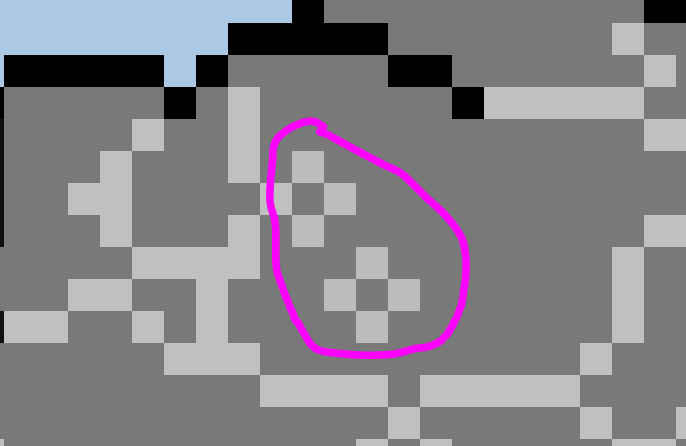
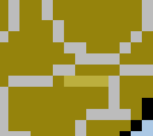
Also what's this?
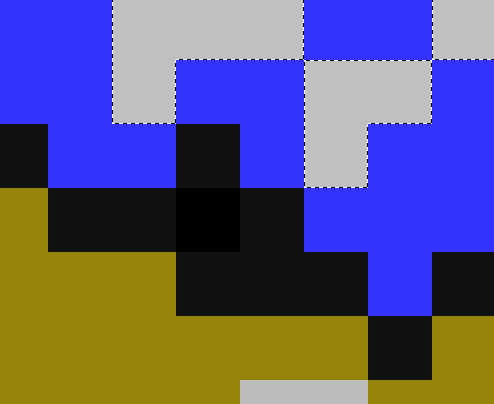
Andorra is the same colour as mountains and coast. Speaking of which why are mountains, coast and internal lakes the same colour? Why are mountains marked at all?

Malta has a border (true in other versions of 2k) and no internal land mass, compare to the topography map:
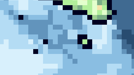
Which of these is correct?
Speaking of the topography map, what is this in the Azores? This colour is not present anywhere else:
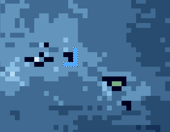
There's also this in two locations:
 ]
]

I'm going to be honest I'm pretty ignorant about how these base maps are made but is there no way to list all of the colours present in an image in a row? Then surely these mistakes could be spotted quickly. http://www.colorexplorer.com/imageimport.aspx
They are not on the 1914 or other versions of the map so were these maps made via different processes?
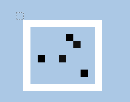 2020 map
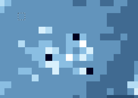 topographic map
https://upload.wikimedia.org/wikipedia/commons/0/05/Asia_-_South_China_Sea_-_Mui_Da_Nang_to_Shen-Ch'uan_Chiang_including_Hai-Nan_Tao_and_Paracel_Islands_(Paracel_Islands_cropped).jpg
Actual map of Parcel islands.
I hit the limit for attaching images.
Edit 1: On 2020, 1914 and 1945 maps Ucal lake in Mongolia is just a circle.
---
Unless someone comments otherwise it seems the topographic map has fewer mistakes so I was going to use this to make 1914 to 1945 2k maps. Hopefully doing every border change. I think I will change the colour of mountains and internal rivers though. Also I really do not understand the rules behind internal rivers. You've got the Don but not St Lawrence? I don't want to start doing this and then it turns out there's a problem with the rivers or something
Also what's this?
Andorra is the same colour as mountains and coast. Speaking of which why are mountains, coast and internal lakes the same colour? Why are mountains marked at all?
Malta has a border (true in other versions of 2k) and no internal land mass, compare to the topography map:
Which of these is correct?
Speaking of the topography map, what is this in the Azores? This colour is not present anywhere else:
There's also this in two locations:
I'm going to be honest I'm pretty ignorant about how these base maps are made but is there no way to list all of the colours present in an image in a row? Then surely these mistakes could be spotted quickly. http://www.colorexplorer.com/imageimport.aspx
They are not on the 1914 or other versions of the map so were these maps made via different processes?
https://upload.wikimedia.org/wikipedia/commons/0/05/Asia_-_South_China_Sea_-_Mui_Da_Nang_to_Shen-Ch'uan_Chiang_including_Hai-Nan_Tao_and_Paracel_Islands_(Paracel_Islands_cropped).jpg
Actual map of Parcel islands.
I hit the limit for attaching images.
Edit 1: On 2020, 1914 and 1945 maps Ucal lake in Mongolia is just a circle.
---
Unless someone comments otherwise it seems the topographic map has fewer mistakes so I was going to use this to make 1914 to 1945 2k maps. Hopefully doing every border change. I think I will change the colour of mountains and internal rivers though. Also I really do not understand the rules behind internal rivers. You've got the Don but not St Lawrence? I don't want to start doing this and then it turns out there's a problem with the rivers or something
Last edited:

Here is a 2k blank map which should have no errors.
The ocean is blue.
The land is green.
Tiles with water and land are coloured dark blue to avoid confusion with borders and mountains.
Tiles with water that are less than two pixels thick surrounded by land are also only included if the water is a certain percentage of that area, but I have no idea what that percentage is and whoever made the topographical maps should know.
Also I recommend including the names of the people who made each map on the Google Docs list because otherwise how can people be held accountable for what they make. If you spot any errors please let me know ASAP so I can post a fixed version.
here is a double wide version:
And pacific centred:
If someone wants to change the line in the pacific let me know, I cut through the Azores but left Verde in.
I made some lat/long grids. Currently, I only have the lines spaced every 10 degrees, but I'm eventually going to add the tropics of Cancer and Capricorn, along with degree multiples of 5. My final (for a while) grid map will be a 1-degree patch for the Lower 48. If you see any mistakes, please @ me here.
My doc is basically just an organized collection of stuff other people post here, I haven't done anything in the way of refining their work or etc, I don't have that much dedication to the project. My main goal here is to help out in an easy, effective way without taking much more than maybe one hour every few weeks.Even in your Google Doc there are things like this: View attachment 575116View attachment 575117
Why do some of the outlines have corners? I thought the idea was that it should be a diagonal wherever possible especially when this is just indicating control of the islands. In addition why are there country coloured tiles directly touching water where they are islands? I thought the whole point of black/coast tiles was to indicate that there is land and ocean in this tile. If there is a yellow tile as above surrounded by no black tiles are we saying that it's 100% land in that pixel and above it it's 100% water with an exactly straight line coast along the exact point where the pixels change? The lines are obvious because they have no black coast tiles so it's not coast
I want to do 2k BAM maps of WW1+ but where are the rules to refer to when making it?
Also what colour scheme is in use here?
A map like what?Does anyone have a map like this for Syria?
no, but i can help u out what region do u need?Is there a base for the topographic map that can be used for smaller intervals? Like how there is an unfinished base map for rivers.
I have two questions.
First, why is the Caspian Sea different between 1930 and 2019? what caused it to shrink just like the Aral did?
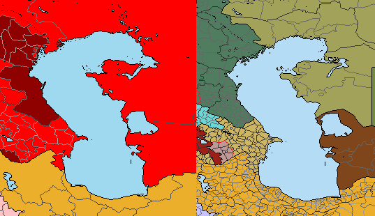
Second, in the 2019 2K map there are missing administrative divisions for Belize, Guatemala, El Salvador, Haiti, the Dominican Republic, the UK, Iceland, Switzerland, Croatia, Bosnia, Albania, Montenegro, Macedonia, Moldova, Latvia, Armenia, Azerbaijan, Jordan, the UAE, Kuwait, Qatar, Bhutan, and the Philippines.
Will it be updated soon? tell me because if it isn't then I'll try to make my own administrative divisions for use in my personal maps, not for the official 2K one.
First, why is the Caspian Sea different between 1930 and 2019? what caused it to shrink just like the Aral did?
Second, in the 2019 2K map there are missing administrative divisions for Belize, Guatemala, El Salvador, Haiti, the Dominican Republic, the UK, Iceland, Switzerland, Croatia, Bosnia, Albania, Montenegro, Macedonia, Moldova, Latvia, Armenia, Azerbaijan, Jordan, the UAE, Kuwait, Qatar, Bhutan, and the Philippines.
Will it be updated soon? tell me because if it isn't then I'll try to make my own administrative divisions for use in my personal maps, not for the official 2K one.
Last edited:
I dont know the exact reasons for it, but Caspian sea is smaller now compared to 19th century and early 20th century maps, so the maps look right, as far as i know volga river has been causing the filling around Astrahan area for agesI have two questions.
First, why is the Caspian Sea different between 1930 and 2019? what caused it to shrink just like the Aral did?
View attachment 582357
Second, in the 2019 2K map there are missing administrative divisions for Belize, Guatemala, El Salvador, Haiti, the Dominican Republic, the UK, Iceland, Switzerland, Croatia, Bosnia, Albania, Montenegro, Macedonia, Moldova, Latvia, Armenia, Azerbaijan, Jordan, the UAE, Kuwait, Qatar, Bhutan, and the Philippines.
Will it be updated soon? tell me because if it isn't then I'll try to make my own administrative divisions for use in my personal maps, not for the official 2K one.
Share: