You are using an out of date browser. It may not display this or other websites correctly.
You should upgrade or use an alternative browser.
You should upgrade or use an alternative browser.
The Q-BAM Improvement and Core Thread
- Thread starter iori
- Start date
That's quite a change to the Islands;Patched up the Outer Hebrides, Orkney Islands and Shetland Islands. EDIT: patched the Faroes and Rockall.
View attachment 802571
comparison [Top = current]
Does anyone else have thoughts on this?
It's worth reflecting that these Northern islands are at very high latitudes, which are the most distorted on most two-dimensional maps. Since the Q-Bam is not a standard projection, I'd suggest deciding exactly where these pixels should be placed is tricky, to say the least.That's quite a change to the Islands;
comparison [Top = current]
View attachment 803683
Does anyone else have thoughts on this?
Assuming that this is basically Robinson, the new patch seems better to my eye. I definitely think Rockall is right to be closer to the British Isles and that Faeroe should be more compressed in the North-South direction. The question is, are we wanting to "Robinsonify" the Q-Bam further? If we are, I'd also be interested in hearing if people agree that the patch is superior.
I do not see it as being any more drastic a change than when you redid all of the Pacific. And everyone just accepted that right off the bat, myself included. My process has become that of comparing the longitute and latitude of an area through proportions. For instance, an island 36w and 14e should be located at a point of x=126/180 and y=204/360 (to compensate for the QBAM's non-meridian centering). That led me to conclude that Rockall needed to be moved further east. And when I was in that general area, I noticed similar inconsistences with other Scottish islands. It's just math, Bob.That's quite a change to the Islands;
Does anyone else have thoughts on this?
EDIT: I do want to state that I've been using this method for awhile. It's the main reason why most of my patches are tiny islands, since that's actually the easiest thing in the world to compute. I have been working on a a full-up 7500 width BAM using this same method, but that's a years-long project, so I'll still be doing my tiny island patches to the QBAM in the meantime.
Last edited:
Hello! Here's my attempt at an improved topology map for Q-BAM. It's quite a large file though, I'd have to split it into 10 pieces to post it directly here which would be extremely frustrating for anyone wanting to use it. Here's a drive link instead: https://drive.google.com/file/d/1TbSNvj8jIXvD6Fb56jyd7X1UYXhl02wi/view?usp=sharing
I can show you a preview:

I had to manually align the map pretty much everywhere, this process was extremely painful and took many hours. I had to align every island, every tiny bit of coast, and more. Even after all of this it's still not aligned well, especially in the arctic and eastern asia. I tried as much as I could, but I'm tired of having to look at this map and just want it out, it's good enough and better than the best we had, no?
I can show you a preview:
I had to manually align the map pretty much everywhere, this process was extremely painful and took many hours. I had to align every island, every tiny bit of coast, and more. Even after all of this it's still not aligned well, especially in the arctic and eastern asia. I tried as much as I could, but I'm tired of having to look at this map and just want it out, it's good enough and better than the best we had, no?
This is definitely the best we've had, good job!Hello! Here's my attempt at an improved topology map for Q-BAM. It's quite a large file though, I'd have to split it into 10 pieces to post it directly here which would be extremely frustrating for anyone wanting to use it. Here's a drive link instead: https://drive.google.com/file/d/1TbSNvj8jIXvD6Fb56jyd7X1UYXhl02wi/view?usp=sharing
I can show you a preview:
View attachment 805046
I had to manually align the map pretty much everywhere, this process was extremely painful and took many hours. I had to align every island, every tiny bit of coast, and more. Even after all of this it's still not aligned well, especially in the arctic and eastern asia. I tried as much as I could, but I'm tired of having to look at this map and just want it out, it's good enough and better than the best we had, no?
Sacer Bubonicus
Banned
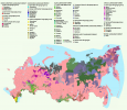
Not pictured: the giant empty spaces in northern Siberia where nobody lives outside of a few tens of thousands of people around a certain town.Ethnographic map of Russia
Any chance we can get a.....blank template of that? This is absolutely gorgeousOn the first map of the Republic of the USSR in 1989. On the second, the same countries 33 years later
If this is a recent map we should keep in mind that there are serious arguments about how reliable current Russian census statistics can be compared to any number coming out from Putin's Russia today, Turkic minorities are claiming they have to really struggle to not be counted automatically as Russians in the census so that even with the falling Russian birth rates the map still looks a conveniently nice uniform pink colour all around...Ethnographic map of Russia
Crazy Boris
Banned
India's districts needs an overhaul, there's been a lot of reorganization there the last few years, and especially Arunachal Pradesh, Chhattisgarh, and Telangana are totally outdated
The autonomous administrative divisions in (the also wrong) Assam and elsewhere should be done too.India's districts needs an overhaul, there's been a lot of reorganization there the last few years, and especially Arunachal Pradesh, Chhattisgarh, and Telangana are totally outdated
This is excellent - great work! The old one was good, but I have to admit that I didn't like looking at places like Russia where its sorta just blobs with only 2 or 3 height levels. This one looks much much much better.I had to manually align the map pretty much everywhere, this process was extremely painful and took many hours. I had to align every island, every tiny bit of coast, and more. Even after all of this it's still not aligned well, especially in the arctic and eastern asia. I tried as much as I could, but I'm tired of having to look at this map and just want it out, it's good enough and better than the best we had, no?
If you combine it with @Bob Hope's bathymetry and rivers, plus a little bit of aesthetics tweaking, I think it ends up looking really really nice.
Really really nice.This is excellent - great work! The old one was good, but I have to admit that I didn't like looking at places like Russia where its sorta just blobs with only 2 or 3 height levels. This one looks much much much better.
View attachment 805293
If you combine it with @Bob Hope's bathymetry and rivers, plus a little bit of aesthetics tweaking, I think it ends up looking really really nice.
The Russian censuses have been showing the Russian proportion of the population declining in several republics. I know there are some in the ethnic minority diaspora who make claims about their numbers being way higher but they generally tend to be the same people who think there's a mass support for independence in, say, Bashkortostan. Not reliable.If this is a recent map we should keep in mind that there are serious arguments about how reliable current Russian census statistics can be compared to any number coming out from Putin's Russia today, Turkic minorities are claiming they have to really struggle to not be counted automatically as Russians in the census so that even with the falling Russian birth rates the map still looks a conveniently nice uniform pink colour all around...
I mean who would have thought in 1985 Kazakstan or Azerbaijan would be independent in about 5 years right? People can be very unreliable, especially when the oppression falls apartThe Russian censuses have been showing the Russian proportion of the population declining in several republics. I know there are some in the ethnic minority diaspora who make claims about their numbers being way higher but they generally tend to be the same people who think there's a mass support for independence in, say, Bashkortostan. Not reliable.
")
I was gonna reply to this with "well yeah but Azerbaijan was 80%+ Azeri in '89 so it can't really be compared to the modern minority republics" but then I checked and apparently the Kazakh SSR was only 40% Kazakh to 38% Russian in the 1989 census, so who knows! For comparison: according to the 2021 census Bashkortostan is 33% Bashkir, 25% Tatar and 38% Russian. Tatarstan is 54% Tatar.I mean who would have thought in 1985 Kazakstan or Azerbaijan would be independent in about 5 years right? People can be very unreliable, especially when the oppression falls apart
Has anyone ever tried to make a Q-BAM of the Human Footprint Index? I feel that this would also serve as a semi useful resource for maps like the Russian demographic one, since the regions which are hardly populated show up well in that dataset.
Share: