Return of Horrible Educational Maps

Mark1878

Donor
Some things that stand out to me that no one's mentioned yet:

Is it just me or does the 2000 BC map imply Australian Aborigines came from the Indus Valley civilization and ancient Ecuadorians settled in Shikoku?

Also, Roman Empire in Thrace in 200 BC?

Cuba, Jamaica, Haiti, Dominican Republic, Puerto Rico and Trinidad in 800? Australia, Taiwan, and New Zealand in 1279? There are other countries appearing way too early too. also Antarctica and Africa are labelled as countries at certain points

"Seljuk Caliphate"

1492: Sultanate of Delhi.... in Assam

1530: Bornu colony in Bioko?

1650: French Alaska

1783: Bhutan can into China

The USA randomly changes color between 1783 and 1815? And what's with the giant Rwanda and Burundi around the same time?

Shoutout to Venezuelan Amazon and Greek Albania in 1880

I guess 1945 was the Year of Africa instead of 1960

why are all the colonies seperate colors from the ruling country?

Also, lots of my least-favorite thing ever, just putting "X city states" or "X kingdoms" instead of actually showing the countries. I can forgive it sometimes, but on a map where you can infinitely zoom in, "too small" isn't an excuse.

And this is just scratching the surface
There's so, so much wrong with this in every single map
I thought Geacron was bad, but this is on a whole other level, I don't know whether to laugh or scream
Ireland free of the UK in 1650 onwards
Israel exists from 1920
Austrian Empire has Baltic provencies from 1640
Who wants to put a link to this thread in their bug reporter on Github https://github.com/nrgapple/historic-country-borders-app/issues?q=is:open+is:issue
 
Probably from before the Covid pandemic, a map where they didn't forget New Zealand, the two islands of New Zealand are definitely on that map.

badhealth.jpg
 
Cuba, Jamaica, Haiti, Dominican Republic, Puerto Rico and Trinidad in 800? Australia, Taiwan, and New Zealand in 1279? There are other countries appearing way too early too. also Antarctica and Africa are labelled as countries at certain points
Seems that they used the modern day map as a base and forgot to delete Caribbean countries at a certain point. I'm not sure what was going on with "Africa", though.
1783: Bhutan can into China
This would certainly make an entertaining AH about a Bhutanese conquest dynasty.
 
Gaze at the goings-on in the timeline and despair.


In fact, I'm surprised these mappers got anything right at all, given the evident sloppiness and coding errors.
Their map of the year 1000 refers to the Holy Roman Empire as Hamburg! What went wrong there? Also later maps include Flanders in the HRE.

One of the maps which misnames the Ottoman Empire as Montenegro gives some Aegean Islands to 'England and Ireland' and gives ALL of Siberia to 'Central Asian Khanates'...
In 1650 and 1715 the 'Austrian Empire' is/owns an enclave in Royal Prussia. Those dates also have respectively a Luxembourg with the borders of 'Greater Belgium' and an 'Austrian Netherlands' with the borders of present day Belgium...
Also Belgium already exists in 1783 and 1815, and the borders of Austria-Hungary are flat out wrong.

I'll stop with looking at it now as I don't have the whole day.
 
Man this is wrong on soo many levels. Is it intentional? I thought of making a list but its simply too much.
It does warn that "Boundary representation is not necessarily authoritative". Which is wonderful phrasing, but sadly misses out the many, many other things wrong with that map apart from the boundaries.
 
Oh yeah, that's super intentional. I mean, come on, it's got "Belcurve" instead of Belgrade.
The more I look at that map, the more hilarious it becomes... all the way down to the mathematically-impossible projection and the scale bar :p
Sad thing is, you could probably show that to 90% of mah fellow countr'men, and they'd just shrug if you asked 'em what's wrong with it :/
 
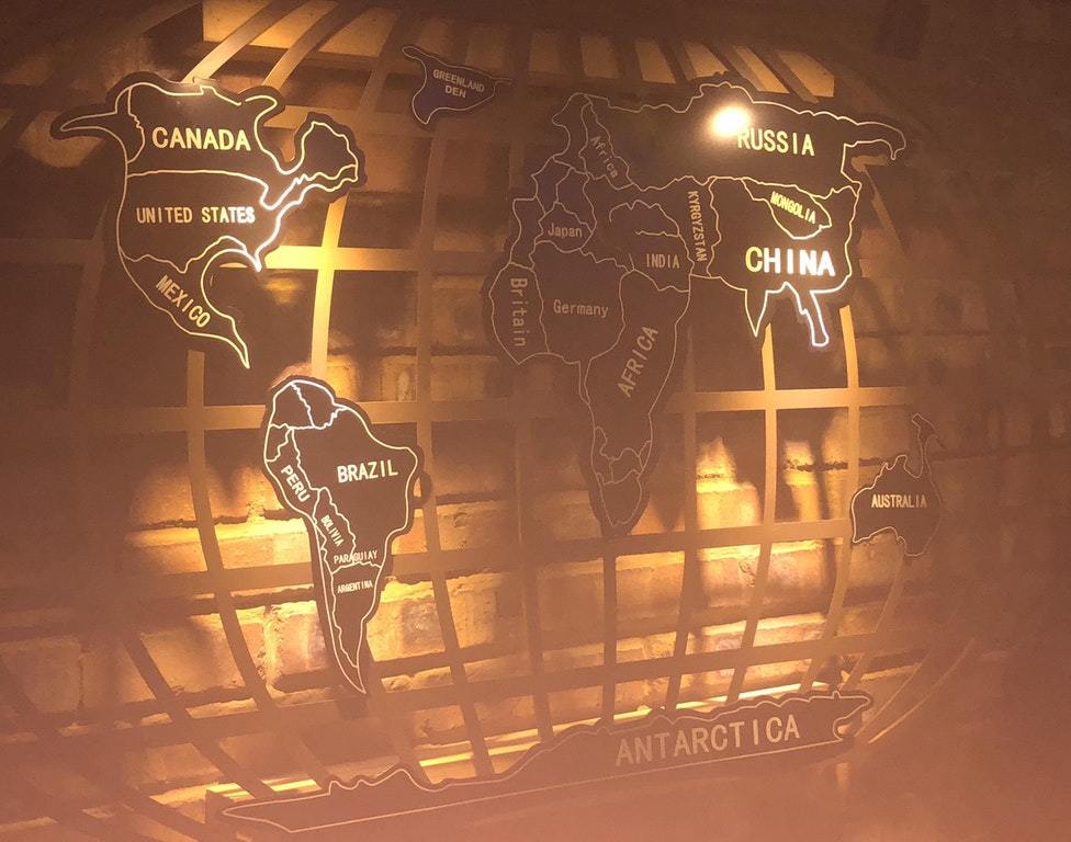
I found this... thing at my local IKEA.
View attachment 620933
I remember that one since I wrote a small story for it, but would not expect such an abomination to be mass produced...
At what point is a map so erroneous it is disqualified from this thread?
Because I have found a contender.

tumblr_p4wlajj0QD1wsbn2ao1_1280.jpg

That's a long story. Remember Atlantropa? It started nice, creating new fertile land, and helped Germany expand into North Africa and the Sahara. Other projects followed to dam the Baltic and Red Seas. But it soon went horribly wrong. The sea wanted its due, and after catastrophic earthquakes flooded the British Isles, Japan, Indonesia and Central America. We gave the Japanese exile in the Mediterranean Basin, and the British conquered West Africa. The Indonesians were less lucky, also the Indians who were driven out of their homeland by China and settled around the former Persian Gulf. Then, decades later, came the African Revenge, leading to what Eoropeans call the Reverse Colonisation.
 
Man this is wrong on soo many levels. Is it intentional? I thought of making a list but its simply too much.
If I remember correctly somebody had said earlier on the tread that this map was made up for a fictional travel guide for the country 'Molvania'.

EDIT: It was this post here.

I recognize this one! If you look at what should be Slovenia you’ll see it’s called “Molvania” with the capital at “Lutenblag”, this is from a humoristic fake travel guide to a made up Eastern European country. I wouldn’t be surprised if all the weirdness is intentional.

Edit: Yeah this one is parody for sure, just look at the Scandinavian cities like “Legoland”, “Koskenkorva” and “Surströmming”
 
Last edited:
Top