Pharaoh’s troops finally bled out, so they no longer went with a color based name.View attachment 522796
Has Ascension as Assuncion,the Dead Sea replacing the Red Sea and no South Sudan.From 2018,when the Romanian government decided that the state publisher would be in charge of all textbooks.
You are using an out of date browser. It may not display this or other websites correctly.
You should upgrade or use an alternative browser.
You should upgrade or use an alternative browser.
Return of Horrible Educational Maps
- Thread starter Westphalian
- Start date
Yeah, it looks right when flipped. The only problem is that whoever approved must have never seen a map in their life
Or maybe he looked at the globe from the inside, could have been a hollow-earther, who knows?
Well, since I have ventured into the surreal the following one is more than appropriate, even if it was deliberate:
Crazy Boris
Banned
View attachment 522796
Has Ascension as Assuncion,the Dead Sea replacing the Red Sea and no South Sudan.From 2018,when the Romanian government decided that the state publisher would be in charge of all textbooks.
It also looks like Sierra Leone sank
It also looks like Sierra Leone sank
No, it’s color is different from the ocean’s, but not by much.
I'm all for world maps *not* trying to prove the four-color theorem, but this map must have 15 or more different colors for nations...No, it’s color is different from the ocean’s, but not by much.
it was lagging on my computer, and loading slowly, each second I was like "thy can't fail anymore, right?" , followed by "oh fuck it".
Furthermore, what do you expect of a retired bridges and roads inspector when it comes to migration maps?
(the worst parts are probably north america and the Indian ocean, made me mentally puke)
« retired bridges and roads inspector », is this ironic?
I know that I'm answering an old post (though not necromancing the thread), but you are writing here about none other than Charles Minard, the man who made the “best graphics ever” — he is very well-known for the 1812 retreat from Russia map/graphic. The map posted in the thread is a modern fac-simile from a 1858 map of global migrations which, though a bit less ugly, shows the same deformation of continent shapes. However, given the considerable talent usually shown by Minard throughout his excellent work, we can safely assume that these deformations were introduced on purpose, to leave some room for the main point of the map, which is the alluvial diagram of migration. (This certainly explains at least the displacement of the British isles).
Etch-a-Sketch?
The Mutilated States of America

The Mutilated States of America
I mean, it's far from the worst map on this thread. Which doesn't say much...
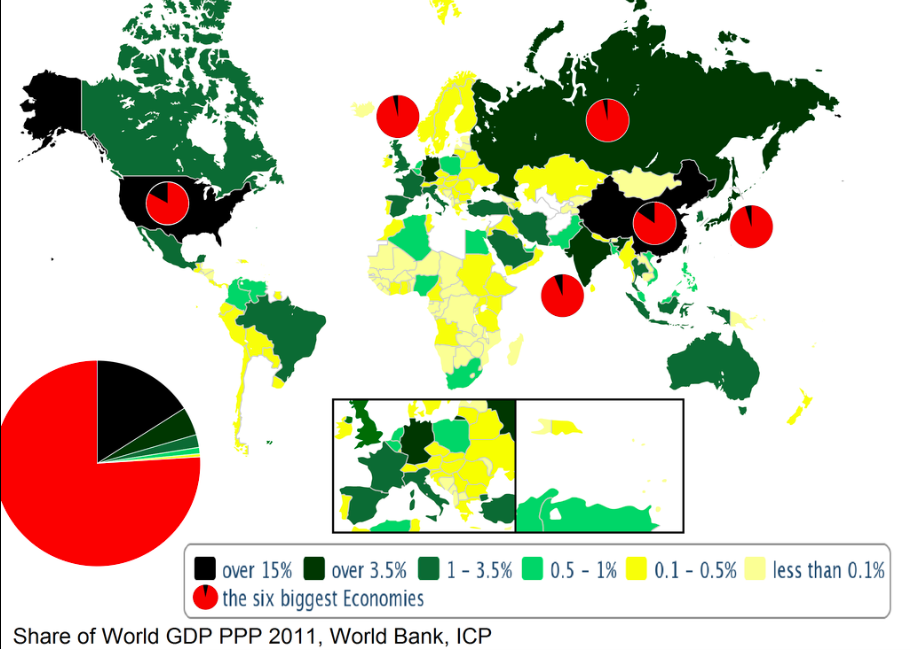
Might be because of omissions due to lack of data but this World Bank map of global country share of GDP PPP lolz

Another romanian map.It seems we're bad at them.Now for a map that is rather odd than bad.
It is accurate enough but reducing just about anything to straight lines and angles only either 45° or 90° is a bit weird.
View attachment 524585
Is it just me, or are the relative sizes of Romania and Bulgaria off from the way that they actually are.Another romanian map.It seems we're bad at them.
i actually made a map kind of like this once. i tried to find the final version but i guess i never uploaded it to the Map Thread so here's the WIP instead:Now for a map that is rather odd than bad.
It is accurate enough but reducing just about anything to straight lines and angles only either 45° or 90° is a bit weird.
View attachment 524585
It's satisfying in a blocky sort of way.snip
I don't really think so but the romanian shoreline is way too big.Is it just me, or are the relative sizes of Romania and Bulgaria off from the way that they actually are.
I never knew the Mississippi River had 90 degree corners.
The Mutilated States of America
Is it just me, or are the relative sizes of Romania and Bulgaria off from the way that they actually are.
What can you expect when one is essentially reduced to a hexagon and the other a rectangle?
Meanwhile on the back of a car...
Share: