I'm not sure that there is an outcome of the Chaco war that lead to either Bolivia or Paraguay completely annexing each other. It is almost like imagining an end to the Crimean War that would lead to either Britain annexing Russia or vice versa. The Bolivian Military was used to Andean heights and not the lowlands and the Paraguayan military was certainly unused to the highlands.and someone definitely won the Chaco war, though you can't really tell who.
You are using an out of date browser. It may not display this or other websites correctly.
You should upgrade or use an alternative browser.
You should upgrade or use an alternative browser.
Return of Horrible Educational Maps
- Thread starter Westphalian
- Start date
I mean, I know its just meant to show countries with a coastline (and even then it isn't perfect - notice the omission of the DRC that does have an (admittedly small) coast), but they could at least show borders between landlocked states for clarity. Otherwise it just looks like a load of random space-filling empires have been created from nowhere. Not the worst map on the thread, but definitely bad.
Not to mention that there are rivers runningthrough many of those landlocked countries, which surely would take some plastic waste along for the ride (for example Vienna with over a million inhabitants and a tourist destination surely has the odd plastic cup/bag/wrapping ending up drifting downstream in the Danube) but that seems to be left out.
Unrelated, from a flyer (unknown source):
Even if this is meant to be a globe and as such the curvature has to be taken into account there are still things not adding up (like the total lack of Africa south of Somalia and eastern Asia in general)
Crazy Boris
Banned
Not to mention that there are rivers runningthrough many of those landlocked countries, which surely would take some plastic waste along for the ride (for example Vienna with over a million inhabitants and a tourist destination surely has the odd plastic cup/bag/wrapping ending up drifting downstream in the Danube) but that seems to be left out.
Unrelated, from a flyer (unknown source):
View attachment 462792
Even if this is meant to be a globe and as such the curvature has to be taken into account there are still things not adding up (like the total lack of Africa south of Somalia and eastern Asia in general)
It almost looks like a massively enlarged Baffin Island is glued where the Malayan Penninsula should be
Speaking of globes here is one that is technically bad due to low degree of detail (when a single 1x brick is effectively standing in for something like 250miles you can't depict smaller stuff by default)
That much said, while the Leglobe should not be used in an educational sense it is awesome in all other regards.

That much said the green Sahara is a bit weird but they seemingly did the colors to depict elevation, not vegetation.
That much said, while the Leglobe should not be used in an educational sense it is awesome in all other regards.
That much said the green Sahara is a bit weird but they seemingly did the colors to depict elevation, not vegetation.
Last edited:
But now back to genuinely bad maps:
Given the size of Svalbard they started with the mercator projection and then got worse...
View attachment 463058
Especially weird is the fact that there are two Japans.
Good Lord. No Britain, New Zealand looks like Taiwan, No Tasmania (Australia's island state) or Sweden. Who the hell made this map?
Good Lord. No Britain, New Zealand looks like Taiwan, No Tasmania (Australia's island state) or Sweden. Who the hell made this map?
New Zealand looks like Madagascar, not Taiwan.
New Zealand looks like Madagascar, not Taiwan.
In my defence, Taiwan and Madagascar look incredibly similar.
Madagascar has a pinched waist, Taiwan doesn't...In my defence, Taiwan and Madagascar look incredibly similar.
Attachments
That's Fox News levels of not paying attention.
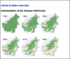
What's the map in the image from? It could be a strange view of the amazon watershed, without the rest of the continent but i miss the roads and straight lines of Brazilian state borders and nature reserves.
Wait, that's Borneo?
How many textbooks have video links in the text?
Not sure if they count if exclusively online. Anyways, best to quote a message when replying to it. I might have never seen it.Online ones?
As a LTLFTP, how do I quote a message?
I think they count if exclusively online.
@Albidoom to me, that just looks highly stylised, not despicable.
I think they count if exclusively online.
@Albidoom to me, that just looks highly stylised, not despicable.
@Albidoom to me, that just looks highly stylised, not despicable.
Especially with high stylisation neither Alsace Lorraine should be that obviously French nor South Tyrol plain visibly Italian on a 1914 map. Not to mention Serbia, which painfully obvious has its modern northern border.
It's not stylized, it was a modern map with 1914 borders splotched over it.
OH. I did not notice Alsace-Lorraine and Sud-Tirol. What I did notice was those islands west of Estonia, which were very certainly part of Russia (not Swedish(?) or independent) during that time period
Share: