OTL Map Thread Mk IV., 2014-

Can someone create a blank map of a beautiful North & South America with a vertical perspective projection but on a flat surface spread out similar to this:
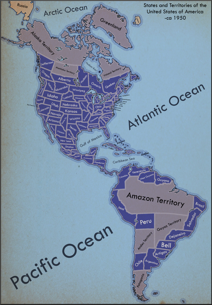
two_continents__one_republic_by_ynot1989-d4ddl49.png
 
Last edited:
Well, I think Iori only shows Armenia as he uses a stripped down colour scheme. It may also be outdated and referring to a period of stronger Russian influence some years ago. Probably needs looking into.

Yeah, I sort keep forgetting it's actually outlines and thus it's continued on all my maps. :eek:

That said, I'm not sure really what year exactly to remove it.
 
Ah, no. full colour indicates that they are the ones in de facto control of the territory, stripes merely indicates an area of significant operations (e.g. frequently car bombing and launching attacks, possibly even in control of large parts of the countryside, but government forces are still around and policing etc.). You've got Poland correct there, so long as they actually control the territory, while we're showing the situation in Donetsk as a case of being a Russian protectorate de fact existing there. You could stripe with Russian colours as well if they weren't actually getting support from Russia.

Hmmm...I'm still not sure I understand.

I'll ask a different question then; let's say China is divided into a republic and an empire. If there were areas of rebellion in the republic fighting for union with the empire, how I would I depict that?

In the case of Donetsk, are we using the Russian protectorate colour only because Russia is giving them support and keeping them afloat? I.e., what convention would we use if Russia wasn't? Just a red border with regular grey?
 
The Romania patch from the other thread and my North Transylvania WW2 patch both were bugging me and felt off, so I decided to correct the borders of Romania from 1914 to present day. It also changes Romania's black sea coast, I saw this coast on a blank map and felt it worked really good. The 6 maps are pre-WWI, interwar, pre-Barbarossa, 1942, Cold War and Present Day. Any input is appreciated.

romaniaall.png
 
I would be interested in seeing examples. I certainly don't recall seeing any on the wiki, and I not too long ago downloaded the entire map repository (or most of it anyway) for local use.

Try any map showing the Naxalite presence in India. It's for 'rebel presence but not full control of the area'.
 
Apologies for double-posting, but (with a little help from the GIS Stack Exchange people) got a world map done, and I figured it needed more than just an edit.

http://i.imgur.com/TGdL1oR.png

About the same scale as the above map of the Americas (and with the same features).

Size: 4.4MB .png - 24,192 x 11,433 pixels :cool: ...

You have been warned.

+ + +

So, if anyone needs a ludicrously detailed map of part of the world, give me a poke and I can cut my map up for you :) .

Hey, excellent work (I assume, as I can't open it yet), I keep getting an error that your image cannot be displayed because of errors. Any chance you can upload it in a compressed file?

Also, How easy would it be to add watersheds to this map? I like using those for alternate borders.
 
Should I cross-post my space map? It's OTL in it's current setup?

EDIT... Whatever... when in doubt, crosspost!

Two versions, One with Labels, One without.
Here is the full description:
The colors used in the map are the same as that from most Color schemes, and should not conflict. Blue represents generic outer space. The width is the same as our most used, so it can be used together with it. I do believe my "Mini-Earth" map should be fixed, but it works for now. (Japan is squished over on the right side so you can't even tell I put the color on the map)

Green represents colonizable surface/atmosphere.
This is an approximation based off radius of planet/object using a power function (Jupiter's radius was multiplied by a factor of 20, whereas Earth's was multiplied by 40, and the smallest named items were multiplied by 80. Thus there is compensation. Most things that are the same size on the map, however, are somewhat close to the same size though, so there is some level of consistency, and things that are smaller are smaller, just not by the same factor. That is, the order is right, just the scales change to give extra representation to smaller items).

Distances around the swirl attempt to match up to actual distances... minus Sedna and anything way out. Distances just too large. Distance from Mars to the Sun is same as Mars to Jupiter for example.

Moons are placed around their host planet. Only larger moons are represented. When you get to the objects outside of Neptune you see a lot "Off the inside wall" that is, I have planets touching the inside wall when they have more circular orbits, and the further away from the wall, the more eccentric their orbit. Eris has a crazy eccentric orbit (minus Sedna, but Sedna is crazy anyways... hard to represent).

The Asteroids are mostly approximations, but if you saw my previous map then you'll notice I've altered the Neptunian Trojans. I had screwed up. Apparently there is an order of magnitude increase of Neptunian Trojans compared to the Jupiter Trojans.

The Ice represents less than 1 W/m^2 of Solar Radiation. Notice that Pluto is half covered. That's because it's eccentric orbit (it's not on the inside wall notice) means it sometimes has greater than 1 W/m^2 of Solar radiation and sometimes less. For most of those I B'sed it, but I was careful about Pluto XD

I WANT people to use it, edit it, fix it, alter it, to their hearts content!
--------------------
Without Labels

sAb3weE.png


with labels
mSGWj0A.png


EDIT... COULDN"T SLEEP... FOUND GREAT DATA... (an awesome plot of asteroid groupings based on Eccentricity [SUPER AWESOME CAUSE THATS TOTALLY WHAT I MADE One of the axis on this map! XD] and inclination... which really works perfect for IRL asteroid groupings)

Data comes from here:
http://en.wikipedia.org/wiki/Asteroid_belt#mediaviewer/File:Asteroid_proper_elements_i_vs_e.png

And I shifted everything around in the asteroid belt to make it more realistic. I'll have to update the other stuff soon, but It looks so much better when it's more accurate!

So here's the two patches (labeled and unlabeled)

0qUiFlR.png


dsSpqpv.png
 
Last edited:
That looks very good, and I think I might find some uses for it... but I don't think you should use the same colors that we use for Earth as "land" and "sea" in space (unless you're planning some retrò space fantasy thing). When I tried my hand as a Mars basemap I used red for lowlands and darker brown red for highlands... but we can come up with a spaceCS later.

Great map.

So... where's Yuggoth?
 
That looks very good, and I think I might find some uses for it... but I don't think you should use the same colors that we use for Earth as "land" and "sea" in space (unless you're planning some retrò space fantasy thing). When I tried my hand as a Mars basemap I used red for lowlands and darker brown red for highlands... but we can come up with a spaceCS later.

I considered a SpaceCS... but IDK... 2 major issues assail me. 1) Space is "Darkish" so the colors I pick for it usually make the black outlines disappear and basically become useless. 2) If we alter the CS too far from our previously accepted CS's then it'll be difficult to transfer over. I was seeking compatability.

Still, I suppose it is something to think about.

On that note, I tried, for like 20 minutes, to start in on a local cluster map... but I gave up after I realized we know soo little about our own local star system that it might as well be the empty edges of the maps of old. I was going to do the major planets and their stars in approximate locations, distorting a 3-D geometry into 2-D as best I could, but we don't even know that many of the planets outside our solar system within our local star system. *sigh*

Great map.

So... where's Yuggoth?
IDK you'll have to ISOT it in XD (or name one of those "unnamed things with the numbers out there on the edge)
 
I considered a SpaceCS... but IDK... 2 major issues assail me. 1) Space is "Darkish" so the colors I pick for it usually make the black outlines disappear and basically become useless. 2) If we alter the CS too far from our previously accepted CS's then it'll be difficult to transfer over. I was seeking compatability.

You could go for a Grey border instead.
 
Top