Doesn't look quite right tbh.


Incidentally, is it me or did the current Welsh flag used to be slightly different? Could have sworn the green stripe was once a third rather than half. Am I having a Mandela moment! Or just my memory playing tricks on me considering how many alternative union flags I've considered over the years?
The Union Flag proportions are correct, just the colours have been changed and the lower half cut off.

AFAIK, the Welsh flag has always had two equal stripes.
 
I decided the three slogans on my Cosmintern flag were a bit much so I did a new version. Suffice to say the Northern powers are incredibly freaked out by basically every aspect of Cosmicist symbology but that's at least partially intentional on the part of the Antarctic Revolutionary Commonwealths and her allies.

cosmintern2-png.764856
Hmm, you entering the latest Challenge? 😋
 
Hmm, you entering the latest Challenge? 😋
Unfortunately no, my access to internet on my computer is still scattershot, I just did this quick change to one for Power Without Knowledge because it was a quick fix and I had a few free minutes to get it done at the office during my free time 😅
 
@The Professor I stand corrected, I had a quick idea for a random flag for my TL that might work for the challenge. I figure it's just good form to use a new one rather than a slightly tweaked one from two months ago 😂
bellinsgauzenia-png.765497


Unfairly regarded as a pariah state, Virgin Bellinsgauzenia has been able to carve out a hard but stable existence in Antarctica, transforming a ragtag bunch of political exiles into a united collective determined to preserve their freedom in the face of repression in their home countries and rapacious corporations out to plunder the southern continent. With a founding population of radical American environmentalists, Russians fleeing the post-Soviet scramble for power, and black South Africans practically driven into the sea by the apartheid government, the new "nation"* has made itself busy accepting refugees of all stripes in its quest to build a sustainable monument to human freedom. Using the Antarctic flag as a base, the flag of Virgin Bellinsgauzenia incorporates green to represent its environmentalism, the literary symbol of Zoran's Equation to represent knowledge, and the stylized skull as a memento mori in the face of the unforgiving ice and the polar night.

Say hello to the joke country in the Power Without Knowledge version of the Red World HOI4 mod 😂

*Such as it is.
Here's my entry in the flag challenge/a joke country in my TL's version of a Hearts of Iron mod 😂
 
Last edited:
The second set of my Canadian flag redesigns.

Newfoundland & Labrador.png

Newfoundland and Labrador
The flag combines the blue, green and white of Labrador's flag with the pink, green and white of the Newfoundland tricolour, with the upper blue section for Labrador and the lower pink section for Newfoundland to reflect the geographic positions of the two parts of the province. In the centre is a twig of spruce, the provincial tree. The diagonal division of the flag suggests a quadrant of the British Union Flag, used by the Dominion of Newfoundland prior to its admission to Canada as the country's tenth province.

Northwest Territories.png

Northwest Territories
The wavy division of the flag, reflecting the territorial arms, represents the Northwest Territories' climatic and cultural division between the northern Inuit-inhabited tundra of Inuvik (blue and white) and the southern boreal forests below the treeline, home to the Athabascan Dene people (red and yellow), with the five billets representing the five main Dene groups (Chipewyan, Tłı̨chǫ, Yellowknives, Slavey and Sahtú). The Arctic fox represents the unity of the territory as a whole.

Nova Scotia.png

Nova Scotia
Based on a banner of Nova Scotia's arms, the blue on white saltire is the reverse of the flag of Scotland, from where the province's first European settlers came, and where Nova Scotia ("New Scotland" in Latin) takes its name. In the centre is a simplified version of the royal arms of Scotland, with a fleur-de-lis from the bordure replacing the lion. The fleur-de-lis also recalls Nova Scotia's Arcadian heritage and links to Canada's other maritime provinces.

Nunavut.png

Nunavut
In the centre of the flag is an inuksuk - a traditional Inuit cairn used as a land marker and cultural symbol - with Polaris, the North Star or Niqirtsuituq, which serves as an important navigational aid and represents the leadership of community elders. Yellow represents the richness of Nunavut's land and blue represents the territory's seas and skies. White is for the snow and ice of the Arctic landscape while red provides a link to Canada as a whole.​
 
Last edited:
Soviet Republic Of The Steppe
Following the collapse of the U.S.S.R. OTL , the majority of communist figureheads attempted a violent coup in the newly formed Kazakhstan , twice. The first time was a disaster , leading to thousands of dead civilians. However in the year 2036 , with a collapsing economy in the Central Asian sphere - and a rising China about to enter a bloody war with the new Higashiajia kyōtei (East Asian Accord) - led by Japan , the second coup played out successfully with Chinese backing. As we look towards the uncertain future , it is entirely possible that this new Soviet Union may attempt to reclaim its former hegemony in the Turkic-speaking sphere , as the modern-day despot Sergey Bekarys begins his radical (and tyrannical) state reforms.
 

Attachments

  • The Steppe SR.png
    The Steppe SR.png
    54.1 KB · Views: 160
The final part of my Canadian flag redesigns.

Ontario.png

Ontario
The three maple leaves are taken from Ontario's arms and represent the province's position as one of the founding members of the Canadian Confederation and location of the national capital. This link is also recalled by the "Canadian pale" design of the flag with the central stripe being twice the width of the outer two stripes. White symbolises the Ontario's provincial flower, the white trillium, and white and green are used on the province's Francophone flag.

Prince Edward Island.png

Prince Edward Island
The flag shows three acorns representing Prince Edward Island's three counties (Kings, Queens and Prince) and two mature oak leaves representing the provincial and national governments. Together, the acorns and oak leaves recall the province's motto of "The small protected by the great". The red and white border is retained and together green, white and red all appear on the provincial arms.

Quebec.png

Quebec
The flag combines the white cross on blue of the naval flag of the Kingdom of France with the green, white and red Parti Patriote flag flown during the Rebellions of 1837-38, representing Quebec's roots in the French colony of New France, its role in the creation of the modern Canadian Confederation and Québécois nationalism. Three fleurs-de-lis, which appear in both the French royal arms and the provincial arms, are added to the Patriote flag to represent Quebec's position as Canada's only majority Francophone province.

Saskatchewan.png

Saskatchewan
In the centre of the flag is a wheatsheaf, a common symbol of Saskatchewan which also appears on the province's arms. The sheaf is composed of ten wheat stalks as Saskatchewan was the tenth province/territory to join the Canadian Confederation (simultaneously with Alberta). The wheatsheaf also reflects Saskatchewan's motto of "Strength from many". Surrounding the sheaf is a ring of 10 western red lilies, the provincial flower. The rectangular division of the field recalls the shape of the province. Yellow symbolises the rich wheat fields, green the forests and red the rejuvenating fires that scorch the land. Yellow, green and red are also the colours of Saskatchewan's arms and its Francophone flag.

Yukon.png

Yukon
The centre of the flag shows a heraldic roundel of vair (fur) while on the hoist are three gold disks taken from the territorial arms and representing Yukon's natural and mineral wealth which first attracted European settlers to the area and later to the Klondike Gold Rush and the establishment of Yukon as a separate Canadian territory. The wavy lines form a turned Y shape and symbolise the Yukon River. Blue stands for the territory's lakes and river, green for the forests, white for the winter snows and red recalls the fireweed, Yukon's territorial flower.​
 
Kind of a boring one

fQqWgGk.png


Flag of the CCP (Xinjiang)

Alternate timeline where CCP collapses during the Chinese Civil War, but maintains control of Xinjiang with Russian assistance. The flag is an alternate 5 star pattern (same rationale as the OTL flag) with a green band. In this timeline, each regional army had a coloured band as a regimental flag, with Xinjiang's being green. This was eventually adopted as the regional flag, with the full red banner being used until the CCP rescinded their claims over the rest of China. The green band flag is now used as the only official flag.
 
The final part of my Canadian flag redesigns.

View attachment 766371
Ontario
The three maple leaves are taken from Ontario's arms and represent the province's position as one of the founding members of the Canadian Confederation and location of the national capital. This link is also recalled by the "Canadian pale" design of the flag with the central stripe being twice the width of the outer two stripes. White symbolises the Ontario's provincial flower, the white trillium, and white and green are used on the province's Francophone flag.

View attachment 766372
Prince Edward Island
The flag shows three acorns representing Prince Edward Island's three counties (Kings, Queens and Prince) and two mature oak leaves representing the provincial and national governments. Together, the acorns and oak leaves recall the province's motto of "The small protected by the great". The red and white border is retained and together green, white and red all appear on the provincial arms.

View attachment 766373
Quebec
The flag combines the white cross on blue of the naval flag of the Kingdom of France with the green, white and red Parti Patriote flag flown during the Rebellions of 1837-38, representing Quebec's roots in the French colony of New France, its role in the creation of the modern Canadian Confederation and Québécois nationalism. Three fleurs-de-lis, which appear in both the French royal arms and the provincial arms, are added to the Patriote flag to represent Quebec's position as Canada's only majority Francophone province.

View attachment 766374
Saskatchewan
In the centre of the flag is a wheatsheaf, a common symbol of Saskatchewan which also appears on the province's arms. The sheaf is composed of ten wheat stalks as Saskatchewan was the tenth province/territory to join the Canadian Confederation (simultaneously with Alberta). The wheatsheaf also reflects Saskatchewan's motto of "Strength from many". Surrounding the sheaf is a ring of 10 western red lilies, the provincial flower. The rectangular division of the field recalls the shape of the province. Yellow symbolises the rich wheat fields, green the forests and red the rejuvenating fires that scorch the land. Yellow, green and red are also the colours of Saskatchewan's arms and its Francophone flag.

View attachment 766375
Yukon
The centre of the flag shows a heraldic roundel of vair (fur) while on the hoist are three gold disks taken from the territorial arms and representing Yukon's natural and mineral wealth which first attracted European settlers to the area and later to the Klondike Gold Rush and the establishment of Yukon as a separate Canadian territory. The wavy lines form a turned Y shape and symbolise the Yukon River. Blue stands for the territory's lakes and river, green for the forests, white for the winter snows and red recalls the fireweed, Yukon's territorial flower.​
Very nice! I'm quite partial to the current PEI flag, but yours is really nice too. For the Ontario flag, I think it'd be better to use green/gold for the background. White/green is right for Ontario, but I think it'd be better to match the maple leaf in the centre.
 
Very nice! I'm quite partial to the current PEI flag, but yours is really nice too. For the Ontario flag, I think it'd be better to use green/gold for the background. White/green is right for Ontario, but I think it'd be better to match the maple leaf in the centre.
Thank you! I did try the Ontario one with gold instead of white at the side, but it didn't look as nice to be me and, as you say, white works better symbolically for Ontario than gold does. I quite like as well how the white outer stripes and coloured middle stripe is the inverse of the Canadian national flag.
 

Deleted member 139407

Screen Shot 2022-08-14 at 5.34.17 PM.png

So, I've seen this flag twice now in my native New Jersey: 1) in my hometown being flown off of a person's dock on a lake and 2) in the Central Jersey area being flown off of someone's truck. I thought I'd post it here with a question: has anyone else seen this flag and maybe know what it's cause is (if it, indeed, has one)? I looked on this Wikipedia page for any clue. The only others similarly designed to this one belong to the Department of Customs and Border Protection, the ensign of the Coast Guard, the traditional flags of the Revenue-Marines, and the Power Squadrons. The only possible meanings behind this flag I can think of are 1) a flag sponsored by one of these groups maybe as a veteran's or civil ensign, 2) a flag for a nascent/underground political movement of some kind (maybe a Movement for a Second Republic akin to those alt-right 2nd Revolution wingbats), or 3) two people coincidentally owning the same cool lookin' flag that somebody was selling one day. Any and all help in its identification would be very helpful and informative!

EDIT: After finding out the meaning of this flag and its purported values, I want to make it VERY clear that I was merely posting this flag in an inquisitive manner and NOT in support of the American branch of the Sovereign Citizens Movement. I actually was not aware of the movement itself beforehand.
 
Last edited by a moderator:

So, I've seen this flag twice now in my native New Jersey: 1) in my hometown being flown off of a person's dock on a lake and 2) in the Central Jersey area being flown off of someone's truck. I thought I'd post it here with a question: has anyone else seen this flag and maybe know what it's cause is (if it, indeed, has one)? I looked on this Wikipedia page for any clue. The only others similarly designed to this one belong to the Department of Customs and Border Protection, the ensign of the Coast Guard, the traditional flags of the Revenue-Marines, and the Power Squadrons. The only possible meanings behind this flag I can think of are 1) a flag sponsored by one of these groups maybe as a veteran's or civil ensign, 2) a flag for a nascent/underground political movement of some kind (maybe a Movement for a Second Republic akin to those alt-right 2nd Revolution wingbats), or 3) two people coincidentally owning the same cool lookin' flag that somebody was selling one day. Any and all help in its identification would be very helpful and informative!
It's allegedly the Civil Flag of the US. According to sovereign citizens the fact we use the traditional one is a sign we're under military dictatorship and naval law.
 

Deleted member 139407

I can tell you almost certainly it's some kind of sovereign citizen flag, so more in line with that second possibility you outlined
It's allegedly the Civil Flag of the US. According to sovereign citizens the fact we use the traditional one is a sign we're under military dictatorship and naval law.
Oh dear… (after looking up the “Civil Flag” and being led to the Sovereign Citizen movement) oh dear…
 
Last edited by a moderator:
It's allegedly the Civil Flag of the US. According to sovereign citizens the fact we use the traditional one is a sign we're under military dictatorship and naval law.
That's hilarious.

Also IMO their "civil flag" feels more "dictatorship" than the current one, considering the vertical stripes look the bars of a cell.
 
NaEcw7C.png


A set of flags for an ATL federalized Kingdom of Yugoslavia.

Croatia and Slovenia shouldn't need much explanation, Vardaria (OTL Macedonia, the name is avoided to avoid connections with the IMRO and claims on Greek land) uses the "Macedonian" COA from the Illyrian armorials that also forms the basis of a modern proposal for a new Macedonian COA. The Illyrian Armorials, though partly fictional, were and continue to be very influential on Balkan and Hungarian heraldry. The colors roughly represent the blue waters of the Vardar as well as prosperity, the bright sun that shines over the country as well as the mineral wealth of the highlands, and the green stands for the extreme fertility of the Vardar valley.

The Banovinas that didn't get any kind of special autonomy, formally called the Federal Banovinas, are basically a greater Serbia and have collectively been referred to as Serbia colloquially especially after Slovenia was elevated to the same status as Croatia and Vardaria (as opposed to being a "special federal Banovina" with some autonomy but less than the autonomous ones).
The old Banovina borders, rather than ones based on historic and cultural regions, were retained despite the development of "organic Yugoslavism" which accepts the existence of regional sub-identities within the overarching Yugoslav one, not out of any ideological reason but out of pragmatism. It would've been expensive and complicated to redraw the borders and the pre-existing ones have the advantage of gerrymandering each federal Banovina into being Orthodox Serb-majority (as opposed to having any Hungarian, Albanian, or most importantly Bosniak or, as the government would say Muslim Serb and Muslim Croat, majority areas). The banovinas did, however, adopt historic and regional symbols to the best of their abilities.
  • Vrbas (Bosnian Krajina) lacks any clear heraldic symbols due both to the late arrival of heraldry and the fact that Donji Kraj was generally ruled by nobles from other regions and thus had no unique arms associated with itself. Thus, a common local animal, the badger, was chosen. Its featuring in local Serb author Petar Kočić's anti-Austrian satire "The Badger in Court" as a victim of Austrian tyranny didn't hurt the badger's chances of being chosen. The green and blue represent the tree-covered hills and many rivers of the Banovina.
  • The Drina Banovina uses the arms of the Vojinović coat of arms (or at least the arms attributed to them in the Illyrian armorials) as it is a slightly expanded version of the domain of Altoman Vojinović, a powerful noble from the Serbian empire who held land on both sides of the Drina. The red and yellow bicolor just takes from the arms.
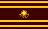
  • The Danube Banovina contains much of Šumadija and other parts of former Revolutionary Serbia so its bicolor draws on flags flown during the revolution and its arms features the Triballian Boar, used as a secondary symbol of Serbia generally especially during the revolution and in Karađorđević heraldry, but also often representing the Šumadija region specifically.
  • The flag of Zeta uses the arms of Zeta from the Illyrian armorials. It avoids direct/modern Montenegrin symbolism as Petrović-Njegoš loyalists and Montenegrin regionalists are still around and also because it encompasses more than just Montenegro. The colors are the red from the arms and the blue of the sea (but also the red and blue of the first attested Serbian flag to emphasize the region's Serbianness).
  • Moravia uses the arms attributed to St. Prince Lazar of Moravian Serbia by the Illyrian Armorials for obvious reasons. The blue here stands for the Morava river and completes the pan Slavic tricolor combination in the flag.

The Banovina of Croatia is too big to be administered as a single unit so it has been divided into its 3 historic regions (with Western Herzegovina being attached to Dalmatia). The flags are in the style of the Serbian banovinas and use the historic bicolors and coats of arms of Croatia's three regions.

The 2 Royal Cities are ruled directly as federal districts. Belgrade is a Royal City because having the capital be part of a Serbian banovina was controversial and it's so populous and economically important that it made sense to make it a distinct administrative unit. When the Free State of Rijeka was annexed, part of the agreement was that it would be autonomous within Yugoslavia and would not be attached to Croatia, so it was also made a Royal City, however it is very strongly connected to Croatia. The Royal Castellan (Kraljevski Tepčija) of Rijeka, who represents the king and oversees the mayor and city council, has always been the Ban of Croatia and the two offices are unofficially merged by this unwritten rule of appointment. This is generally not a problem as many Italians were pushed out of the city by anti-Italian riots at the end of the war of German aggression (WWII in Europe) and more left the after the annexation so it is a clearly majority Croat settlement. Both municipal flags are just heraldic banners of the cities' coats of arms. And yes, for Rijeka, I know Cyrillic Ijekavica might look cursed but part of making Yugoslav identity not just assimilation into Serbia ITTL is sticking more closely to Vuk's standard language, which means no ekavica in government documents or place names (other than places with established ekavica names like beograd), a popular slogan about this among Organic Yugoslavists/Postwar Yugoslavists is "Čirilica u Zagrebu, Ijekavica u Beogradu" (Cyrillic in Zagreb and Ijekavica in Belgrade).

The three capitals of the Autonomous Banovinas similarly have heraldic banners for flags. There isn't much to say about Ljubljana or Zagreb, but Skopje had a contest for a new COA after Vardaria gained autonomy as their previous one was seen as too complex and unheraldic.
 
Last edited:
Top