toot toot it's me again, redid the flag of the League of Communists flag of Yugoslavia if they used Interslavic with southern flavorization!:


You are using an out of date browser. It may not display this or other websites correctly.
You should upgrade or use an alternative browser.
You should upgrade or use an alternative browser.
Flag Thread V
Maximinus Thrax II
Banned
Alternate flag of Canada . The Union Jack at upper left corner symbolizes Canada's membership in Commonwealth of Nations. The white line symbolizes bright future and red field is a inspired by original colonial flags of Canada. The three maple leaves represent Native People of Canada and founders of the Canadian state- Anglo-Canadians and Franco-Canadians.

I'd maintain the proportions for the first.My modified version of real Canadian flag proposal, to make them better

Argh the pixel-wide gap between the red band and the red cross!Alternative flag of the Province of Antwerp
View attachment 585809
Maximinus Thrax II
Banned
Fixed it. Is it better?Argh the pixel-wide gap between the red band and the red cross!
Oh very much, thank you! I like itFixed it. Is it better?
Do we have any heraldry connoisseurs in the house? How's this for a battle standard for Richard de la Pole?

Alternate US state flags (by Petike): Chapter 1
A few years ago, I made the resolution that I would create my own reworked versions of US state flags.
I even used this as a backstory for two state flags I already designed, when I entered them into the Weekly Flag Challenge back then.
Since then, my efforts had unfortunately stalled. However, now I've decided to revisit this older project of mine. This summer, and possibly until the end of this year, I will be taking part in a self-imposed challenge at redesigning various US state flags. Particularly those that have good elements, but are too cluttered and busy, or use questionable colour and charge choices, etc. Furthermore, like with my initial flags made for the project, the premise is that the US is trying to replace complicated-seals-on-a-bedsheet state flags with "bedsheet" state flags that have a proper, heraldic coat of arms. Minimalism, taking the rule of tincture into account, that sort of thing.
In each chapter of this ongoing project of mine, you'll find links to the OTL US state flags I'm reworking, as well as links to untextured, base versions of the flags I'll be gradually presenting.
----
General ATL backstory to this vexilological project
A timeline where the North American Vexilological Association saw the creation of a spinoff organisation, the North American Heraldry Association. During the ATL 1980s, the NAVA and NAHA gained a lot of public attention and lobbying power. Combined with a favourable political climate at the time, many US states agreed to create newer, simpler versions of their flags. Given the goal of greater simplicity, but also apprehension towards losing some of the traditional vexilological symbols, NAVA consultants proposed the idea of switching to European-style heraldry, with flags containing coats of arms instead of circular state seals. This was adopted as a compromise for many reworked US state flags, which still kept their basic "bedsheet" approach, but replaced their overly busy seals with coats of arms. This whole effort became known as the Heraldising reform. Though initially questioned by many, it gained gradual support from the public and new US state flags were born during the 1980s and 1990s.
----
State flag of Vermont (untextured version)
State flag of New Hampshire (untextured version)
State flag of West Virginia (untextured version)
State flag of Wyoming - basic variant (untextured version)
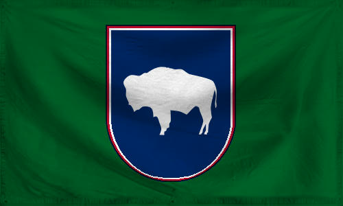
State flag of Wyoming - heraldic variant (untextured version)
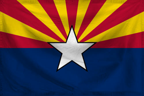
State flag of Arizona - basic variant (untextured version)
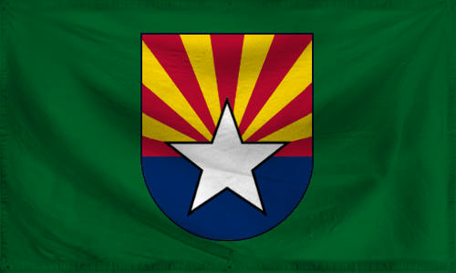
State flag of Arizona - heraldic variant (untextured version)
----
The story so far:
Chapter 2
Chapter 3
Chapter 4
This post was originally made here, in the now-closed flag thread.
I'm restarting this series in order to continue it properly, from start to completion, in a single flag thread.
A few years ago, I made the resolution that I would create my own reworked versions of US state flags.
I even used this as a backstory for two state flags I already designed, when I entered them into the Weekly Flag Challenge back then.
Since then, my efforts had unfortunately stalled. However, now I've decided to revisit this older project of mine. This summer, and possibly until the end of this year, I will be taking part in a self-imposed challenge at redesigning various US state flags. Particularly those that have good elements, but are too cluttered and busy, or use questionable colour and charge choices, etc. Furthermore, like with my initial flags made for the project, the premise is that the US is trying to replace complicated-seals-on-a-bedsheet state flags with "bedsheet" state flags that have a proper, heraldic coat of arms. Minimalism, taking the rule of tincture into account, that sort of thing.
In each chapter of this ongoing project of mine, you'll find links to the OTL US state flags I'm reworking, as well as links to untextured, base versions of the flags I'll be gradually presenting.
----
General ATL backstory to this vexilological project
A timeline where the North American Vexilological Association saw the creation of a spinoff organisation, the North American Heraldry Association. During the ATL 1980s, the NAVA and NAHA gained a lot of public attention and lobbying power. Combined with a favourable political climate at the time, many US states agreed to create newer, simpler versions of their flags. Given the goal of greater simplicity, but also apprehension towards losing some of the traditional vexilological symbols, NAVA consultants proposed the idea of switching to European-style heraldry, with flags containing coats of arms instead of circular state seals. This was adopted as a compromise for many reworked US state flags, which still kept their basic "bedsheet" approach, but replaced their overly busy seals with coats of arms. This whole effort became known as the Heraldising reform. Though initially questioned by many, it gained gradual support from the public and new US state flags were born during the 1980s and 1990s.
----
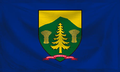
State flag of Vermont (untextured version)
The coat of arms on the post-1980s Vermont state flag keeps the central tree, mountains and sheaves of wheat symbolism from the original coat of arms, but eschews everything else and simplifies the heraldic charges significantly. Only two colours were used for the coat of arms, a stark reduction from the many different shades used in the old coat of arms. In a creative use of this deliberate minimalism, the chosen colour for the mountain that makes up the majority of the shield was chosen as green (vert), while gold (or) was selected for the flora charges and the sky, to provide effective contrast. This makes the coat of arms a "talking" type, pointing to the name of the state (Vertmont, "Green Mountain"; historically misspelled as Vermont). A minor concession to the highly heraldic approach to the coat of arms was adding the little state motto at its foot, the single element unchanged from the previous flag with the state seal.
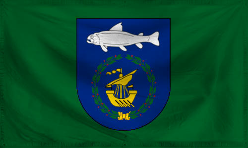
State flag of New Hampshire (untextured version)
The coat of arms on the post-1980s New Hampshire flag keeps the ship and wreath symbolism from the original state seal, in simplified form, while eschewing all the other graphical elements. To tie the coat of arms back to a pre-independence, colonial era seal, a trout-like fish is included in the upper part of the shield, above the wreath and ship. The New Hampshire coat of arms and flag helps highlight the early colonial period of the territory and the long history of settlement. The background of the flag was changed from dark blue to dark green, in order to avoid contrast issues with the coat of arms, and to provide the flag with a more distinguishable appearance.
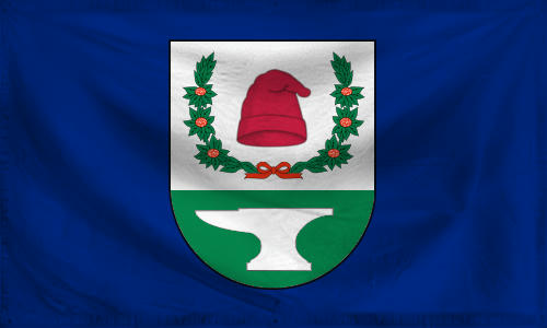
State flag of West Virginia (untextured version)
West Virginia's state seal is notably complex and the history of its state flag has gone back and forth in terms of symbols, though the same motives repeat throughout the 20th century. The NAHA chose a few of the most enduring and meaningful symbols. Rhododendron maximum flowers were a recurring motif on the state's flag in the past. The wreath of green sprigs from this plant, with white-and-red flowers, was kept from the previous state seal. Between the two sprigs, at the centre of the upper half of the coat of arms, is a red phrygian cap, a symbol of liberty, seen already in previous WV state seals and flags. Together with the springs, the cap stands out on a white background, its colour meant to symbolise purity of heart and peace. The lower half of the new West Virginian coat of arms is green, symbolising the green forests and mountains of the Appalachians and the state, with an argent anvil at the forefront, symbolising the mining, crafts and industries of West Virginian history.
Yes, ladies and gents, you can humm the song, if you like.")
Yes, ladies and gents, you can humm the song, if you like.
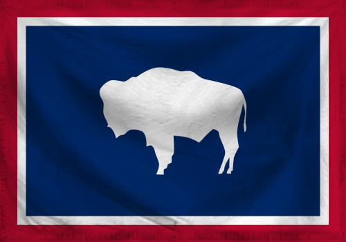
State flag of Wyoming - basic variant (untextured version)
State flag of Wyoming - heraldic variant (untextured version)
With the flag of Wyoming, the NAHA and NAVA had relatively little work to do. The seal of Wyoming was removed from the buffalo silhouette, and the new coat of arms for Wyoming incorporated the tincture pattern and the buffalo charge from the basic state flag. The coat of arms then became the basis for the heraldic variant of the state flag as well.
State flag of Arizona - basic variant (untextured version)
State flag of Arizona - heraldic variant (untextured version)
Arizona's flag was one of the easier existing state flags to tweak. The colour of the central star on the flag had never been officially specificed, and though an orange/copper colour was in use for decades, a white star, for better contrast, was popular on many variant flags of Arizona. This white star, with a slightly thicker black border, ultimately won out. It also became the basis for the state's new coat of arms, replacing the old state seal, and the coat of arms then appeared on a heraldic variant of the standard version, devised in cooperation between NAVA and NAHA.
----
The story so far:
Chapter 2
Chapter 3
Chapter 4
This post was originally made here, in the now-closed flag thread.
I'm restarting this series in order to continue it properly, from start to completion, in a single flag thread.
Last edited:
Alternate US state flags (by Petike): Chapter 2
We continue our journey through redesigned US state flags with another new batch, by your's truly.
Which five states shall we visit today, redefining their flags in a heraldic manner ?
----
General ATL backstory to this vexilological project
A timeline where the North American Vexilological Association saw the creation of a spinoff organisation, the North American Heraldry Association. During the ATL 1980s, the NAVA and NAHA gained a lot of public attention and lobbying power. Combined with a favourable political climate at the time, many US states agreed to create newer, simpler versions of their flags. Given the goal of greater simplicity, but also apprehension towards losing some of the traditional vexilological symbols, NAVA consultants proposed the idea of switching to European-style heraldry, with flags containing coats of arms instead of circular state seals. This was adopted as a compromise for many reworked US state flags, which still kept their basic "bedsheet" approach, but replaced their overly busy seals with coats of arms. This whole effort became known as the Heraldising reform. Though initially questioned by many, it gained gradual support from the public and new US state flags were born during the 1980s and 1990s.
----
State flag of Mississippi (untextured version)
State flag of Connecticut (untextured version)
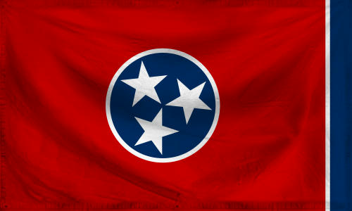
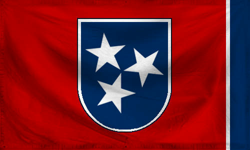
State flag of Tennessee - basic variant (untextured version)
State flag of Tennessee - heraldic variant (untextured version)

State flag of Rhode Island (untextured version)
State flag of Oregon (untextured version)
-----
The story so far:
Chapter 1
Chapter 3
Chapter 4
This post was originally made here, in the now-closed flag thread.
I'm restarting this series in order to continue it properly, from start to completion, in a single flag thread.
We continue our journey through redesigned US state flags with another new batch, by your's truly.
Which five states shall we visit today, redefining their flags in a heraldic manner ?
----
General ATL backstory to this vexilological project
A timeline where the North American Vexilological Association saw the creation of a spinoff organisation, the North American Heraldry Association. During the ATL 1980s, the NAVA and NAHA gained a lot of public attention and lobbying power. Combined with a favourable political climate at the time, many US states agreed to create newer, simpler versions of their flags. Given the goal of greater simplicity, but also apprehension towards losing some of the traditional vexilological symbols, NAVA consultants proposed the idea of switching to European-style heraldry, with flags containing coats of arms instead of circular state seals. This was adopted as a compromise for many reworked US state flags, which still kept their basic "bedsheet" approach, but replaced their overly busy seals with coats of arms. This whole effort became known as the Heraldising reform. Though initially questioned by many, it gained gradual support from the public and new US state flags were born during the 1980s and 1990s.
----
State flag of Mississippi (untextured version)
More than any other US state, Mississippi wanted to take full advantage of the heraldising reform of US state flags. With the assistance of NAHA and NAVA, the state government of Mississippi asked for a flag that would represent the main characteristics of the state and neutral natural, historical and cultural symbolism associated with the state. The Mississippi River and the magnolia flower were chosen as two such obvious elements by the coat of arms designers at NAHA. The latter charge was a sporadic but traditional vexilological symbol of the state, with plenty of staying power throughout the history of the state's attempts at standardising a state flag and state symbols (Mississipi doesn't have the magnolia as its official flower and as part of its nickname "Magnolia state" for nothing...). Given growing archaeological research and scientific knowledge of the Mississippian cultures of North America, the state also wanted to capitalise on the fact some of the major Mississippian sites were on the territory of the eponymous state, and asked NAHA designers to incorporate this into the new coat of arms and flag of the state. The resulting flag includes the wide and "mighty ol' Mississip'" at the centre of the coat of arms, in azure, then to the (heraldic) right of the river a vert background with three argent magnolias in the upper part of the shield, and finally, to the (heraldic) left of the river an argent background, with two taller vert mounds. These mounds symbolise the Mississippian archaeological cultures, known for building tall mound structures as part of their sacred sites and towns (hence also the "Mound builder" nickname for these ancient native cultures from North America's "medieval" period.)
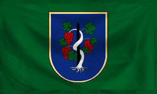
State flag of Connecticut (untextured version)
Similarly to the new heraldic state flags for other New England states, New Hampshire and Vermont, the new heraldic state flag for Connecticut was also designed as a simplification of the existing design, seen already in the previous state flag, only more visually complex. The ornate Baroque/Rococo shield of the coat of arms was done away with, along with the overly ornate banner with the state motto under the shield. The only element fully kept were the or (golden) and argent (silver) inner lining of the shield, and the central charge, vines growing upward along a vineyard stake, with vert (green) leaves and gules (red) bunches of ripe grapes, all on an azure (blue) background.
The grapevine motif predated the history of Connecticut as a US state, dating back to the days of the Saybrook Colony, New Haven Colony and Connecticut Colony in the 17th century. The motif of several vines with stakes was seen on the Connecticut colony's official seal. When the state of Connecticut developed their previous state flag in the late 19th century, it adopted this motif, opting to depict three identical vines with stakes and grapes on a shield with a silver background. When creating the new heraldic version of the state flag, the joint NAHA and NAVA committee decided to reduce the number of vines with stakes from three to just a single one, and make it the undisputed central charge of the coat of arms. As the three vines were supposedly meant to represent the three historical colonies that predated the creation of Connecticut, it was felt that the new state flag should represent Connecticut as a single state, though with a nod to the very long history of this state symbol. Very fortunately, this traditional seal and heraldic symbol of Connecticut goes hand in hand with the state motto, Qui Transtulit Sustinet, Latin for "He who transplanted sustains".
The grapevine motif predated the history of Connecticut as a US state, dating back to the days of the Saybrook Colony, New Haven Colony and Connecticut Colony in the 17th century. The motif of several vines with stakes was seen on the Connecticut colony's official seal. When the state of Connecticut developed their previous state flag in the late 19th century, it adopted this motif, opting to depict three identical vines with stakes and grapes on a shield with a silver background. When creating the new heraldic version of the state flag, the joint NAHA and NAVA committee decided to reduce the number of vines with stakes from three to just a single one, and make it the undisputed central charge of the coat of arms. As the three vines were supposedly meant to represent the three historical colonies that predated the creation of Connecticut, it was felt that the new state flag should represent Connecticut as a single state, though with a nod to the very long history of this state symbol. Very fortunately, this traditional seal and heraldic symbol of Connecticut goes hand in hand with the state motto, Qui Transtulit Sustinet, Latin for "He who transplanted sustains".
State flag of Tennessee - basic variant (untextured version)
State flag of Tennessee - heraldic variant (untextured version)
Tennessee's state flag, like Wyoming's or Arizona's, was deemed highly iconic and already well-designed, so the new heraldic flag for the state was merely an addition to the existing state flag. The traditional state flag and the new heraldic state flag are almost identical, with the only difference being the use of a coat of arms shield on the latter.
State flag of Rhode Island (untextured version)
Creating the new heraldic version of the state flag of "Little Rhody" was a rather straightforward process, but also an excercise in reasonable compromise and avoidance of confusion. Rhode Island's state flag was well-established since the late 19th century, its anchor reflecting the maritime traditions of the state and thirteen stars representing its historic role as one of the Thirteen Colonies and one of the founding thirteen states of the US. As part of the Heraldising reform, it was felt that a few changes needed to be made. At first, the NAVA and NAHA made the emphatic suggestion that the new heraldic state flag should return to the design of the state flag from the late 19th century. The golden anchor and thirteen golden stars would remain in place, but the background would be changed to blue. This design would constitute the coat of arms, and the background of the flag would be white. However, while this planning was going on in the early 1990s, 1993 saw the founding of the European Union across the Atlantic, as a successor to the previous European Community. Rhode Island's state government, and the NAVA and NAHA comittee for the Heraldising reform immediately noticed that the new flag of the EU, with twelve golden stars on a dark blue background, would look very similar to the reintroduced older Rhode Island design. They were forced to change their plans, with both the shield and flag background becoming white (argent).
Rhode Island's state flag became one of the few new heraldic state flags in the US that includes a banner with the motto of the state (some of the other examples including the new heraldic flag of the state of Vermont). The NAVA and NAHA were reluctant to keep these motto banners on most flags, and their rule of thumb was that none of these mottos could exceed three words or overshadow the coat of arms, and that the ideal number of words would be just one, or two. Rhode Island's simple motto of "Hope" was given the green light and appeared at the bottom of the shield (in the same style as the motto on Vermont's new heraldic flag). Originally, the banner with the motto was to be ditched from the new state flag design entirely, but the precedent of Vermont and a few other cases allowed Rhode Island to keep their motto at the bottom of the shield.
Rhode Island's state flag became one of the few new heraldic state flags in the US that includes a banner with the motto of the state (some of the other examples including the new heraldic flag of the state of Vermont). The NAVA and NAHA were reluctant to keep these motto banners on most flags, and their rule of thumb was that none of these mottos could exceed three words or overshadow the coat of arms, and that the ideal number of words would be just one, or two. Rhode Island's simple motto of "Hope" was given the green light and appeared at the bottom of the shield (in the same style as the motto on Vermont's new heraldic flag). Originally, the banner with the motto was to be ditched from the new state flag design entirely, but the precedent of Vermont and a few other cases allowed Rhode Island to keep their motto at the bottom of the shield.
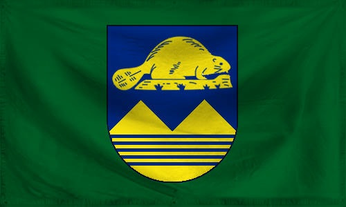
State flag of Oregon (untextured version)
Like the other US states with simple enough flag iconography, it was decided that the new flag of Oregon would also focus on a long-established state symbol, the beaver. The skillful golden rodent on a golden log was suddenly elevated from its humble position on the reverse of the older Oregon state flag, to the centerpiece of the coat of arms on the new state flag. In order to avoid making the coat of arms on the new heraldic flag of Oregon seem too empty, some symbolism related to Oregon's mountains and rivers was also added. The two equally tall golden peaks represent Oregonian mountain ranges, their natural riches, and the equality of the state's citizens. Below the peaks flow five blue rivers, symbolising the waters of the state, and often said to represent five specific major rivers of the state (per usual tradition, the Columbia River, Klamath River, Grande Ronde River, Snake River and Applegate River).
-----
The story so far:
Chapter 1
Chapter 3
Chapter 4
This post was originally made here, in the now-closed flag thread.
I'm restarting this series in order to continue it properly, from start to completion, in a single flag thread.
Last edited:
Alternate US state flags (by Petike): Chapter 3
Another new batch of redesigned, heraldic style US state flags, by your's truly.
Read on to see what five states I'll be covering this time.
----
General ATL backstory to this vexilological project
A timeline where the North American Vexilological Association saw the creation of a spinoff organisation, the North American Heraldry Association. During the ATL 1980s, the NAVA and NAHA gained a lot of public attention and lobbying power. Combined with a favourable political climate at the time, many US states agreed to create newer, simpler versions of their flags. Given the goal of greater simplicity, but also apprehension towards losing some of the traditional vexilological symbols, NAVA consultants proposed the idea of switching to European-style heraldry, with flags containing coats of arms instead of circular state seals. This was adopted as a compromise for many reworked US state flags, which still kept their basic "bedsheet" approach, but replaced their overly busy seals with coats of arms. This whole effort became known as the Heraldising reform. Though initially questioned by many, it gained gradual support from the public and new US state flags were born during the 1980s and 1990s.
----
State flag of North Dakota (untextured version)
State flag of South Dakota (untextured version)
State flag of Alabama - basic variant (untextured version)
State flag of Alabama - heraldic variant (untextured version)
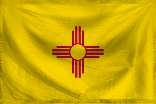
State flag of New Mexico - basic variant (untextured version)
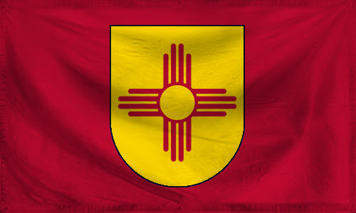
State flag of New Mexico - heraldic variant (untextured version)
State flag of Washington (untextured version)
-----
The story so far:
Chapter 1
Chapter 2
Chapter 4
This post was originally made here, in the now-closed flag thread.
I'm restarting this series in order to continue it properly, from start to completion, in a single flag thread.
Another new batch of redesigned, heraldic style US state flags, by your's truly.
Read on to see what five states I'll be covering this time.
----
General ATL backstory to this vexilological project
A timeline where the North American Vexilological Association saw the creation of a spinoff organisation, the North American Heraldry Association. During the ATL 1980s, the NAVA and NAHA gained a lot of public attention and lobbying power. Combined with a favourable political climate at the time, many US states agreed to create newer, simpler versions of their flags. Given the goal of greater simplicity, but also apprehension towards losing some of the traditional vexilological symbols, NAVA consultants proposed the idea of switching to European-style heraldry, with flags containing coats of arms instead of circular state seals. This was adopted as a compromise for many reworked US state flags, which still kept their basic "bedsheet" approach, but replaced their overly busy seals with coats of arms. This whole effort became known as the Heraldising reform. Though initially questioned by many, it gained gradual support from the public and new US state flags were born during the 1980s and 1990s.
----
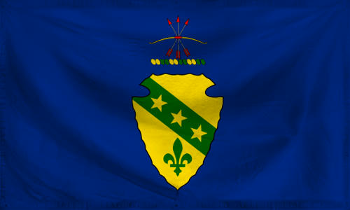
State flag of North Dakota (untextured version)
The North Dakota state flag was criticised by many for being unmemorable and including generic American imagery, with virtually no imagery directly related to the state itself. Though based on a historical regimental flag, it began to be seen as outdated. Many, even among the general public, found the design too complicated and non-memorable. NAVA and NAHA entered the project with the intention of creating an adequate heraldic flag, but to their own surprise, among the existing North Dakotan state symbols, they found an excellent and highly unique alternative to the highly generic flag. Ever since 1957, North Dakota already had a well-designed state coat of arms, reflecting both the native and colonial history of the state. What's more, its shield had some of the most unique shapes anywhere in the world, as it was intentionally designed to resemble a traditional stone arrowhead of the local native peoples, including the Lakota and Dakota of the Sioux. NAHA thus didn't have much trouble designing a new heraldic state flag for North Dakota, adopting the existing coat of arms for it. The only modifications were the ommission of the banner with the state motto below the shield, and the colour change in the thread that forms part of the crest, from azure to vert (in order to avoid clashing with the background colour of the flag). After the Heraldising reform on the North Dakotan state flag, the flag turned from one of the most generic and least distinctive of US state flags into one of the most unique.
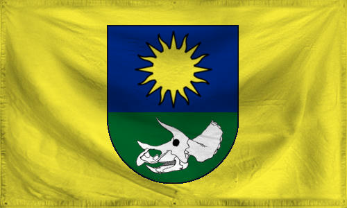
State flag of South Dakota (untextured version)
Dakota's overly complex and thematically rather generic "seal-on-a-bedsheet" flag would see a complete design replacement in its new heraldic state flag. Nevertheless, the state government and the general public in various opinion polls made it clear that they want the new flag to include at least some of the symbolism or monikers traditionally associated with the state. South Dakota has been traditionally referred to as the "Sunshine state" and this was the glue that was going to hold the concept of the new state flag together. Thus, a heraldic or (golden) sun on an azure (blue) background in the upper half of the shield, and an unusual golden background of the flag itself. However, early on, it became clear that the sun won't be the only charge present on the shield of the new South Dakotan coat of arms. A female student from one of the high schools of the state sent in her suggestion to the NAVA, NAHA and state government committee for the new state flag. Her suggestion was striking: Include an argent triceratops skull in the new coat of arms, the dinosaur genus already considered one of the state symbols, as a reference to South Dakota's global fame as a major paleontological site (especially with regards to the history of dinosaur fossil study and research). To everyone's surprise, this suggestion didn't fall through the cracks, but was adopted and supported by the then state government, and rather enthusiastically at that. The new state flag of South Dakota was first flown in 1996, and remains the first and only US state flag to include a dinosaur-related charge, and a rare example of an administrative unit coat of arms and flag that includes a dinosaur charge. Funnily enough, it was often rumoured the state government and state tourism organizations were pushing the "fossil paradise" angle in anticipation of increased tourist interest in the state related to dinosaurs. This was due to a new wave of interest in dinosaurs that began in the early 1990s, bolstered by 1993's premiere of Jurassic Park, and by 1996, the hotly-anticipated sequel The Lost World: Jurassic Park, set to hit movie theatres in 1997. Nowadays, it's unclear whether this was part of the real motivation, or if the whole rumour is an ex-post-facto urban legend made up by jokesters on the Internet.
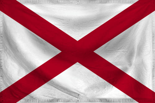
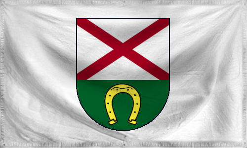
State flag of Alabama - basic variant (untextured version)
State flag of Alabama - heraldic variant (untextured version)
The state flag of Alabama, with its red St Andrew saltire, was considered another classic and minimalist state flag that didn't need to be replaced entirely. The typical version of the state flag was kept, but as part of the Heraldising reform, a heraldic state flag was created as well. It took the Alabama state government, the NAVA and NAHA a while to figure out the new coat of arms for the heraldic variant of the state flag. They didn't want to limit the shield to merely the red St Andrew cross, as iconic as it was, but for a while, they weren't sure what secondary symbol they could add, without adding too much unnecessary complexity to an already simple and clearly designed flag. In the end, the sheer amount of horse husbandry, horse trading, horse show and horsemanship traditions present in the traditional culture of the state made them opt to include a golden horseshoe on a green background in the lower part of the shield, under the red St Andrew cross on a white background in the upper part of the shield. Besides the horse-related traditions of Alabama, the horseshoe is supposed to symbolize good luck for the future of the state, a golden future rife with opportunities and progress.
State flag of New Mexico - basic variant (untextured version)
State flag of New Mexico - heraldic variant (untextured version)
For many decades, New Mexico's highly distinctive state flag was among the most praised US state flags, by vexilologists and the general public alike. It was therefore no real surprise when NAVA's and NAHA's cooperation in the Heraldising reform of US state flags concluded "if it ain't broken, don't fix it" and opted for a similar approach as with the state flags of Tennessee, Wyoming and Arizona. As in the case of the three aforementioned states (particularly Tennessee), the basic version of the state flag was kept in use, but a new heraldic variant was introduced as well.
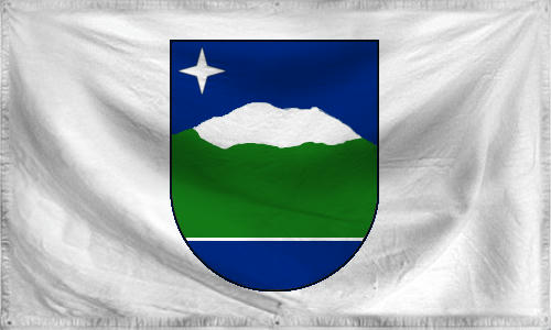
State flag of Washington (untextured version)
The state flag of Washington state was one of those that underwent a complete reworking. Though the state kept their seal with George Washington, one of the founding fathers of the US and the source of the state's name, the new flag and new coat of arms would not feature the seal with George anymore. A decision was taken by the state government, and their joint committee with NAVA and NAHA employees, to create a coat of arms and flag for Washington state that would be more reflective of the state's regional geography and geographic uniqueness. Similarly to South Dakota, Washington State's traditional nickname was to be acknowledged in the state's new coat of arms. Washington being called the "Evergreen state", it was crucial that one of the key colours in the new coat of arms would be vert, i.e. green. To keep things simple, it was also decided there would only be a single major charge on the coat of arms. Pouring through the history of state symbols for Washington state, the Heraldising reform committee stumbled upon an interesting fact. In the late 19th century and early 20th century proposals for a state flag, Mount Rainier (a.k.a. Tahoma/Tacoma), a landmark of the state, was one of the top candidates for inclusion. However, this design concept was ultimately never used. Many decades later, the committee revisited the concept and an outline in the shape of Mount Rainier, green with a snow-capped top, now adorns the Washington coat of arms. The sky above is azure (blue), with a single argent (silver) four-pointed star in the (heraldic) upper right corner, representing the Northstar (Polar star). At the bottom end of the coat of arms, there is another azure area, separated from the green of the Mount Rainier charge with a single thin, horizontal, argent band. These represent Washington state's position on the coastline of the Pacific Ocean, in the Pacific Northwest.
-----
The story so far:
Chapter 1
Chapter 2
Chapter 4
This post was originally made here, in the now-closed flag thread.
I'm restarting this series in order to continue it properly, from start to completion, in a single flag thread.
Last edited:
These give me an Alt!Madness Confederation of New England vibe 🤔Ideas for an independent New England:
View attachment 586139
View attachment 586140
View attachment 586141

I’m definitely reusing this flag for a remake whenever it comes. May make the symbol either smaller or more central though to make it distinct.
I’m definitely reusing this flag for a remake whenever it comes. May make the symbol either smaller or more central though to make it distinct.
Is the central one a spade/shovel? Kinda looks like a kunai to me.
Yeah that’s it.Is the central one a spade/shovel? Kinda looks like a kunai to me.
Share: