Status
Not open for further replies.
Still have to write proper interludes for these, but here are a few flags (and a coat of arms because the Heraldry Thread is a ghost town) from the latest chapter in my TL, Part #13: The Good Auld Days

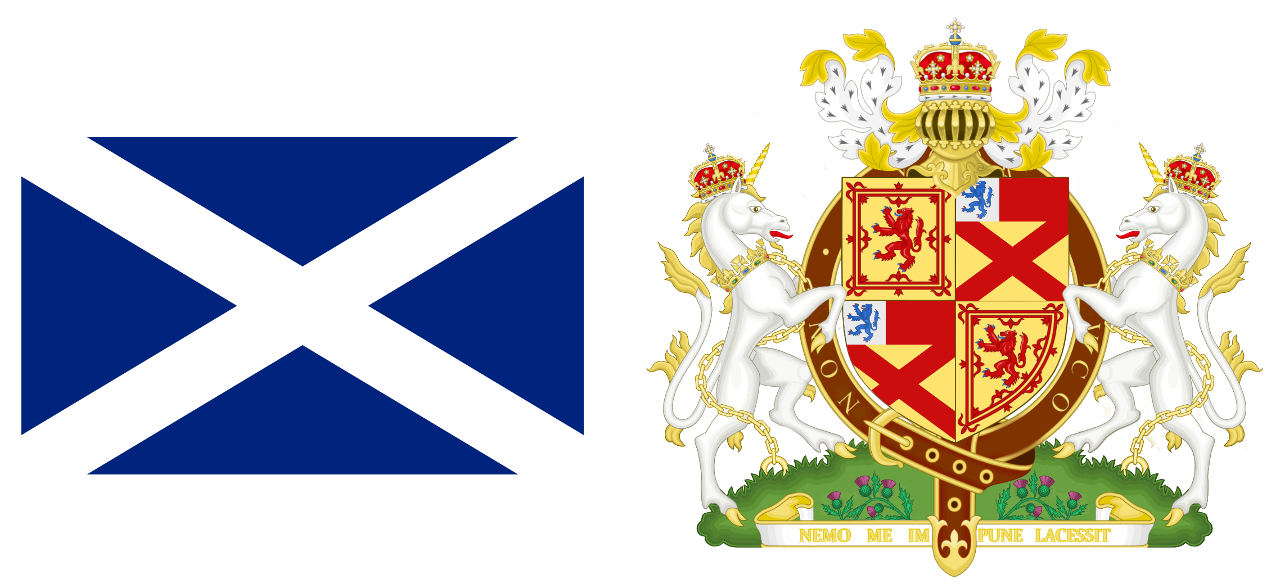
Firstly is the flag and arms of the rebelling Kingdom of Scotland under King Charles III Bruce. The royal arms were made in the midst of the War of the Spanish Succession by Charles in order to boost the legitimacy of Scotland, and the design reflects the nature of Scotland as a state attempting to define itself. The arms take the crest of Clan Bruce and quarters it with those of Scotland to show the ruling line. As a note, Charles Bruce's father ended up arrested and dying in the Tower of London, causing his son to flee north and purchase estate in Moray, where he sought refuge with his title as Earl of Elgin; he became a Covenanter and use his Clan's history and his own connection as a Covenanter to have himself elected King of Scots by the rebel Free Parliament of Scotland. A strap and buckle encircle the crest, but rather than have the clan motto displayed, the King's personal motto "Non Ducor, Duco" is displayed instead, a symbolic demonstration of how the king binds the kingdom together. The kingdom's motto is down below, Nemo me impune lacessit, used first by Charles II, kept due to the wonderful connotation of a rebel Scottish kingdom having the motto "none may strike me unpunished". Thistle and field adorns the bottom, a helm royal of the crown of Scotland is atop, and two unicorns sever as bearers.
ScotlandNOAH.png


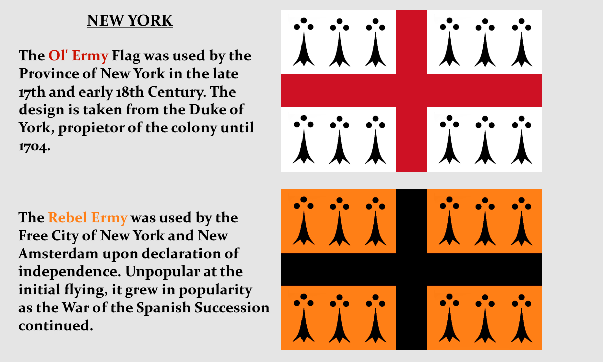
Next is New York, which had a flag for colonial use in trade ships due to competition between fellow colonies, which consisted of placing three black ermines in each quarter, taken from the Duke of York who used that as a the difference for his arms from his brother the King. The second flag is one used by the so-called "Free City of New York and New Amsterdam" which rebelled against the English Crown with the backing of the French and Dutch during TTL's War of Spanish Succession. Its a Dutch West India Company colony in all but name after that, with company officials mediating the colonial government's decisions for purposes of "synchronizing strategy".
Yorkish3.png
 
Still have to write proper interludes for these, but here are a few flags (and a coat of arms because the Heraldry Thread is a ghost town) from the latest chapter in my TL, Part #13: The Good Auld Days

Firstly is the flag and arms of the rebelling Kingdom of Scotland under King Charles III Bruce. The royal arms were made in the midst of the War of the Spanish Succession by Charles in order to boost the legitimacy of Scotland, and the design reflects the nature of Scotland as a state attempting to define itself. The arms take the crest of Clan Bruce and quarters it with those of Scotland to show the ruling line. As a note, Charles Bruce's father ended up arrested and dying in the Tower of London, causing his son to flee north and purchase estate in Moray, where he sought refuge with his title as Earl of Elgin; he became a Covenanter and use his Clan's history and his own connection as a Covenanter to have himself elected King of Scots by the rebel Free Parliament of Scotland. A strap and buckle encircle the crest, but rather than have the clan motto displayed, the King's personal motto "Non Ducor, Duco" is displayed instead, a symbolic demonstration of how the king binds the kingdom together. The kingdom's motto is down below, Nemo me impune lacessit, used first by Charles II, kept due to the wonderful connotation of a rebel Scottish kingdom having the motto "none may strike me unpunished". Thistle and field adorns the bottom, a helm royal of the crown of Scotland is atop, and two unicorns sever as bearers.

View attachment 368190


Next is New York, which had a flag for colonial use in trade ships due to competition between fellow colonies, which consisted of placing three black ermines in each quarter, taken from the Duke of York who used that as a the difference for his arms from his brother the King. The second flag is one used by the so-called "Free City of New York and New Amsterdam" which rebelled against the English Crown with the backing of the French and Dutch during TTL's War of Spanish Succession. Its a Dutch West India Company colony in all but name after that, with company officials mediating the colonial government's decisions for purposes of "synchronizing strategy".

View attachment 368191
Ah, the Yorkite flags make more sense now. You could disregard my comments in your thread now :happyblush
 
It is Sütterlin, which is based on actual German handwriting for centuries up to the Second World War. You're right @Remitonov that it's based on latin, albeit German styles of Blackletter script. Thanks to @fashbasher for reminding me that I can kind of read it, though it's a painful thing to decifer :confounded: The three flags say, in turn, "Bundesrepublik Deutschland", "Russian Federation" and "great seal of the united states of canada".
 
It is Sütterlin, which is based on actual German handwriting for centuries up to the Second World War. You're right @Remitonov that it's based on latin, albeit German styles of Blackletter script. Thanks to @fashbasher for reminding me that I can kind of read it, though it's a painful thing to decifer :confounded: The three flags say, in turn, "Bundesrepublik Deutschland", "Russian Federation" and "great seal of the united states of canada".

Given how Sanskrit-ish the text looks, I think I can understand why he opted for Sütterlin for his Thai Western Hemisphere. :V
 
I might be wrong here but aren't Sütterlin-letters meant to be connect like Arabic script?
They are, yes - like Arabic they're a cursive hand-written form originally. The letters connect on the third flag. Whether they actually connect or not as you use them will depend on how good the font is that you use. It's very hard to draw font characters in this type of cursive that link up perfectly as though hand-written when typed, unless you put in a huge amount of work building character variants and the selective coding to make a computer use them correctly. It's easier in Arabic as most characters begin and/or end on the baseline, depending on which of the initial/medial/final forms you're looking at.

I'd guess that the creator of the font on flags 1 and 2 wanted an earlier-style printer's typeface based on Sütterlin-type hand-writing, while the font on the third flag was intended to mimic the actual hand-writing more closely. I've seen some interesting Fraktur fonts over the years that fall into AH territory, where the idea was "What if Germans hadn't moved away from Fraktur script, and had evolved it into a more humanist form like Helvetica." The kind of Fraktur you could easily turn into a neon sign. I don't remember the font names any more though, unfortunately.
 
Some interesting flags there: the Irish one is a curious take but I think it would make more sense to have the St Patrick's Cross in front of the white cross, similar to the old Scottish Union Flag.

I'll admit to going back and forth between which cross would be in front, because I was uncertain of the meaning of what I wanted the flag to imply.
The red saltire on white is mostly associated with Anglo-Irish and Protestants, in OTL first being used as a symbol of Ireland in 1783 imposed by the British.
The white cross on green is mostly associated with native Irish and Catholics, in OTL being used in the Irish Catholic Confederacy until conquered by Oliver Cromwell.
Interestingly enough, both of these have been called Saint Patrick's Cross.

I think I'll keep the Irish flag as it is for now because it suggests supremacy of Irish Home Rule over Irish Unionism, though I may change it later once I've pinned down the specifics of how Ireland gains independence from Great Britain in TTL.

Thank you everyone for your kind words and likes as it has taken me nearly 4 years since joining to get over my nerves and actually post something.
 
South_Africa_Flag_Proposal.png
South Africa in the style of the Republic of Congo
South_Africa_Flag_Proposal_2.png
South Africa in the style of the Dutch Air Force

(I do not endorse Apartheid, I just chose the orange-white-blue color scheme for aesthetic purposes)
 
confluencia.png


A very quick flag. Confluencia; the Mercosur nations (Argentina, Brazil, Paraguay and Uruguay) join together. The blue represents clear skies and the green clean land, the wishes of the confderation and also remember the flags of its members. The stars obviously represent the Southern Cross but also the founding members.
 
Hawaii_Flag.png
Flag of an independent Hawaiian republic
Mitteleuropa_Flag.png
Mitteleuropa flag used as a symbol of the economic union
Mongolian_Manchu_Flag.png
Flag of a Manchu separatist group in Inner Mongolia
 
Tekengebied 1-100.jpg


This is the flag of the Union of Syndicalist Council Republics (of the Low Countries) or in Dutch: Unie van Syndicalistische Raadrepublieken. The flag was adopted shortly after the revolution in the Netherlands and Flanders-Wallonia. There will never be direct rule from Brussels or Amsterdam. Since in the U.S.R.R the importance of the local workers councils are emphasized above centralized government.

Tekengebied 1-100.jpg


The flag of the National Catholic Workers Party (Nationaal Katholieke Arbeiders Partij/Parti National des Travailleurs Catholiques) also called Degrellists. The party was founded as a direct response towards the atheist syndicalism of the leadership of the U.S.R.R. It combines totalist syndicalism with Catholicism and became popular in the early thirties of the 20th century.
 
Last edited:
IWW/Syndicalist America. Maybe needs more black somewhere there, but couldn't make it look that good.

OBGG2jD.png


This is the alternative:


wRUnOy5.png
 

Attachments

  • upload_2018-2-9_12-35-57.png
    upload_2018-2-9_12-35-57.png
    26.9 KB · Views: 404
Top
Status
Not open for further replies.
Top