You are using an out of date browser. It may not display this or other websites correctly.
You should upgrade or use an alternative browser.
You should upgrade or use an alternative browser.
Flag Thread IV
- Thread starter Pragmatic Progressive
- Start date
- Status
- Not open for further replies.


Thought I'd post a few flags I recently made for the 4 kingdoms of Scotland. I tried to make them as different as possible as other flags i.e. staying away from saltires and tricolours as much as possible.
Pictland (Most of North and North East Scotland)
Design based on the common Pictish artwork known as Z Rod and Double Disc which appears on numerous ancient stones in Pictland.
The colours are based on the earthy tones available from nature in this area and the blue on the discs represents the dye used in the Pictish tattoos.
View attachment 560138
Dal Riata (Parts of Northern Ireland, Argyll and the southern isles off Scotlands west coast)
Green is the fertile land of Dal Riata, the orange represents the 2 main parts on Ireland & Scotland, and the blue is the water joining the 2 lands.
View attachment 560140
Bernicia (The Lothians and Borders with some territory in Northumberland)
Based on the the existing Northumbrian county flag (bottom half) but with the sun, the symbol of the Lothians included
View attachment 560135
Alt Clud / Strathclyde (South Western Scotland but centred around the Firth of Clyde and the river valley)
The ecclesiastical centre of Govan was created by St Columba during one of his many journeys, this flag is based on the Christianity that St Columba introduced.
The blue is for the blessed water that removes sin, the white is cleansing of the soul with the water, the cross with circle is based on a traditional Celtic-style cross and the dove is the symbol of St Columba.
View attachment 560136
Hope you all like them.
I love the final one.
The top two? Even with the clashing colours?I think they're very nice.
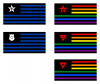
Here are the flags I designed with @Laqueesha for the "two Americas" I see clearly divided and locked in a deathmatch - one for the Republican rural conservative heartland and the other for the Democrat urban liberal coast (at the risk of oversimplifying). You've got very disparate flags for smaller causes like the Thin Blue Line flag, Black Lives Matter, Antifa, the Christian flag and so on, but none for the overall allegiances.
Ideally it should be clear which is which. Let me know which is the best option in each series.

Ideally it should be clear which is which. Let me know which is the best option in each series.
Attachments
Last edited:
The top two? Even with the clashing colours?
They are unusual, but they're still nice. They definitely have a newer/more modern feel, but I wouldn't say that the colours really clash that much.
Ha, now I'm jealous, this would be pretty much exactly what I would have needed for a fictional country for my own story. Nice work.
That coat of arms is based directly on the traditional coat of arms of that region, so I doubt you could use it for a fictional country and pretend it doesn't exist in OTL. The Turiec great coat of arms was directly influenced by the Révay family in the region, their coat of arms becoming part of the county's great coat of arms. The modern version I reused for my flag was designed by Ladislav Vrteľ in the late 1990s, for the historical/tourist region's public and promotional needs.
Last edited:
I wanted to improve the city flag of Nanjing, my hometown, for its red-green colour combination and emblem-on-flag layout made it a quite uncoordinated design.
But then I realized that though the flag violated a number of vexillology rules, it‘s actually also majestic and striking, and it’s downsides are closely linked to its advantages .
Then there are a number of East Asian city flags that are far worse than Nanjing. Basically, they aren’t flags at all, but are 1990s and 2000s commercial logo designs, changing ANY of them, to something more linked to their culture and history, would be doing their local people a great service.
Examples of these “logo on a white sheet” flags
South Korean Provinces
Taiwanese cities and counties
Chinese cities
Flag of Illyria or Croatoslovenia

Nice flag, but it must be for a relatively new state if Slovenia is using that arms, which is from the '90s.
If it's supposed to be an earlier flag (which I assume it is given that the white comes first on the Šahovnica), I would use the Slovene Illyrian Crest or maybe the Carniolan Eagle if you don't want it looking too similar to the other stuff. Alternatively, just the 3 stars alone without the mountains and water were historically used as well to represent Celje and there is the Carantanian Panther, though it may be controversial as it could be taken as implying a claim on southern Austria.
My personal preference for Illyrian flags is just the crescent on red, but this does work better for a more federal state, though then shouldn't the crescent which symbolizes all Illyrians be in the central Inescutcheon instead of the Croatian Chequy?
Again, this isn't meant to roast your flag, it's quite nice and I love seeing anything pertaining to the Balkans, these are just some opinions and realism tips.
Last edited:
That Nanjing flag only violates having a complicated emblem. And is kind of forgivable.I wanted to improve the city flag of Nanjing, my hometown, for its red-green colour combination and emblem-on-flag layout made it a quite uncoordinated design.
But then I realized that though the flag violated a number of vexillology rules, it‘s actually also majestic and striking, and it’s downsides are closely linked to its advantages .
Then there are a number of East Asian city flags that are far worse than Nanjing. Basically, they aren’t flags at all, but are 1990s and 2000s commercial logo designs, changing ANY of them, to something more linked to their culture and history, would be doing their local people a great service.
Examples of these “logo on a white sheet” flags
South Korean Provinces
Taiwanese cities and counties
Chinese cities
I agree. I suggest using a modified Carniolan Eagle: blue on white with 3 gold stars replacing the checkered crescent.Nice flag, but it must be for a relatively new state if Slovenia is using that arms, which is from the '90s.
If it's supposed to be an earlier flag (which I assume it is given that the white comes first on the Šahovnica), I would use the Slovene Illyrian Crest or maybe the Carniolan Eagle if you don't want it looking too similar to the other stuff. Alternatively, just the 3 stars alone without the mountains and water were historically used as well to represent Celje and there is the Carantanian Panther, though it may be controversial as it could be taken as implying a claim on southern Austria.
My personal preference for Illyrian flags is just the crescent on red, but this does work better for a more federal state, though then shouldn't the crescent which symbolizes all Illyrians be in the central Inescutcheon instead of the Croatian Chequy?
Again, this isn't meant to roast your flag, it's quite nice and I love seeing anything pertaining to the Balkans, these are just some opinions and realism tips.
With the Illyrian Arms being quartered: Croatia Proper, Slovenia, Dalmatia, Slavonia, escutcheon Ancient Illyria (the star and crescent on red).
That Nanjing flag only violates having a complicated emblem. And is kind of forgivable.
I agree. I suggest using a modified Carniolan Eagle: blue on white with 3 gold stars replacing the checkered crescent.
With the Illyrian Arms being quartered: Croatia Proper, Slovenia, Dalmatia, Slavonia, escutcheon Ancient Illyria (the star and crescent on red).
So something like this (ignoring the shitty border of course)?
Pretty much. You'd probably need to shift things about manually so the lions and star from the lower half are less covered by the central shield or border (much as you did the eagle) but this is pretty much what I envisioned!
@Petike just reminded me of an old challenge entry of mine:
The Sanchan Regency (Regencia Sancxàna)
Sanchana has its origins in the Navarrese colonisation of the New World. Though it was never able to fully compete with the growing Porto-Leonese (later Spanish), Anglo-Irish, or even Lorrainian empires it was able to maintain its presence in the Grand Gulf with said territories forming La Tèrra de Sancxo and often governed as a viceroyalty.
The region first separated from Navarre when the kingdom was occupied by the United Republics of Spain leaving Sanchana as the home for the Navarrese Navy. During this period the naval flag of crossed chains on a red cross became strongly associated with Sanchana itself and following restoration Raimon V instituted crossed chains on a fully red field as the naval ensign.
The second and final separation began as the Sanchan Viceroyalty grew at odds with the rise of racial nationalism in Europe having developed a strongly pragmatic approach to the idea of race, given its large indigenous and former slave minorities had produced a majority multiracial population, and strong ties with the postcolonial Anglo-Irish League of Regencies and Empire of Cinnabar. Its Government formally declared independence in 1949 replacing the red cross and chains on the flag with a black cross and coins - a gold coin on black featuring on the Civil Arms of New Bayonne.

Why only one sword?
The Sanchan Viceroyalty flag (and former Navarrese Ensign):@Petike just reminded me of an old challenge entry of mine:
Last edited:
Why only one sword?
Because the fascist symbol represents only one sword, behind a green coat of arms containing an ear of wheat.
Because the fascist symbol represents only one sword, behind a green coat of arms containing an ear of wheat.
maybe have the sword centered instead, either pointing up or down. having a single diagonal sword just makes the design look uneven.
for example:
Last edited:
I still decided to design a new flag for Nanjing, to participate in the new challenge.That Nanjing flag only violates having a complicated emblem. And is kind of forgivable.
There are other layouts in my computer.
- Status
- Not open for further replies.
Share: