The town of Cary, North Carolina's flag isn't great.

Having the town seal, name, and location is one thing, but the random yellow border is something else entirely.
The yellow border must symbolize the containment area.
The town of Cary, North Carolina's flag isn't great.
Having the town seal, name, and location is one thing, but the random yellow border is something else entirely.

The town of Cary, North Carolina's flag isn't great. Having the town seal, name, and location is one thing, but the random yellow border is something else entirely.
When you get the intern to design your flag
View attachment 306322


*snip*
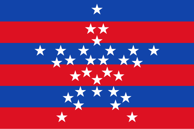
It was probably made so simple to avoid offending anyoneFuck it, why not? It's only the holy land to three major religions with millions upon millions of followers, not like anyone's gonna' care right?
Reminds me of those little buggers from Super Mario. The ones that pop out of the green tubes and try to eat ya.
They're overcompensating for not living in San Francisco.Why do Angelenos need to have "County of Los Angeles" two times on their flags?
A thread dedicated to bad flags?
The first is the flag of Mars, although unofficial, it's used by both the mars society and the planetary society, and the colours do not go together. Red and greed should never be seen, everyone knows that. It might look better if they placed the blue between the red and green to create a barrier, but they didn't.
Menage à trout.And finally, Kvalsund, which looks like a three-way kiss between fish.
View attachment 306655


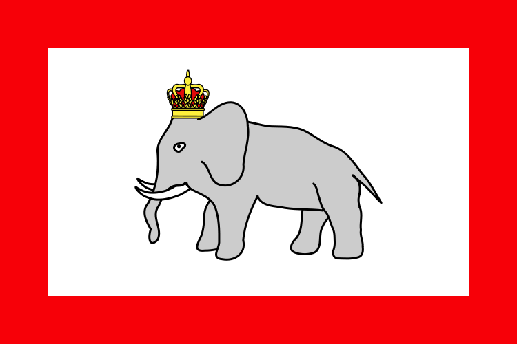
Babar is that you?Here's the MS Paint flag of the african kingdom of Dahomey.
No cultural offense intended, but was this really the only flag they could find?
Austin, Texas.
The standard low-effort flag is a seal on a field of some color. Austin did... some of that.
I've seen a proposal which is essentially that. It looked too much like Puerto Rico averaged with the Czech Republic to me, but it'd be a step up.The seal turned horizontally would make a decent flag: the blue wedge on the hoist, genie lamp (no idea what that symbolizes in Austin), and a red-white triband.