Or change the stars for leafs.I like this one, though I'd add six or seven more stars
Or change the stars for leafs.I like this one, though I'd add six or seven more stars
How about standard flag, but with maple syrup bottle at the middle, instead of maple leaf?
Ah but if we change the colours and say have 20 -30 stars to represent the northern states that join Canada.I'm thinking this myself....
It's 1965, & debate is underway to replace the Red Duster.
Your mission: come up with something less boring than the Maple Leaf.
(My personal choice, the beaver kicking Uncle Sam's ass, is an obvious fail.
Respect for national colors, & for the Quebec & Native influences, is mandatory.
Didn't the Comedy Channel up here use that as a gag in a parody of the ad? (Along with the Uncle Sam getting kicked in the butt, which was my fave choice.I know it's been years and I hate to necro a thread, knowing it will be closed; but I have to share this one I found because of just how unique it is;
)Inclusivity jokes aside, a “modern reimagining” of the Canadian flag would probably try to include some element to represent the Native Americans. Which might be a problem: there are over 600 different officially-recognized tribal governments in Canada so what symbol(s) would you use to somehow represent them all?While we are adding colours, all those special interest groups will require their colours on a new flag: LGBT etc. rainbow.
“Black Lives Matter” will probably demand a black stripe .... even though Africans are only a tiny percentage of Canadian population. In Vancouver, dark-skinned citizens are more likely from Southern India.
Then Canadians Sikhs might demand a kirpan knife ....
Do it medieval style and incorporate everything.so what symbol(s) would you use to somehow represent them all?
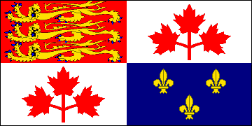
The Maple Leaf doesn't represent Quebec in some way? I was under the impression that the three parts of the OTL maple leaf symbol represented English speakers, Quebecois, and the First Nations peoples.I've always been partial to the Pearson Pennant:
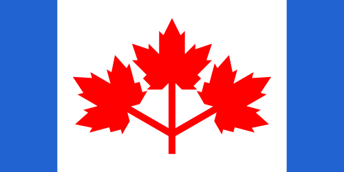
Not having any blue element on our flag is a pretty gross oversight, "official colours" be damned. There ought to be an acknowledgment of Quebec somehow, since it's undeniable that they've maintained a distinct identity, yet one that should still be confirmed as Canadian.
I'll be the first to admit, though, that the OTL flag is superior aesthetically. The single maple leaf is an iconic symbol, and the three leaves of the Pennant overcomplicate the design. That said, I feel like the Pennant needs the triple leaf design, since the OTL flag with blue bars instead of red would just look shitty.

See? The leaf becomes too dominant, and it throws off the feel of the whole thing. It looks clownish.
I wasn't aware Quebec was a CSA member.http://rebelflag.ca/wp-content/uploads/2016/03/RF-29.jpg
The image won't post here.
Wouldnt this belong in the maps and graphics forum?
No element of the flag is given any official meaning or symbolism. So no, Quebec is not represented on the flag, nor is English Canada, nor First Nations nor anyone else. This was entirely intentional: the flag was designed to be neutral— without any reference to colonial history or linguistic communities— to serve as a bold, new and unifying symbol for Canada.The Maple Leaf doesn't represent Quebec in some way? I was under the impression that the three parts of the OTL maple leaf symbol represented English speakers, Quebecois, and the First Nations peoples.