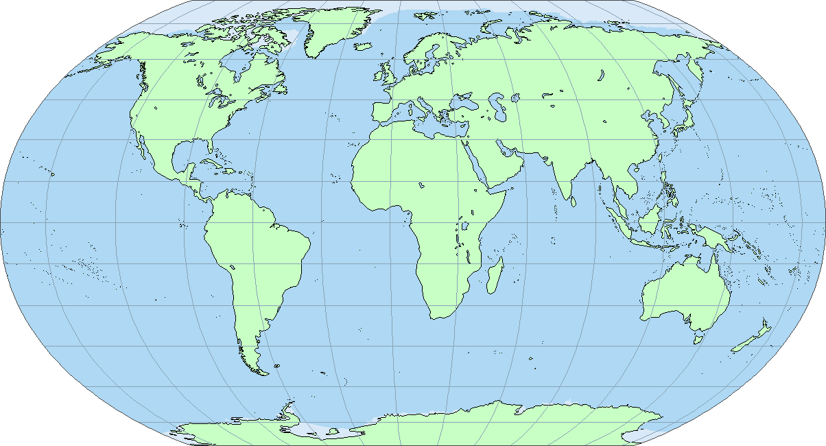
Currently, most world maps on this site use the Robinson projection. Here's a blank map of the Earth, followed by a completely blank map with only lines of latitude and longitude.
I don't think that this projection is ideal, for several reasons.
Of course no map projection is perfect; it is impossible to perfectly map a globe onto a 2D surface. However, I think that the following projection, which I have just made, is significantly better.

Advantages of this projection:
So, questions. Is this better than the Robinson projection for general use on the site, and if so, should we start a collaborative effort to create a world map in this new projection? Any suggested improvements?
I don't think that this projection is ideal, for several reasons.
- Distances vary between different parts of the map.
- On the edges of the map, there are large amounts of skewing.
- It is difficult to work out exactly which direction is north, especially if the gridlines are removed.
- It's impossible to use it for a map centered on the Pacific.
- Areas very close to the poles are grotesquely stretched and impossible to map accurately.
Of course no map projection is perfect; it is impossible to perfectly map a globe onto a 2D surface. However, I think that the following projection, which I have just made, is significantly better.
Advantages of this projection:
- Distances are much easier to calculate. Vertical distances are *always* 27.777 kilometers per pixel; horizontal distances are (33.3333*cos y) kilometers, where y is the latitude of the location in question. (For locations further north than 60 degrees north or further south than 60 degrees south - i.e., in one of those triangles near the poles - use y=60.)
- No more skewing. New Zealand and Alaska are now no longer horribly contorted.
- The poles are much less distorted and can be mapped accurately.
- You can easily move the center and change it into a Pacific-centered map.
- While one disadvantage is that the landmasses at the poles are non-contiguous, this is not a big issue, for the only landmasses that are divided are very sparsely-populated anyway.
- Even when the gridlines are removed, it's easy to tell which direction is north. (For most of the map, north is straight upwards; in the triangles near the poles, north is towards the apex of the triangle).
So, questions. Is this better than the Robinson projection for general use on the site, and if so, should we start a collaborative effort to create a world map in this new projection? Any suggested improvements?
")
