You are using an out of date browser. It may not display this or other websites correctly.
You should upgrade or use an alternative browser.
You should upgrade or use an alternative browser.
OTL Election maps resources thread
- Thread starter Thande
- Start date
Here's the 1905 election. The left managed to win back a modest majority and formed a government afterwards. Ever since 1897 suffrage had very gradually increased at every election, which is reflected by the growing number of Freethinking Democratic and Social Democratic seats.
Honestly this wasn't the most exciting election ever so there's not much more to tell about it.

Honestly this wasn't the most exciting election ever so there's not much more to tell about it.

Last edited:
Alex Richards
Donor
The line of Liberal seats next to the ultra-Catholic bits seems a bit odd out of context of the Belt.
The only explanation I can think of is that those seats are rather religiously heterogeneous, inhabited by both Catholics and Protestants who despise each other so much they'd rather vote for a Liberal in the second round than for their fellow rightist. Other than that, two of those seats are large towns (Dordrecht and Arnhem) which are typically more left-leaning.

1968 Democratic primaries by county. County maps for primaries this early are hard to find.
Definitely DID NOT make this for the record.
Last edited:
Where did you find the county maps?
1968 Democratic primaries by county. County maps for primaries this early are hard to find.
Thande
Donor
Although there is a copyright mark on the map, you may want to be clear in your post whether you are posting something you made yourself or found elsewhere.
1968 Democratic primaries by county. County maps for primaries this early are hard to find.
Google search.Where did you find the county maps?
Oh, I definitely didn't make it myself, county maps take forever. Still, that is now noted in the post.Although there is a copyright mark on the map, you may want to be clear in your post whether you are posting something you made yourself or found elsewhere.
Thande
Donor
Thanks, just wanted to make sure. I think I remember seeing other ones similar to that posted on the US election atlas forum, there was a megathread (though some of the old imagehostings may be dead now)Oh, I definitely didn't make it myself, county maps take forever. Still, that is now noted in the post.
edit: found it - https://uselectionatlas.org/FORUM/index.php?topic=97330.0 He even found broken-down data for Kansas in 2016, though admittedly by legislative district(!) not county, which is rather impressive.
Thande
Donor
Right, I didn't know what your methodology was. I'll take 2016 data if you can do it then (no rush, as I know you'll probably be wanting to do Alabama-related stuff in the near future).I could probably construct something for 2016 (by summing the raw votes tabulated by racial group by state, and then dividing by the theoretical eligible population), but only that election.
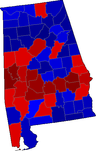
Results for the special election for Alabama are in. The Talley as of 12/12/2017 11:37 EST:
Doug Jones: 673,236 (49.9%)
Roy Moore: 652,300 (48.4%)
Write In: 22,873 (1.7%)
(County colors based on US Election Atlas)

It seems that for the first time since 1992, an Alabama Democrat has been elected to the US Senate (albeit just barely).
Doug Jones: 673,236 (49.9%)
Roy Moore: 652,300 (48.4%)
Write In: 22,873 (1.7%)
(County colors based on US Election Atlas)
It seems that for the first time since 1992, an Alabama Democrat has been elected to the US Senate (albeit just barely).
Last edited:
Results for the special election for Alabama are in. The Talley as of 12/12/2017 11:37 EST:
Doug Jones: 673,236 (49.9%)
Roy Moore: 652,300 (48.4%)
Write In: 22,873 (1.7%)
(County colors based on US Election Atlas)
View attachment 360018
It seems that for the first time since 1992, an Alabama Democrat has been elected to the US Senate (albeit just barely).
Might want to change the color of the text for the candidates if you are using atlas colors - I know somebody is going to be confused that Moore is red text yet won the black belt.
Made this to compare the Alabama result to the last two narrow Democratic senatorial wins there...which is going back a bit.
View attachment 360075
No matter what, Winston County remains red.
But seriously I love how erratic the county results are between all three elections.
Thande
Donor
I may post it on the Deviantart and do a writeup attempting to explain why.No matter what, Winston County remains red.
But seriously I love how erratic the county results are between all three elections.
(The obvious one is 'notice the lack of Black Belt in 1962 because, er, black people couldn't vote')
1962 and 2017 look close to just a palette swap.No matter what, Winston County remains red.
But seriously I love how erratic the county results are between all three elections.
Share: