A lot of people have recently inquired about my news graphics. Finally, I have gotten myself into action and have made a tutorial to get everyone to make their very own imaginary news station to report on news from your alternate (or future) world!
In this tutorial, I will be using Illustrator. For those of you who want free vector program, you can download Inkscape. It will do most of the same things that Illustrator will for things like this, and most of the things I will be explaining are universal and not limited to Illustrator in its scope of use.
First things first, fire up your vector illustration software, and go to File / New. Ideally, you would use the golden ratio (1 to 1.68) to make something like this, but that is not feasible due to the fact that most pictures are closer to square. Therefore, I use a ratio of about 1 to 1.45. That usually works the best for pleasing to the eye and still able to fit pictures well.
You should open up to a blank canvas. First thing to do is to slap down a few rectangles. You can find these under the shapes tool. Once you select rectangle, all you have to do is drag on your artboard to make a rectangle. Make a skinny one at the bottom, and one about twice as thick just above it. These will be your ticker and main headline sections once the graphic is complete.
Step two is getting your rectangles gradients. A solid color looks boring and amateurish, but the tasteful use of gradients (and drop shadows, which I will get to another time) is really what could separate you from the rest of people who can't use them properly. On the right side of the screen toolbar, there is a small rectangle with a gradient. Click on that icon, and it will bring you to a small popout that shows a large gradient. You can add "handles" (extra color stops) by pressing just below, but we don't need to do that right now. Just double click inside of a handle to bring you to the small popup below. Click on the small button in the corner to pull up a list like the one below, and select RGB as your palette type.
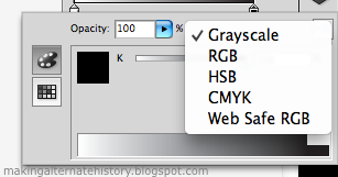
Grayscale could work just fine, but only if you wanted it to be black and white. In RGB, you can pull the tabs or type in numbers to get a color. For today, I wanted a nice light gray, which is a RGB value of 175-175-175. Whenever all three numbers are the same, the color will be a shade of gray. For now, we will leave the other handle white. Here is what your canvas should look like at the moment.

Now, select the gradient tool on the left side of the screen. It will pop up with a bar over the shape, showing the gradient. Get close to the square on one end, and you will see a circle at 270 degrees, and this is to turn the gradient. We want to turn ours straight up, with white on top and gray on bottom. Push in on the square size to decrease the length of the gradient. We want the white to start right on top of the rectangle and the gray to end on the bottom of the rectangle. I apologize, but whenever I took a screenshot, the gradient bar went away for a reason unbeknownst to me.
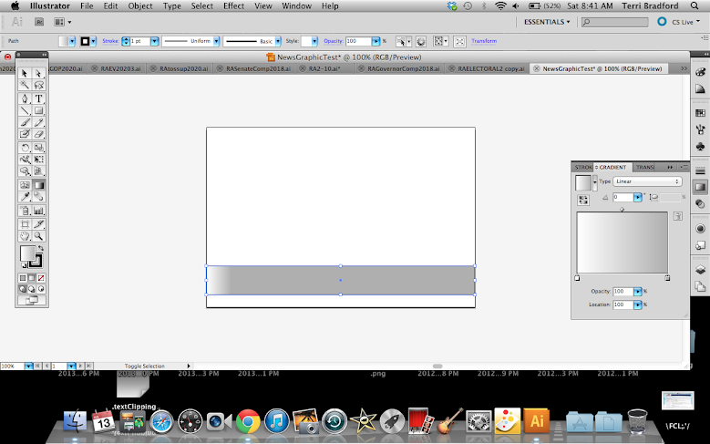
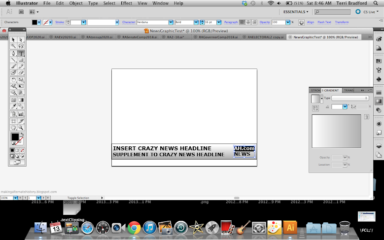
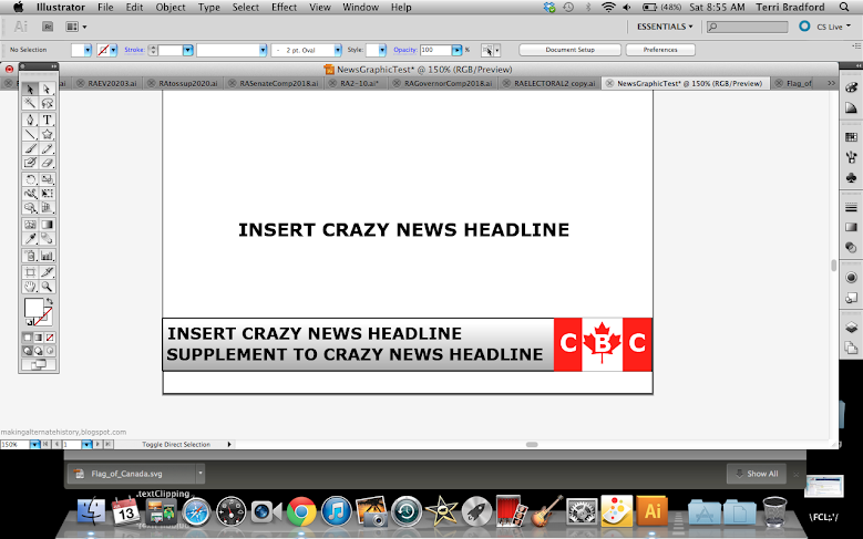
Now, you can add in preliminary text. In this shot, I chose Verdana font at bold 30 pt. I like Verdana and Arial the most, but sometimes Impact can look good in types of news graphics. It doesn't matter to much what your text is like now, but it is important just to get some on the page to start getting into the nitty gritty of the layout.
Next thing we want to look at is a logo. It might seem like a lot of work, but if there is something you want in your logo, then there is no need to reinvent the wheel. Look up your object you want with the term svg at the end. This is a vector file, and the type you want when editing in a vector program. Usually the first link will be a Wikipedia one, and if not, find the Wikipedia one. Most vetcor files on Wikipedia are open source as long as you do not claim the work as your own, which is why it is my first stop. In this case, I searched "Canadian flag svg", and this is what I got.

Click directly on the image, and it will open in a new tab. Right click, save, and open in your vector program. Make sure objects are selected by clicking and dragging over the entire thing. Copy (Ctrl-C or Cmd-C) and paste (Ctrl-V or Cmd-V) on your news graphic. Grab the corner and resize while holding the shift key down. This maintains perfect proportions from the original.
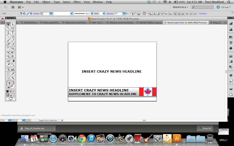
The logo almost always includes the abbreviations, with the BC or NN suffix. This requires creative discretion based on what you want your logo to look like, but in my case, I wanted it to mesh with the flag. Press the text tool and drag a small box over the logo, and then type. I put extra spaces in mine to fit the flag.
The logo should be clean, but is too boring and stiff right now. The perfect way to fix it and make it look professional is with a gradient. Check the shapes solid RGB value, and insert that as the color of the first gradient handle.
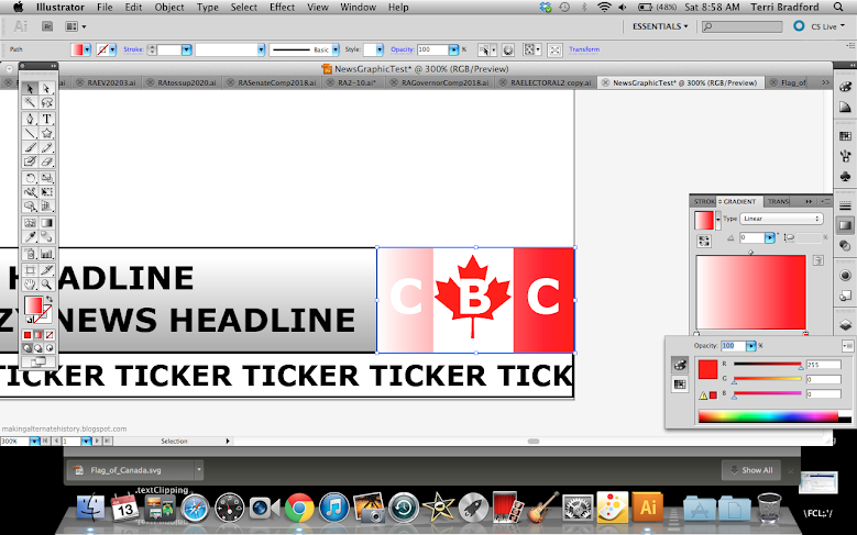
Next is the important part. Switch to the second gradient handle, and then switch from RGB to HSB from the dropdown menu in the upper right corner like I showed earlier. This gives you three bars: Hue, saturation, and blend. Decrease the saturation of the first color to around 80%. This gives you a soft gradient. Now, fix it with the gradient tool on the left bar to make the lighter color on top and darker on bottom.

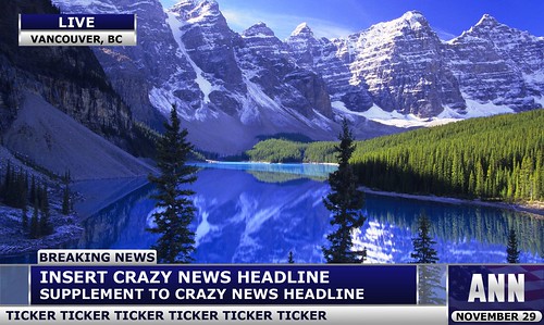
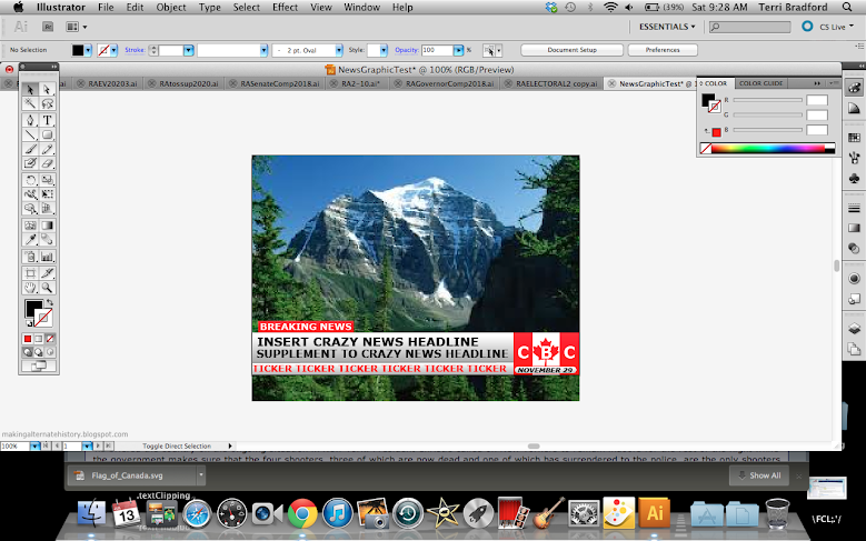
You can't quite get the feel of what the final result will look like without a picture, so I put in a random picture of the Canadian Rockies. This is the point where you will have to start taking a lot of artistic liberty and make it your own. What I did was decrease the length of the ticker and extend the logo. I also made a straight line with 2pt stroke and 150-150-150 color to divide the ticker and headline. It is subtle, but would look much more plain without it. I also made the headline text smaller and decreased the size of the bar behind it. I also made a breaking news symbol by copying the logo rectangle and the ticker text. You can use the eyedropper tool when the text is selected and pressing on any other object to make it that color. Usually, your ticker text starts at the far left while the main headline has a decent amount of buffer room. The headline should also line up as close as possible with the breaking news icon.
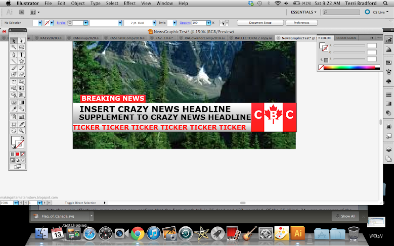
At this point, the logo still looked off and I was missing some sort of time. I put the date in the empty space at the bottom of the logo by making a rounded rectangle (under the shapes bar menu) and making Verdana bold-italic size 10 text.
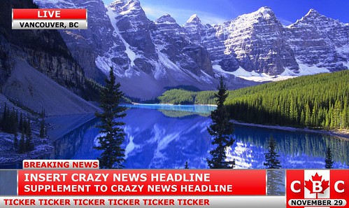
For some situations, you want to show live and the place just for some pizzaz. Copy the headline rectangle and the breaking news rectangle and place them adjacent to eachother. A dark grey divider does wonders in this part as well. To top it off, I changed the "LIVE" color to white and added the dark gray bar at the top of the headline to finish things off. I also decreased text sizes for the second time in the ticker.
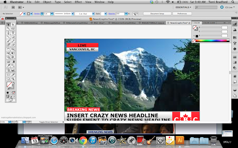
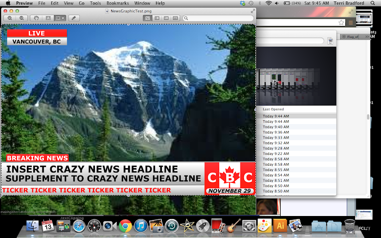
To get your finalized graphic out, just go to File / Export. Make sure it is a .png, and save. You can then go to Finder and double click to open it in Preview. There you can crop any straggling parts left from the export.
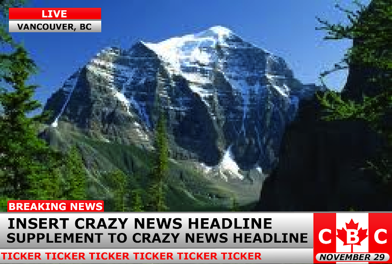
Here is the final product! It can still be refined I think by making the headline text smaller and adding gradients to some of the text. Overall, I hoped you found this tutorial informative and helpful. Ask me any questions below, I will be happy to answer them.
In this tutorial, I will be using Illustrator. For those of you who want free vector program, you can download Inkscape. It will do most of the same things that Illustrator will for things like this, and most of the things I will be explaining are universal and not limited to Illustrator in its scope of use.
First things first, fire up your vector illustration software, and go to File / New. Ideally, you would use the golden ratio (1 to 1.68) to make something like this, but that is not feasible due to the fact that most pictures are closer to square. Therefore, I use a ratio of about 1 to 1.45. That usually works the best for pleasing to the eye and still able to fit pictures well.
You should open up to a blank canvas. First thing to do is to slap down a few rectangles. You can find these under the shapes tool. Once you select rectangle, all you have to do is drag on your artboard to make a rectangle. Make a skinny one at the bottom, and one about twice as thick just above it. These will be your ticker and main headline sections once the graphic is complete.
Step two is getting your rectangles gradients. A solid color looks boring and amateurish, but the tasteful use of gradients (and drop shadows, which I will get to another time) is really what could separate you from the rest of people who can't use them properly. On the right side of the screen toolbar, there is a small rectangle with a gradient. Click on that icon, and it will bring you to a small popout that shows a large gradient. You can add "handles" (extra color stops) by pressing just below, but we don't need to do that right now. Just double click inside of a handle to bring you to the small popup below. Click on the small button in the corner to pull up a list like the one below, and select RGB as your palette type.
Grayscale could work just fine, but only if you wanted it to be black and white. In RGB, you can pull the tabs or type in numbers to get a color. For today, I wanted a nice light gray, which is a RGB value of 175-175-175. Whenever all three numbers are the same, the color will be a shade of gray. For now, we will leave the other handle white. Here is what your canvas should look like at the moment.
Now, select the gradient tool on the left side of the screen. It will pop up with a bar over the shape, showing the gradient. Get close to the square on one end, and you will see a circle at 270 degrees, and this is to turn the gradient. We want to turn ours straight up, with white on top and gray on bottom. Push in on the square size to decrease the length of the gradient. We want the white to start right on top of the rectangle and the gray to end on the bottom of the rectangle. I apologize, but whenever I took a screenshot, the gradient bar went away for a reason unbeknownst to me.
Now, you can add in preliminary text. In this shot, I chose Verdana font at bold 30 pt. I like Verdana and Arial the most, but sometimes Impact can look good in types of news graphics. It doesn't matter to much what your text is like now, but it is important just to get some on the page to start getting into the nitty gritty of the layout.
Next thing we want to look at is a logo. It might seem like a lot of work, but if there is something you want in your logo, then there is no need to reinvent the wheel. Look up your object you want with the term svg at the end. This is a vector file, and the type you want when editing in a vector program. Usually the first link will be a Wikipedia one, and if not, find the Wikipedia one. Most vetcor files on Wikipedia are open source as long as you do not claim the work as your own, which is why it is my first stop. In this case, I searched "Canadian flag svg", and this is what I got.
Click directly on the image, and it will open in a new tab. Right click, save, and open in your vector program. Make sure objects are selected by clicking and dragging over the entire thing. Copy (Ctrl-C or Cmd-C) and paste (Ctrl-V or Cmd-V) on your news graphic. Grab the corner and resize while holding the shift key down. This maintains perfect proportions from the original.
The logo almost always includes the abbreviations, with the BC or NN suffix. This requires creative discretion based on what you want your logo to look like, but in my case, I wanted it to mesh with the flag. Press the text tool and drag a small box over the logo, and then type. I put extra spaces in mine to fit the flag.
The logo should be clean, but is too boring and stiff right now. The perfect way to fix it and make it look professional is with a gradient. Check the shapes solid RGB value, and insert that as the color of the first gradient handle.
Next is the important part. Switch to the second gradient handle, and then switch from RGB to HSB from the dropdown menu in the upper right corner like I showed earlier. This gives you three bars: Hue, saturation, and blend. Decrease the saturation of the first color to around 80%. This gives you a soft gradient. Now, fix it with the gradient tool on the left bar to make the lighter color on top and darker on bottom.
You can't quite get the feel of what the final result will look like without a picture, so I put in a random picture of the Canadian Rockies. This is the point where you will have to start taking a lot of artistic liberty and make it your own. What I did was decrease the length of the ticker and extend the logo. I also made a straight line with 2pt stroke and 150-150-150 color to divide the ticker and headline. It is subtle, but would look much more plain without it. I also made the headline text smaller and decreased the size of the bar behind it. I also made a breaking news symbol by copying the logo rectangle and the ticker text. You can use the eyedropper tool when the text is selected and pressing on any other object to make it that color. Usually, your ticker text starts at the far left while the main headline has a decent amount of buffer room. The headline should also line up as close as possible with the breaking news icon.
At this point, the logo still looked off and I was missing some sort of time. I put the date in the empty space at the bottom of the logo by making a rounded rectangle (under the shapes bar menu) and making Verdana bold-italic size 10 text.
For some situations, you want to show live and the place just for some pizzaz. Copy the headline rectangle and the breaking news rectangle and place them adjacent to eachother. A dark grey divider does wonders in this part as well. To top it off, I changed the "LIVE" color to white and added the dark gray bar at the top of the headline to finish things off. I also decreased text sizes for the second time in the ticker.
To get your finalized graphic out, just go to File / Export. Make sure it is a .png, and save. You can then go to Finder and double click to open it in Preview. There you can crop any straggling parts left from the export.
Here is the final product! It can still be refined I think by making the headline text smaller and adding gradients to some of the text. Overall, I hoped you found this tutorial informative and helpful. Ask me any questions below, I will be happy to answer them.