Dominion of Southern America - Updated July 1, 2018

Glen

Moderator
Did I already place these here for reference?

Cheers. Feel free to use it :D

How about this (chronological) set of flags?

I have some suggestions:

For Republic of Brazil, the Incofidência Mineira would be perfect, as (IIRC) that event occurred in your TL too.
800px-Bandeira_de_Minas_Gerais.svg.png

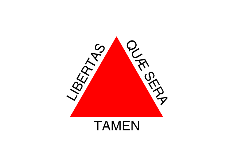
It was a very republican and irredentist symbol - Brazil, IOTL, did not adopted it when it became independent because the red triangle on red with the "libertas quae sera tamen" motto was too "revolutionary" against Portugal and the Monarchy that Brazil became. I think that, in the context of your TL, the Armillar Sphere would be a rather "continuist" flag, too connected to the Portuguese symbolism given to Brazil, and would not have a lot of popular support.
The Latin motto in it reads "Libertas quae sera tamen", a verse of Virgil that translates to "Freedom, albeit late".


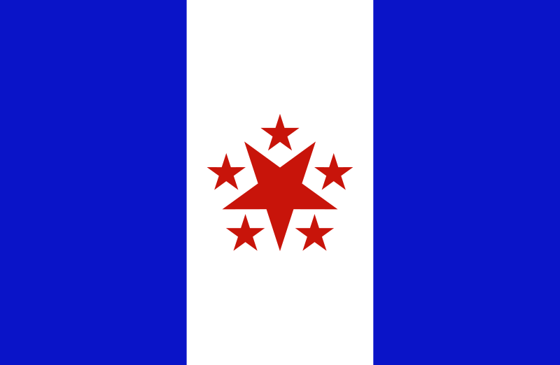
For Condeferation of the Equator, I tried something inspired in both the red-white-black of the abolitionists and the cross used in the OTL flag of the Confederation.
confeqvectorizedfree.png

The seven stars are for the seven provinces that form it (Sergipe, Pernambuco, Rio Grande do Norte, Paraiba, Alagoas, Ceará and Piaui), as it is a Confederation.

For Bahia, I used the dove from the flag of Salvador and the traditional colour of Bahia (red, blue and white).
bahia.png

It's not very revolutionary, but clearly shows their republican and "fraternal"/"equalitary"(in the french revolutionary meanings) of the republic. Besides, most of the black political revolts, in this period, were inspired by Haiti(is there an Haiti in your TL?), so the red-blue colour scheme could have another inspiration too.

I did also a version with black rather than blue, just to show another option.
bahiablack.png

Thank you for the feedback!

@ Republic of Brazil: I can't disagree that the Armillary Sphere is a more appealing symbol, but the Minas Gerais' motto is hard to win over, lol.
About its "revolutionarity", it's as "revolutionary" as a tricolour, but more "national" - if the idea is rather continuist and the Armillary Sphere gets more popular ITTL, though, I could see it working.
(oh, and yesterday was Tiradentes' day, the "martyr" of Minas Conspiracy!)

@Confederation of the Equator: The actual flag of the Confederation of the Equator, as seem here:
confederacao-do-equador-2.jpg

I think, though, that a thin stripe across the flag would be interesting too, to symbolize the "equator" part.
The provinces are the actual states/provinces that formed the OTL(and TTL) Confederation plus Piaui, which seems to be inside it ITTL. As it's a confederation, it seems to me that the representation of the constituent states would be fair.

@Bahia: I used the flag of Bahia's capital, Salvador city, as a base. The white dove is a nice symbol of liberty, equality and syncretism, which was very widespread among the african-brazilians in their mix of Catholicism and traditional religions. I agree that a "broken chains" symbol would be more obvious, but to show (the wish for) peace rather than (the regret of past) violence seems nicer to me.
There's also the actual Tailors Revolt flag, that happened in Bahia and had a very strong popular base:
800px-Flag_Revolt_of_the_Tailors.svg.png

It was republican, very, very anti-slavery and even against any kind of prejudice or segregation. "Equality" was their biggest political flag, attracting a lot of popular support. It was lead, though, by the intellectual elite of Bahia (masonic, of course, as every single Brazilian(and, in general, american) intellectual elite of those times), so I don't know if it's sufficiently related.

I agree about the cross - it's why I did a variant in my suggestions for Glen. But as they based their flag on the contemporary Imperial Brazilian flag I went with them doing the same with the ATL Republican one.

For an alternative to the Armillary but still in contemporary Brazilian colours (Gold and Blue) how about a Sun&Triangle flag for the Republic instead? with or without stripes:
 

Glen

Moderator
My first round picks?

For Condeferation of the Equator, something inspired in both the red-white-black of the abolitionists and the cross used in the OTL flag of the Confederation.
confeqvectorizedfree.png

The seven stars are for the seven provinces that form it (Sergipe, Pernambuco, Rio Grande do Norte, Paraiba, Alagoas, Ceará and Piaui), as it is a Confederation.

Flags of the Brazilian Successor States.png
 
I'd honestly be surprised if the Republic of Brazil stuck with that flag. The colours and lines are fine, but the globe thing (sorry, it's late and I couldn't be bothered to look up the actual word) in the centre was closely associated with the Portuguese monarchy. It would be like the USA deciding to put a crown on their flag after winning independence.
 

Glen

Moderator
I'd honestly be surprised if the Republic of Brazil stuck with that flag. The colours and lines are fine, but the globe thing (sorry, it's late and I couldn't be bothered to look up the actual word) in the centre was closely associated with the Portuguese monarchy. It would be like the USA deciding to put a crown on their flag after winning independence.

I hear you, but I think it would be more like them having St. George's Cross in the flag. Henry the Navigator was a shared treasure, not just a symbol of monarchy IMO.
 
Fair enough, then. I don't know if you're going to chalk it up as butterfly chow and a result of the diverging timelines, or simply say you prefer your version, but I did a little more research for the fun of it and the flag that you've picked for the colony of Maranhao is actually OTL's naval jack, not OTL's actual flag. The actual flag was very similar, but had the crest, as well as the blue-white divide, straight down the centre where the naval jack had it on the 1/3 across (left-right) line.

That is to say, it was this:

http://en.wikipedia.org/wiki/File:Flag_Portugal_(1830).svg
 
I'd honestly be surprised if the Republic of Brazil stuck with that flag. The colours and lines are fine, but the globe thing (sorry, it's late and I couldn't be bothered to look up the actual word) in the centre was closely associated with the Portuguese monarchy. It would be like the USA deciding to put a crown on their flag after winning independence.

I sort of felt the same way. So, below is a bit of a fix up with the globe more of an ideogram/pictogram form.

Zil.png
 
I sort of felt the same way. So, below is a bit of a fix up with the globe more of an ideogram/pictogram form.

mmm, nice.

Incidentally, during my research mentioned above I came across a line saying that the ancillary was removed from the Portuguese flag OTL because it was thought to be "too closely linked to Brazil" - though this was just in the era when Brazil was separated from Portugal again and not quite ready for establishing its independence - so maybe it is a feasible development after all.
 

Glen

Moderator
Fair enough, then. I don't know if you're going to chalk it up as butterfly chow and a result of the diverging timelines, or simply say you prefer your version, but I did a little more research for the fun of it and the flag that you've picked for the colony of Maranhao is actually OTL's naval jack, not OTL's actual flag. The actual flag was very similar, but had the crest, as well as the blue-white divide, straight down the centre where the naval jack had it on the 1/3 across (left-right) line.

That is to say, it was this:

http://en.wikipedia.org/wiki/File:Flag_Portugal_(1830).svg

You mean this flag?

500px-Flag_Portugal_%281830%29.svg.png


I thought it was specific for colonial Portugal, but if not, then we can adjust.
 

Glen

Moderator
I sort of felt the same way. So, below is a bit of a fix up with the globe more of an ideogram/pictogram form.

mmm, nice.

Yes, it is, but somehow it just doesn't feel right for this Republic of Brazil.

Incidentally, during my research mentioned above I came across a line saying that the ancillary was removed from the Portuguese flag OTL because it was thought to be "too closely linked to Brazil" - though this was just in the era when Brazil was separated from Portugal again and not quite ready for establishing its independence - so maybe it is a feasible development after all.

Ah Ha! I will take your thin line and grasp it as my rationale for accepting that flag!!
 
You mean this flag?

500px-Flag_Portugal_%281830%29.svg.png


I thought it was specific for colonial Portugal, but if not, then we can adjust.

Yeah, that one.

The liberals formed a separate government exiled on the Azorian island of Terceira. It was this government that issued two decrees establishing modifications to the national flag. While supporters of usurper King Miguel I still upheld the flag established by John VI, the liberal supporters imposed important changes on it. The background was equally divided along its length into blue (hoist) and white (fly); the armillary sphere (associated with Brazil) was removed and the coat of arms was centered over the color boundary; and the shield reverted to the "French type" shape of John V. This new flag configuration was decreed solely for terrestrial use, but a variation of it was used as the national ensign. This ensign differed in the way the colors occupied the background (blue 1/3, white 2/3) with a consequent positional shift of the arms.http://en.wikipedia.org/wiki/Flag_of_Portugal#cite_note-flaghist-19

http://en.wikipedia.org/wiki/Flag_of_Portugal#cite_note-flaghist-19
With the defeat and and exile of Miguel, in 1834, Queen Maria II was reinstated and the standard of the victorious side was hoisted in Lisbon as the new national flag. It would survive for 80 years, witnessing the last period of the Portuguese monarchy until its abolition, in 1910.
 

Glen

Moderator
While there had been several suggestions for the Flag of the nascent nation of Germany, in the end the winner was a flag that paid homage to the three major states in the new German nation, Bavaria, Saxony, and Hanover. The tricolor combined colors associated with all three states (and reminiscent of those associated with the Rhineland as well). At the last, the White Stallion of Hanover was emblazoned upon it as well, perhaps in answer to the glaring eagles of the East.

Flag of Germany:

Flag of Germany.png
 

Glen

Moderator
Yes, ironically, the flag of the Kingdom of Italy develops exactly the same was as the OTL flag did - despite all the changes going on around it, this one remains the same. Now, if someone wants to recreate this flag with basically all these elements just 'different' (like a different crown, for example) that would be fine.
 
Top