Return of Horrible Educational Maps

Deleted member 6086

Offer the current Russian government *that* trade and see if you get a response...
If I were an amoral Russian leader, I'd probably take it, but only if I was sure the annexed parts of Ukraine and Belarus could be "pacified". Kyiv and Minsk are more valuable than the Gulf of Narva.
 
The solar system can be depicted with correct proportions - https://www.joshworth.com/dev/pixelspace/pixelspace_solarsystem.html but it really is freaking huge.
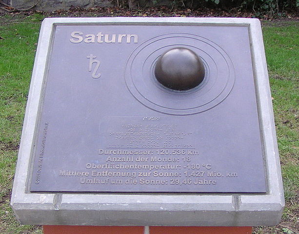
Since 2002 there's the so called "educational planet trail" on the Rhine embankment in Bonn. It depicts the solar system on a 1:1'000'000'000 scale, i.e. the sun is 1.39 m in diameter, Mercury at a distance of 60 metres 4.9 mm, Venus at 108 metres 1.2 cm, Earth at 150 metres 1.27 cm, Mars at 228 metres 6.8 mm, Jupiter at 778 metres 13.98 cm, Saturn at 1'427 metres 11,65 cm, Uranus at 2'870 metres 5.07 cm, Neptune at 4'497 metres 4.92 cm and finally Pluto at 5'946 metres 4.7 mm. For better visibility and to avoid theft the planetrs are depicted as hemispheres on broze plaques containing information about them. It's a popular destination for science teachers to demonstrate the true size of the solar systen to their classes before or after visiting the nearby natural history museum.

640px-Planetenlehrpfad-bonn-04.JPG

The sun at the start of the trail

612px-Planetenlehrpfad-bonn-10.JPG

Earth at 150 metres

613px-Planetenlehrpfad-bonn-16.JPG

Saturn at 1'427 metres
 
Last edited:
Those borders are quite clearly puzzle pieces. There’s mirrored regularity to them and it repeats. I guess the map creator was told to make a map from scratch to “avoid copyright problems” and thought the squiggle of a puzzle piece was sufficiently un-American that he could get away with it.
 
Did you know that you can depict the entire world with simple geometric shapes? (however, it does have minor issues with accuracy...)

badsimplef.jpg
 
God in heaven, I hate Alegria. I hate it so much,
The funny thing is that it isn't *that* bad (we've had worse here). But I'd expect a geometric shape for at least the countries that they have offices for, so the lack of a "rectangle" for Japan is surprising. And it looks like they *tried* to match up the color of the country with the lit up geographic shape for it, but Mexico and Brazil are wrong and Japan and SKorea certainly aren't sharing the lit up shape with Singapore.
 
I’m not sure it’s supposed to be teaching anything, though. It’s certainly not teaching anything that existed in history at any point. The Map Shitpost thread, on the other hand…
 
I’m not sure it’s supposed to be teaching anything, though. It’s certainly not teaching anything that existed in history at any point. The Map Shitpost thread, on the other hand…
I was trying to find which forum that thread was in and I forgot about the wording of the name, so I posted it here, will post there when I do find it lmao
 
This map is actually rather informative:

badwoods3.jpg


One can make good guesses about where the map maker lives and from where his (or her) ancestors came from.
 
This map is actually rather informative:

View attachment 825928

One can make good guesses about where the map maker lives and from where his (or her) ancestors came from.
Sadly, the first two things that I noticed was that Antarctica was rotated wrong (The Peninsula should point to South America) and Nova Zemlya was the wrong color...
Any ideas on the island north of the oversize Ireland?
 
Top