You are using an out of date browser. It may not display this or other websites correctly.
You should upgrade or use an alternative browser.
You should upgrade or use an alternative browser.
Return of Horrible Educational Maps
- Thread starter Westphalian
- Start date
Deleted member 107125
Another version of the good old theme: "lets turn a modern map into a WWI map"
View attachment 503550

Crazy Boris
Banned
Another version of the good old theme: "lets turn a modern map into a WWI map"
View attachment 503550
Ah yes, the Central Powers.
-Germany
-The United Duchies of Posen, Silesia, Pomerania, and Prussia
-Austria
-Czechohungarukraintransylvakia
-Slovenia
-The Independent State of Croatia (which, as we all know, was ISOTed out of WWII)
-Vojvodina
-And the Ottoman Empire
Truly, one of the most formidable alliances in history.
Nah, it is not that bad. at least they got the coastlines right and some of the borders even correct (well, those who didn't change in the last ~120 years anyways)
A truly bad map is this "map of pearl origins in the world"

This one only as a thumbnail that you can enlarge at your own risk, because it is that bad.
A truly bad map is this "map of pearl origins in the world"
View attachment 503598
This one only as a thumbnail that you can enlarge at your own risk, because it is that bad.
CLEANSE IT WITH FIRE!
That's too good for itCLEANSE IT WITH FIRE!
That's too good for it
NUCLEAR FIRE!
Now if your mind and eyes can bear it, I found another one. If not, don't enlarge the thumbnail.

Well, if one had to say something good about that map, I guess it is still easily recognizable as a world map. (But maybe not our world map.)
Also they managed to label some countries correctly (albeit, not necessarily their borders)
A special charm point: The Caspian Sea is bordered by Kazakhstan, Pakistan and China. (Hey, they got over 30% correct!)
Deleted member 105545
Ah yes, Pakistan controlling the Russian Steppes. Who could forget the great Pakistani Tartars?Now if your mind and eyes can bear it, I found another one. If not, don't enlarge the thumbnail.
View attachment 503643
Well, if one had to say something good about that map, I guess it is still easily recognizable as a world map. (But maybe not our world map.)
Also they managed to label some countries correctly (albeit, not necessarily their borders)
A special charm point: The Caspian Sea is bordered by Kazakhstan, Pakistan and China. (Hey, they got over 30% correct!)
Ah yes, Pakistan controlling the Russian Steppes. Who could forget the great Pakistani Tartars?
Pakistaniran.
KoRussia and the Republics of South Japan and Sakalin.Pakistaniran.
Well, Madagascar looks about right...searches for anything else good...decides to move on to next 'map'This one only as a thumbnail that you can enlarge at your own risk, because it is that bad.
Okay, now Madagascar's messed up too...Now if your mind and eyes can bear it, I found another one.
Note to self, if Albidoom says don't enlarge, don't enlarge...
I’d like to say something to make fun of this, but I don’t even know where to start.Nah, it is not that bad. at least they got the coastlines right and some of the borders even correct (well, those who didn't change in the last ~120 years anyways)
A truly bad map is this "map of pearl origins in the world"
View attachment 503598
This one only as a thumbnail that you can enlarge at your own risk, because it is that bad.
Well, it looks like the Hashemites finally got their Kingdom of ArabiaNow if your mind and eyes can bear it, I found another one. If not, don't enlarge the thumbnail.
View attachment 503643
Well, if one had to say something good about that map, I guess it is still easily recognizable as a world map. (But maybe not our world map.)
Also they managed to label some countries correctly (albeit, not necessarily their borders)
A special charm point: The Caspian Sea is bordered by Kazakhstan, Pakistan and China. (Hey, they got over 30% correct!)
Well, it looks like the Hashemites finally got their Kingdom of Arabia
Heck, they even have Georgia.
I believe you’re missing someone:my own take on projection alignments (not using a globe because that's cheating)

I believe you’re missing someone:

That breaks the chart.
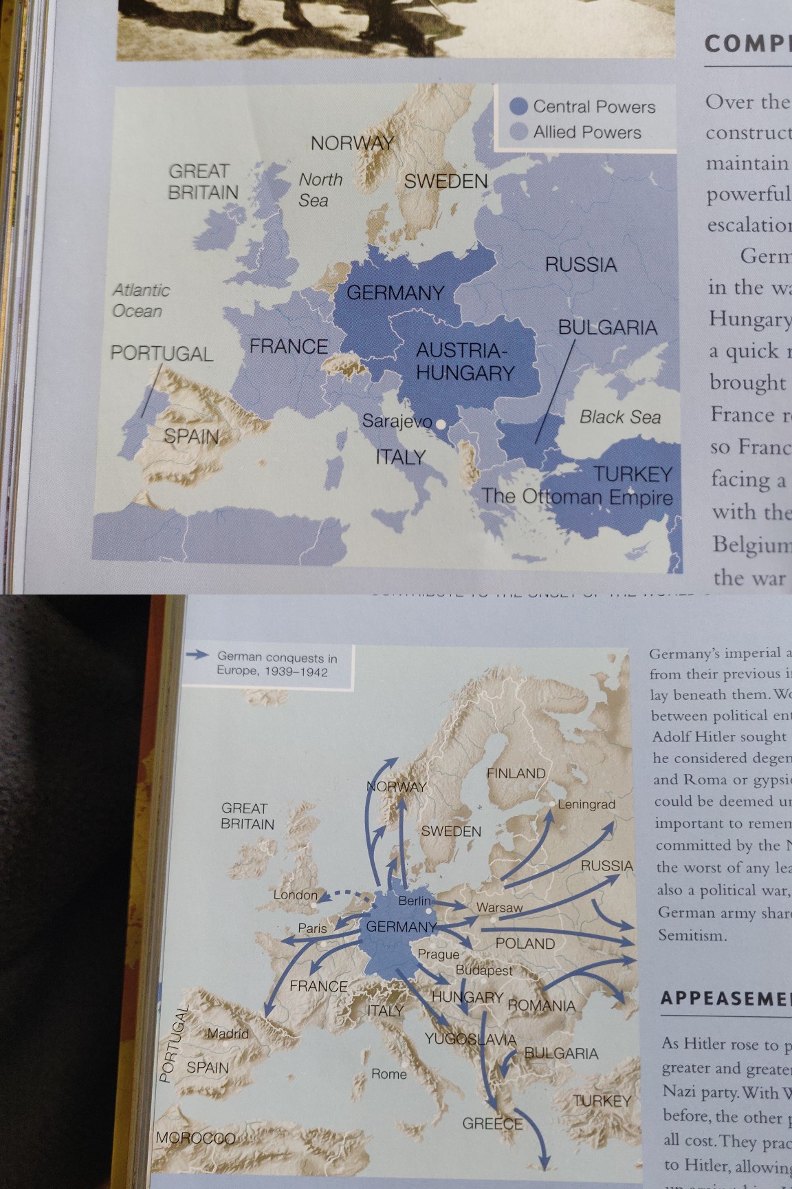
Now maps of both World Wars.
The upper map of WWI is almost acceptable given that they painted over an obviously modern map. The hand drawn borders are not overly wobbly, had they remembered Alsace-Lorraine and North Schleswig and avoided that strange Montenegro Panhandle that separates Serbia and Albania this map would have gotten a passing grade. (not a good grade, mind you, just a passing one)
Unfortunately it seems that the printing press ran short on blue when they came to the WWII map...
Share: