You are using an out of date browser. It may not display this or other websites correctly.
You should upgrade or use an alternative browser.
You should upgrade or use an alternative browser.
The NextGen OTL Worlda Series
- Thread starter hadaril
- Start date
But what does this accomplish? Sure, it may be accurate to some degree, but it's information that people don't really need in a political map. Honestly I think it'll confuse people, because they expect blank land in a WorldA to be actual terra nullius instead of just places where people don't live. Besides, what's the definition of "uninhabited"? Because I have a WorldA language map that shows much more of the world as negligibly populated, such as much of the Arabian Peninsula. It seems to me it's kind of arbitrary, because obviously there are still people in the areas marked as unpopulated but just at far fewer numbers.I would argue that uninhabited land is by its very nature uncontrolled. A state is essentially an organisation of people, so an area without any people isn't under the control of a state. Conversely, areas in Antarctica with bases in them should be shown as part of the state that owns the base.
*edit* I'm not saying that the interior of Greenland isn't part of that nation, but rather that that area isn't de facto controlled by Greenland. So I propose to continue to show recognised borders, even if they run though uninhabited areas, but not colour in that area.
Based on your example that seems like it's just the protectorate color, which'll be very misleading.Or, we could use the tribal/cultural group colour from ncs (if it has one, I've pretty much only used the SUCK.)
Does anyone possess, or can provide a link to, the 1913 Worlda?
Here’s the 1914 one
But what does this accomplish? Sure, it may be accurate to some degree, but it's information that people don't really need in a political map. Honestly I think it'll confuse people, because they expect blank land in a WorldA to be actual terra nullius instead of just places where people don't live. Besides, what's the definition of "uninhabited"? Because I have a WorldA language map that shows much more of the world as negligibly populated, such as much of the Arabian Peninsula. It seems to me it's kind of arbitrary, because obviously there are still people in the areas marked as unpopulated but just at far fewer numbers.
Based on your example that seems like it's just the protectorate color, which'll be very misleading.
It's the protectorate of protectorate colour of greenland in the suck
May I ask why the British Isles were changed? I did a quick search of the thread but couldn’t find anything, thanks!
Thrre’s a patch in the last few pages with an improved Africa.Here’s the 1914 one
View attachment 423162
The problem is that the linguistic map showed regions without permanent settlements as uninhabited, which is useful, but in places like Siberia or the Sahara, where nomads who aren’t necessarily based in cities live, an area can have a population without settlements.But what does this accomplish? Sure, it may be accurate to some degree, but it's information that people don't really need in a political map. Honestly I think it'll confuse people, because they expect blank land in a WorldA to be actual terra nullius instead of just places where people don't live. Besides, what's the definition of "uninhabited"? Because I have a WorldA language map that shows much more of the world as negligibly populated, such as much of the Arabian Peninsula. It seems to me it's kind of arbitrary, because obviously there are still people in the areas marked as unpopulated but just at far fewer numbers.
Based on your example that seems like it's just the protectorate color, which'll be very misleading.
Really this depends on whether we decide to go with the Omniatlas approach and show land within the borders of states that is not under their control as empty. I would support that, evidently you would not.
I'm aware of this, but the WorldA doesn't do well with small scales in general. I wonder if it would be a good idea to draw certain bodies of water with only black pixels (see this map by @MisterP / OneHellofaBird for what I mean by this, and in fact what I was inspired by).Something I've noticed (and something I've had to point out before; Lake Balaton (in Hungary) should not be on the World's maps as it's to small to be shown at the scale of the World's; even worse in these recent ones is it's shown as even larger than normally done.
Last edited:
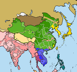
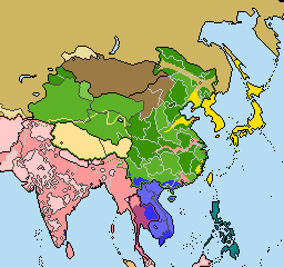
Here's some China patches I made:
1913 1914 1916 1917


Notes:
- All of these assume that the date is January 1 of that year. If the 1914 patch took place at the date Franz Ferdinand was assassinated Uriankhai would be Russian protectorate.
- We really need a 1900 map, which would make a 1912 map actually feasible to make.
- I'm not really sure what all of that stuff in southern China is? I can't find any French are British concessions in the very broad areas shown.
- These overwrite my earlier 1914 fix.
1913 1914 1916 1917
Notes:
- All of these assume that the date is January 1 of that year. If the 1914 patch took place at the date Franz Ferdinand was assassinated Uriankhai would be Russian protectorate.
- We really need a 1900 map, which would make a 1912 map actually feasible to make.
- I'm not really sure what all of that stuff in southern China is? I can't find any French are British concessions in the very broad areas shown.
- These overwrite my earlier 1914 fix.
The best thing to do is simply not try and show them if thrythe to small.
This is honestly the worst solution. Stray black dots all over the map will just look like borders someone forgot to erase when drawing the map.
This. Plus, you would need to standardize 1.) what size lakes could as relevant and 2.) why, which are 2 big questions.This is honestly the worst solution. Stray black dots all over the map will just look like borders someone forgot to erase when drawing the map.
Why do none of the political maps have rivers? I think it would be a good resource for newcomers to see what borders are based off of terrain.
and in Balaton's case there's also the problem of Hungary's TACO color being so dark it doesn't show up--it makes it arbitrary (I'm obsessed with fiddly details like that in my mapmaking anyway)This is honestly the worst solution. Stray black dots all over the map will just look like borders someone forgot to erase when drawing the map.
Due to the use of the NCS in the next-gen worlda, other colour schemes are not taken into consideration afaikand in Balaton's case there's also the problem of Hungary's TACO color being so dark it doesn't show up--it makes it arbitrary (I'm obsessed with fiddly details like that in my mapmaking anyway)
But people who use those colour schemes would use the the NextGen as a base, so it should be taken into account.Due to the use of the NCS in the next-gen worlda, other colour schemes are not taken into consideration afaik
Share: