A Thread for Alternate US State Flags

Here's a flag for Virginia I did a while back:

roserva_by_keperry012-d9p8lps.png


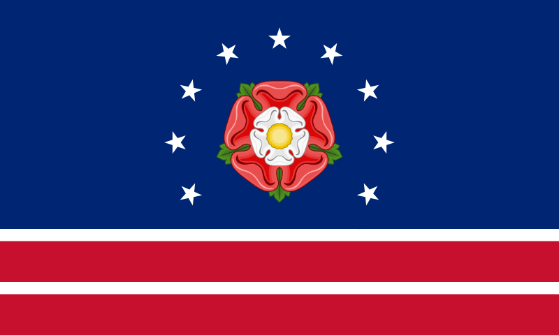
This one is the city flag of Richmond with the central boatman design replaced by a Tudor rose. Now, allow me to grasp at straws as I attempt to extract symbolism:

The Tudor rose symbolizes Queen Elizabeth I, the namesake of the state, and its English colonial heritage in general. More obscurely, the rose is also the national flower of the US (who knew, right?) so it sort of alludes to Virginia's important role in the country's founding. The rose also happens to be shaped like a pentagon, and of course the Pentagon is located in Virginia, as is much of the federal government, so there's an additional allusion.

In the flag of Richmond the nine stars are meant to symbolize the nine states that were formed from Virginia's original territorial name, hence Virginia's nickname "Mother of States", symbolism that carries over nicely here. If you consider the rose as a tenth star it could also represent Virginia's position as the tenth state to ratify the Constitution. And the circular shape recalls the Betsy Ross flag, and we all know how important Virginia was in the Revolution...

As for the stripes... well, they resemble the stripes on George Washington's coat of arms that were adapted into the flag of Washington DC, so it could represent both George Washington's Virginian origins and Virginia's proximity to Washington DC. And the two blood-red stripes could also represent the Revolutionary and Civil Wars, two of the bloodiest and most important wars in American history that were fought on American soil. And if you count the white stripes then there's four stripes, representing the four presidents of the Virginia Dynasty?

Anyway, I think it works.
 
Here's a flag for Virginia I did a while back:

roserva_by_keperry012-d9p8lps.png
are you referring to this:
upload_2016-9-4_7-50-28.png

both are great flags and i like them both, but i prefer this one more, also i had this flag on hand because i have been collecting flags for the past 3 months, idk why, i think i have a problem
 
image.jpeg
image.png
image.png
image.jpeg
image.png
image.png
A nice segment about vexillology and Roman Mars on CBS Sunday Morning. One of the discussions was about redesign of the SF city flag. I found the following proposals interesting, without the verbiage, of course.
 
image.png
image.png
There was another discussion of redesign of the "worst city flag in the US," that of Pocatello ID. Some proposals;
 
Last edited:
image.jpeg
image.jpeg
image.jpeg
image.jpeg
image.jpeg
Pocatello is named for a Shoshoni leader. However the name is not a Shoshoni name or based on a word or phrase in that language. The origin is unknown.

His actual name was Tondaosha, which means "buffalo robe." It would be interesting to try to incorporate Shoshoni design, especially relate to robes, in a flag.
 
image.png
I

Intriguing. A lot of ideas I like, but too much verbiage and the goldfinch looks like it's on meth. While humor has its place on this site, I'm proposing practical redesigns for the real world, so this is my more conservative idea. A jayhawk replaces the bald eagle.
Iowa. The Hawkeye State. Yet it's state symbol is the American or Eastern Goldfinch (Spinus Tristis or Lightning Bird) Thus Eagle Removed.
States like Iowa take themselves too seriously.
I say lighten up Iowa, back your local bird and do it with a bit of fun...

Iowa only has 5 state symbols, and one of them is Geode Rock. Hollow with crystals inside. Thus the joint margins between the blue, white and red panels are angled like the inside of these types of rocks. Also the lame Iowa script is removed for a bolder score in a colour associated to these Geode rocks (235-195-130)

 
Last edited:

Alan Hardy

Banned
well, here is my take...
P for Proud, P for Pocatello, the circular design on the skin is placed as a feature of the negative giant white P in the hoist.

 
image.jpeg


Oh, the use of the hide is very cool! But all the verbiage makes it look like an ad for the Chamber of Commerce. Ironically, that's exactly what the current flag is. It even has the copyright and TM symbol.

well, here is my take...
P for Proud, P for Pocatello, the circular design on the skin is placed as a feature of the negative giant white P in the hoist.

 
Last edited:
image.png


For a long time I felt that enlarging the stars would be all that would be mess art, that the current flag was otherwise basically sound. But, then I saw this one and I thought it a big improvement. The stripes call to mind the Russian flag,, from which it was purchased. I would alter the black stripe to yellow for the Klondike gold rush.


here is a new alaskan flag:
View attachment 285731
inspired by @Transparent Blue 's submission on the request thread on page 109, and i recolored it and turned the stars from 7 points to 5, and as always, hope ya like!
 
image.png


I once thought that this would work well for OR, but decided it was a bit too complex to be practical. It depicts a whale.

Alaska. Sorry little dipper, you can see that sort of thing just about anywhere if you only look up! If you look down closely in Alaska then you may see gold, jade, ice and fish. So much so the locals know a very particular way of drawing them...
Credit going out to the Art Gallery, Fairbanks Alaska. I would redraw it but I've got 26 more flags to look at yet.

The spacing of the salmon very nearly touches the top and foot of the flag because it just about touches everyone's lives who live in Alaska. The fish leaps from the ice white water, clearing its majestic way. To the hoist, gold (255-215-0) (the state mineral) can be seen in small amounts of thin seams shown by the one pixel width of the upper and lower connection. Similarly, Jade (0-168-107) (the state gemstone) can also be found in small amounts. The red (228-32-41) sector (for the 20 tribal languages) in the fly directs a white semi circle into the far corners of the land as it feels like Alaska sits at the very edge of the world.

 
View attachment 286082

For a long time I felt that enlarging the stars would be all that would be mess art, that the current flag was otherwise basically sound. But, then I saw this one and I thought it a big improvement. The stripes call to mind the Russian flag,, from which it was purchased. I would alter the black stripe to yellow for the Klondike gold rush.
that is @Rubberduck3y6 's submission on flag thread IV, his submissions are the best!!! (rubberduck if you see this, please do more, maybe the country flags?)
 
Top