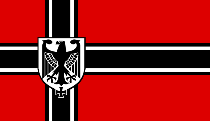
Crossposted from Weekly Flag Challenge, it's a flag for a victorious Nazi Germany, post-Hitler, that has begun to liberalize and remove some of the more overt Nazi imagery, but still remains an authoritarian militaristic state:
You are using an out of date browser. It may not display this or other websites correctly.
You should upgrade or use an alternative browser.
You should upgrade or use an alternative browser.
Flag Thread IV
- Thread starter Pragmatic Progressive
- Start date
- Status
- Not open for further replies.
Crossposted from Weekly Flag Challenge, it's a flag for a victorious Nazi Germany, post-Hitler, that has begun to liberalize and remove some of the more overt Nazi imagery, but still remains an authoritarian militaristic state:
I love this one so much; it screams Nazi to me but it also screams pre-Weimar Germany
Crossposted from Weekly Flag Challenge, it's a flag for a victorious Nazi Germany, post-Hitler, that has begun to liberalize and remove some of the more overt Nazi imagery, but still remains an authoritarian militaristic state:
This is an amazing flag - really well done. I especially like what @gruff.jones pointed out - it harks back to earlier, Second Reich traditions whilst refusing to throw the Nazi aesthetic.
It hits that sweet spot of despicable totalitarian flags.
Hapsburg
Banned
Obverse and Reverse of the CGU National Standard, which is bore like a Roman vexillum. The obverse displays the National Emblem, a single-headed State Eagle clutching an oak-wreathed Earth, itself wreathed by olive branches, all in gold. The reverse is the historical emblem of the Terran government, an outlined Earth wreathed in olive branches, all in white.
The emblem is altogether different from that of the Terran Empire, which was a double-headed black eagle combined with more traditional military imagery. The CGU's iconography rather reaches to Earth's antiquity and to Neo-Deco styles. The CGU especially uses the imagery of a single-headed eagle with wings widely outstretched, representing the whole of humanity brought under a single hegemonic republic, whose wings stretch to cover the whole Galaxy. The combination of oak and olive wreaths in the National Emblem indicate the balance of military power and peacemaking.

The emblem is altogether different from that of the Terran Empire, which was a double-headed black eagle combined with more traditional military imagery. The CGU's iconography rather reaches to Earth's antiquity and to Neo-Deco styles. The CGU especially uses the imagery of a single-headed eagle with wings widely outstretched, representing the whole of humanity brought under a single hegemonic republic, whose wings stretch to cover the whole Galaxy. The combination of oak and olive wreaths in the National Emblem indicate the balance of military power and peacemaking.
Yeah, I actually really like the OTL Sou'frican flag. One of my favorites next to the Gambia's. It's unique in that it derives symbolism not just from its colors as is the case with most flags, but also from its design itself. The two diagonal green bars coming together from the top and bottom to form one single green bar in the middle symbolizes the previously-divided country coming together after the end of Apartheid and moving forward together into a bright new future.This's very reminiscent of Guyana. Still fits South Africa well though.
Gives me an idea for a thread. We've had a "WI: All countries used Nordic Cross flags?" thread, but what if we had a "WI: All countries use a Guyana Arrowhead flag?" thread? Would be interesting to see the different color combinations coming up.
Last edited:
Alan Hardy
Banned
Yes it would, but right now i'm ready to post an updated French Guiana flag after looking back at my last one and not being anything like happy.
The more I'm looking into the topic, the more I think there is room for improvement. Changed the official yellow (252-221-9) to Gold (255-215-0) as that's supposed to be the reference.
Also the ratio is a weird 635x400 so as to junction blue and white in the upper fly.

The more I'm looking into the topic, the more I think there is room for improvement. Changed the official yellow (252-221-9) to Gold (255-215-0) as that's supposed to be the reference.
Also the ratio is a weird 635x400 so as to junction blue and white in the upper fly.

Alan Hardy
Banned
I give you a corrected Guyana...
Now this flag was designed by Whitney Smith. (the famous vexillologist) without the black and white fimbriations. However the UK College of Arms suggested them and thus the flag now shows areas of minor impediment. Apparently, base colours (black, red, blue, green and purple) should not be directly next to other base colours. But spaced with either yellow, gold, silver or white.
So this really is how its supposed to look...

Alan Hardy
Banned
now if you want all those five colours then the layout changes to accommodate too...

from the hoist this is
black white red yellow green. It could be...
red white black yellow green. Or...
black yellow red white green. Or...
red yellow black white green.

from the hoist this is
black white red yellow green. It could be...
red white black yellow green. Or...
black yellow red white green. Or...
red yellow black white green.
Last edited:
Since people are posting their competition entries here, I'm going to post this unofficial one I did for the crusader state competition! 
The Kingdom of God

It's pretty simple in comparison to some of the other entries, but I decided to go with a flag for a united Earth, a world controlled by a single, supremely powerful crusader state. The Earth, enwrapped within a crown of thorns, is surrounded by twelve stars, each representing one of the twelve apostles. In the top left is a cross, placed above but besides the Earth, showing the pre-eminence of God and the mother church over all earthly matters, and from its tip drips a large, red drop of blood, symbolizing not only that of Christ himself, but that of all the saints, martyrs, crusaders and men-of-faith who have been prosecuted throughout the years and whose sacrifice made the Kingdom of God on Earth a reality.
if this is not there civil flag, it should be!I give you a corrected Guyana...
"and another one" -DJ Khaled.....no?...fine whatever, here is the next bunch of flags: Egypt, Estonia and Fiji (finally spelt that right!) so with out further adue!
Egypt:

Colors: green: 0-128-0, red: 206-17-38 (some times the green is 0-64-0 but only on occasion)
Symbolism: the red stands for the times and struggles before the revolution from 1952-1953 and it also stands for the Red Sea, the white represents the bloodless nature of the revolution as well as the purity of the people and the clean Nile River, the black symbolizes the end of oppression after the revolution, the African people and the dawn of the 20th century and finally the star represents democracy as well as Islam, the state religion, and the nation it's self.
Changes: the flag has the CoA and as (most) of you know, the CoA is a terrible thing to put on a flag and (as I've said before) it is most of the time complicated, this one is the exception, this would most likely be the civil flag, and the national flag would be the current flag just with the bands on the eagle's chest are colored in with the left band being red and the right being black with the middle remaining white.
Estonia:

Colors: blue: 0-106-167
Symbolism: the blue represents the ancient freedom, truth, sky and sea. the black represents the attachment to the soil of the homeland as well as the fate of Estonians – for centuries black with worries. and the white symbolizes the purity, hard work, and commitment of the people and the pursuit of a brighter future. and the Nordic Cross represents its connections to the Nordics and ambition to be a Nordic nation.
Changes: ok, i love! the Estonian flag and i wasn't planing on changing it, but i learned the Estonians consider them selves as a Nordic country insted of a Baltic country with Lithuania and Latvia, and to show this i thought, why not have a Nordic flag to show the change. i still love the current flag and i suggest having the current flag as maybe the civil flag? idk.
Fiji:

Colors: light blue: 0-162-232 dark blue: 63-72-204 yellow: 255-242-0
Symbolism: the light blue represents the blue sky, the white represents the white sands of the beaches of the island, the dark blue represents the Pacific Ocean and finally, the yellow circle represents the sun and the main island Viti Levu and its circular shape.
Changes: as i said in the Argentina re-design, i would alter the design a little and use for Fiji, well here it is. originally i had both of the stripes the same light blue color, then i looked at some of the Fiji flag re-designs on Google and i saw them using 2 different blues so i decided to do the same, and this is what we have.
thanks for looking at this and supporting the series, the next 3 will be: Indonesia, Iran and Iraq. and as always, hope ya like!
Egypt:
Colors: green: 0-128-0, red: 206-17-38 (some times the green is 0-64-0 but only on occasion)
Symbolism: the red stands for the times and struggles before the revolution from 1952-1953 and it also stands for the Red Sea, the white represents the bloodless nature of the revolution as well as the purity of the people and the clean Nile River, the black symbolizes the end of oppression after the revolution, the African people and the dawn of the 20th century and finally the star represents democracy as well as Islam, the state religion, and the nation it's self.
Changes: the flag has the CoA and as (most) of you know, the CoA is a terrible thing to put on a flag and (as I've said before) it is most of the time complicated, this one is the exception, this would most likely be the civil flag, and the national flag would be the current flag just with the bands on the eagle's chest are colored in with the left band being red and the right being black with the middle remaining white.
Estonia:
Colors: blue: 0-106-167
Symbolism: the blue represents the ancient freedom, truth, sky and sea. the black represents the attachment to the soil of the homeland as well as the fate of Estonians – for centuries black with worries. and the white symbolizes the purity, hard work, and commitment of the people and the pursuit of a brighter future. and the Nordic Cross represents its connections to the Nordics and ambition to be a Nordic nation.
Changes: ok, i love! the Estonian flag and i wasn't planing on changing it, but i learned the Estonians consider them selves as a Nordic country insted of a Baltic country with Lithuania and Latvia, and to show this i thought, why not have a Nordic flag to show the change. i still love the current flag and i suggest having the current flag as maybe the civil flag? idk.
Fiji:
Colors: light blue: 0-162-232 dark blue: 63-72-204 yellow: 255-242-0
Symbolism: the light blue represents the blue sky, the white represents the white sands of the beaches of the island, the dark blue represents the Pacific Ocean and finally, the yellow circle represents the sun and the main island Viti Levu and its circular shape.
Changes: as i said in the Argentina re-design, i would alter the design a little and use for Fiji, well here it is. originally i had both of the stripes the same light blue color, then i looked at some of the Fiji flag re-designs on Google and i saw them using 2 different blues so i decided to do the same, and this is what we have.
thanks for looking at this and supporting the series, the next 3 will be: Indonesia, Iran and Iraq. and as always, hope ya like!
Last edited:
Dementor
Banned
Did you mean to say Belarus? Because there's nothing even remotely Bulgarian on this flag.Communist Bulgaria
Did you mean to say Belarus? Because there's nothing even remotely Bulgarian on this flag.
Haha yes, communist Belarus sorry!
Estonia:
This is an already existing proposal for the Estonian flag, though, it's even on the Wikipedia page about the flag of Estonia.
https://en.wikipedia.org/wiki/Flag_of_Estonia
Alan Hardy
Banned
Did some maths on the Estonia Nordic Cross so that each colour has as close to 33.33% of the area. Still ratio 7:11 built on breath of 400 pixels (grey 1 pixel edge) thus open area being 625x398. The aim was 82,917 pixels each. Below the 98 pixel canton square and fly rectangular corners have 82,908 pixels combined and the 90 pixel wide cross has 83,070 pixels.
Black cross looked sinister and I wanted to keep the blue away from the black, placing the two together makes the blue (0-114-206) look dirty. Thus...

I still prefer the 3 horizontal bands.
Black cross looked sinister and I wanted to keep the blue away from the black, placing the two together makes the blue (0-114-206) look dirty. Thus...

I still prefer the 3 horizontal bands.
Last edited:
honestly, i didnt know that, i just thought it was a good design...sorryThis is an already existing proposal for the Estonian flag, though, it's even on the Wikipedia page about the flag of Estonia.
https://en.wikipedia.org/wiki/Flag_of_Estonia
agreed 100%, my scenario is if its accepted as a Nordic country, this would be the flag change, other than that, the current flag is awesome!Yeah, the Nordic Cross designs are nice, but Estonian current design is really better.
Two flags for Crovoda.
The following was proposed by President Daniel Celino as part of the country's "rebranding" from Istok to Crovoda, but was rejected by the Parlament.

The current flag has stayed from the old country, and is noted for being the only flag besides Nepal with a higher vertical height than horizontal.

The following was proposed by President Daniel Celino as part of the country's "rebranding" from Istok to Crovoda, but was rejected by the Parlament.
The current flag has stayed from the old country, and is noted for being the only flag besides Nepal with a higher vertical height than horizontal.
- Status
- Not open for further replies.
Share: