You are using an out of date browser. It may not display this or other websites correctly.
You should upgrade or use an alternative browser.
You should upgrade or use an alternative browser.
deleted
- Thread starter Turek
- Start date
I'll be keeping an eye out for your updates. I'd offer to put it in my sig but looks like you've got it covered.
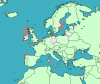
What's with East Germany?
What's with East Germany?
I was working a bit on internal borders. I have an old atlas laying around, so I thought I'd use that; besides, the Cold War German division was one of the biggest internal/allohistorical borders I could think of. The other internal borders were just the stock-standard British subdivisions.
And thanks. I've never really used my sig, though, so I thought I might as well.
Got it.
I took the idea from xt828. He keeps the Qbam in his.
Tweaked some more, namely some islands in the Baltic Sea and Cyprus.
Feedback could be as simple as 'oh, well, revert that corner of Iberia' or 'yeah, the new Sardinia is fine, it's an improvement' or whatever it may be.
Use the one in my sig for comparison, obviously.
Did you start the map from scratch, and is Europe/NA/ME all that you have?
I traced an outline on a layer above a stock Wikipedia map—because that was the best one I could find . . . "best" in a manner of speaking, of course, because obviously Wikipedia's SVG maps aren't very detailed.
I actually do have the entire world mapped in the quality of the original Europe map I posted.
EDIT FOR ADDITIONS: I don't really like how it started, but it got the ball rolling. I spent a little bit cleaning up some of Europe before the initial post, to some effect. I was planning on slowly expanding the expanse of the map as the quality of the existing area improved so that we're not overloaded by my . . . poor decision.
How big is the full thing?
Only you can eliminate greyed-out areas.
Tried to add a few more internal-ish borders in the UK and also the Thames. You know, you'd think it'd be somewhat easy to generalize such large spaces in a few pixels.
That's why I have so much trouble with it-so few choices for pixels makes it more important to get it right, and I have trouble deciding sometimes.
I wasn't getting direct approval but nor was I getting disapproval, so I went ahead and integrated the grey areas.
The coastlines are nowhere near perfect, but I decided to take a break from them and work more on internal borders.
Started working on France; they're not the best by any means but hopefully they're not too bad.
I recommend finishing up the world before moving onto internal borders, but by all means this is great so continue doing what you're doing.
I had the mindset of finishing Europe to the highest quality possible before moving on to the rest of the world, but would it be better to do the opposite?
It would make the map functional as a global basemap, which might entice others to help the quality by adding internal borders and helping tweak coastlines.
Looks like it has potential. Shows more detail than the Worlda but at a smaller size than the Qbam. I'd been experimenting with the possibility of trying to make a middle ground basemap for that purpose (using the Worlda and simply expanding it) but this looks like it'll fill that niche.
Thande
Donor
Looks like it has potential. Shows more detail than the Worlda but at a smaller size than the Qbam. I'd been experimenting with the possibility of trying to make a middle ground basemap for that purpose (using the Worlda and simply expanding it) but this looks like it'll fill that niche.
I agree, this could be a good size compromise.
For reference, the Worlda is about 1200x650, the Miller Cylindrical Basemap (which I need a shorter name for, I'm getting annoyed with typing it so much) is about 2000x1050, and the Q-BAM is roughly 5000x2500.
Yeah, the intermediate I made (but haven't fleshed out) is 3612x1950. I just tripled the Worlda and started filing down the borders.
Alex Richards
Donor
For reference, the Worlda is about 1200x650, the Miller Cylindrical Basemap (which I need a shorter name for, I'm getting annoyed with typing it so much) is about 2000x1050, and the Q-BAM is roughly 5000x2500.
For suggestions, go for either the Miller, MCB or MAM (Medium-assed-Map to correspond with the BAMs. Given the work you've put in I don't think it would be unfair to go for T-MAM in a similar vein to the Q-BAM).
Here we have the Caribbean. Most coasts are not yet altered, only included because a non rectangular patch would be more awkward to use. Might include one or two outsized or phantom islands, but I think it's pretty bloody accurate.
EDIT: I liked some of your Cuba a bit better.
.png")
EDIT: I liked some of your Cuba a bit better.
Last edited:
Here I had a go with Manitoba's lakes. I skipped most of them in an attempt to avoid clutter, but I'm not really satisfied.
That's it for today, got too many pressing matter to attend to. More later.
.png")
That's it for today, got too many pressing matter to attend to. More later.
For suggestions, go for either the Miller, MCB or MAM (Medium-assed-Map to correspond with the BAMs. Given the work you've put in I don't think it would be unfair to go for T-MAM in a similar vein to the Q-BAM).
I dig T-MAM.
Good call.http://i.imgur.com/8gjkX8S.png
Added more national borders. Linking directly to avoid hurting AH.com's servers more than necessary.
Any plans for any official color schemes, or just defer to the UCS type?
That's a good point.. . . and with all the recent talk about Pacific-centric Q-BAM and Worlda basemaps, I'm happy that cylindrical projections avoid that problem entirely.
Alex Richards
Donor
Well, I have a few preferences, and I definitely want to have more countries colored on the basemap by default (compared to the one in your signature, for example) but I don't want to cause any more problems with another, even minor, color scheme.
However, I'm tending towards a new one, because of the reasons mentioned above and a few more concepts I've been tossing around mentally, but if the scheme doesn't take off, even for this basemap, then it doesn't take off. I'm more concerned with the map itself, but when I'm too lazy to correct geography I'll start working on organizing a color scheme. It wouldn't be too different from whatever we're using today. I know the colors, just not the name of the scheme, funnily enough.
Bear in mind that metastasis_d follows Iori's minimalist convention. It's quite possible and acceptable with U/RCS to have something more like this.
The one I actually normally use has a lot more colors than the one in my signature. Every country that has non-continuous territory gets one, plus Germany and Brazil.Bear in mind that metastasis_d follows Iori's minimalist convention. It's quite possible and acceptable with U/RCS to have something more like this.
You should swap the version now attached to that post with the one on the map, as it's yours plus a few smaller islands.I only did what is roughly the western third of the island. Should I replace yours with mine, then?
Share: