Population growth maps

I couldn't find a thread for any of these and American population trends are something I've been looking into, so I started a series of American population growth maps.

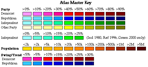
These are done using the Leip electoral college calculator.
30%-0-5% growth/loss
40%-5-10% growth/loss
50%-10-15% growth/loss
60%-15-20% growth/loss
70%-20-25% growth/loss
80%-0-5% growth/loss
90%-30+% growth/loss

2000-2010
Overall growth was 9.7%, down from 13.2% in 2000.

pop growth 2000-2010.png
 
Last edited:
1990-2000

Nevada and Ariona had 66.3% and 40.0% growth, respectively. Also the most recent census where every state had a net gain in population.
Overall growth was 13.2%, up from 9.8% in 1990. This is the only increase in overall growth in the past 50 years, making this a bit of an outlier for recent decades.

pop growth 1990-2000.png
 
Last edited:
1980-1990
The eighties were rough times for states in the Mississippi basin.
Overall growth was 9.8%, down from 11.4% in 1980.

pop growth 1980-1990.png
 
1970-1980
The seventies kick off the rust belt decline. New York saw the single biggest population loss of any state in US history, losing 678,895 people.
Overall growth was 11.4%, down from 13.4% in 1970.

pop growth 1970-1980.png
 
Last edited:
1960-1970
Overall the steel belt is still holding up, but big raw material producers like Pennsylvania and West Virginia are already in trouble.
Overall Growth was 13.4%, down from 18.5% in 1960.

pop growth 1960-1970.png
 
Would you like some help making these? I could make the ones in the 1800s.

Sure, please do. Future ones are going to be harder to make since I haven't yet found a source that lists these figures (Wikipedia only goes as far back as 1990), and have to do all of the calculations by hand.

I also like having them in chronological (or reverse chronological) order so a viewer can see trends over time more easily, which was my main goal.

Edit: The 1800s maps might require a different color key as well, since growth was generally higher.
 
Last edited:

Chicxulub

Banned
Sure, please do. Future ones are going to be harder to make since I haven't yet found a source that lists these figures (Wikipedia only goes as far back as 1990), and have to do all of the calculations by hand.

I also like having them in chronological (or reverse chronological) order so a viewer can see trends over time more easily, which was my main goal.

Edit: The 1800s maps might require a different color key as well, since growth was generally higher.

There is a slight problem, the maps use a color scheme that goes up to 30% growth, when for most of the early 1800s the population was double every 10 years or so...

EDIT: Just noticed you mentioning that.

What if you used a logarithmic scale?

0% - 0-1%
10% - 1-2%
20% - 2-4%
30% - 4-8%
40% - 8-16%
50% - 16-32%
60% - 32-64%
70% - 64-128%
80% - 128-256%
90% - 256%+

For this color scheme I would suggest using the Other Party colors on this key, as they stand out more for the lower percentages.

key.gif


And here is what the 2000-2010 map looks like with this scheme.

2000-2010 Growth.png
 
Last edited:
1950-1960 (probably the last one for the old color scheme)
The lingering effects of the Great Depression can still be seen in the Great Plains and Dixie.
Overall Growth was 18.5%, up from 14.5% in 1950.

pop growth 1950-1960.png
 

Chicxulub

Banned
1950-1960 (probably the last one for the old color scheme)
The lingering effects of the Great Depression can still be seen in the Great Plains and Dixie.
Overall Growth was 18.5%, up from 14.5% in 1950.

If you want I can do the maps in the new color scheme for 1950 to 2000
 
1940-1950, done using the old scheme but on the logarithmic scale. I think the green color scheme will work just fine.

Edit: Image fixed!

population change 1940-1950.jpg
 
Last edited:
Top